Your Next Volunteer Is Already on Your Website: Conversion-Focused Design & AEO for Canadian Nonprofits

Your organization has meaningful work to do.

Rhami Aboud
Want Help With Your Website?

Book a call directly with our CEO, Rhami Aboud. We have 7 years experience creating high-converting SaaS websites that elevate your brand and are built to generate leads.

Book A Call
CEO - Rhami Aboud

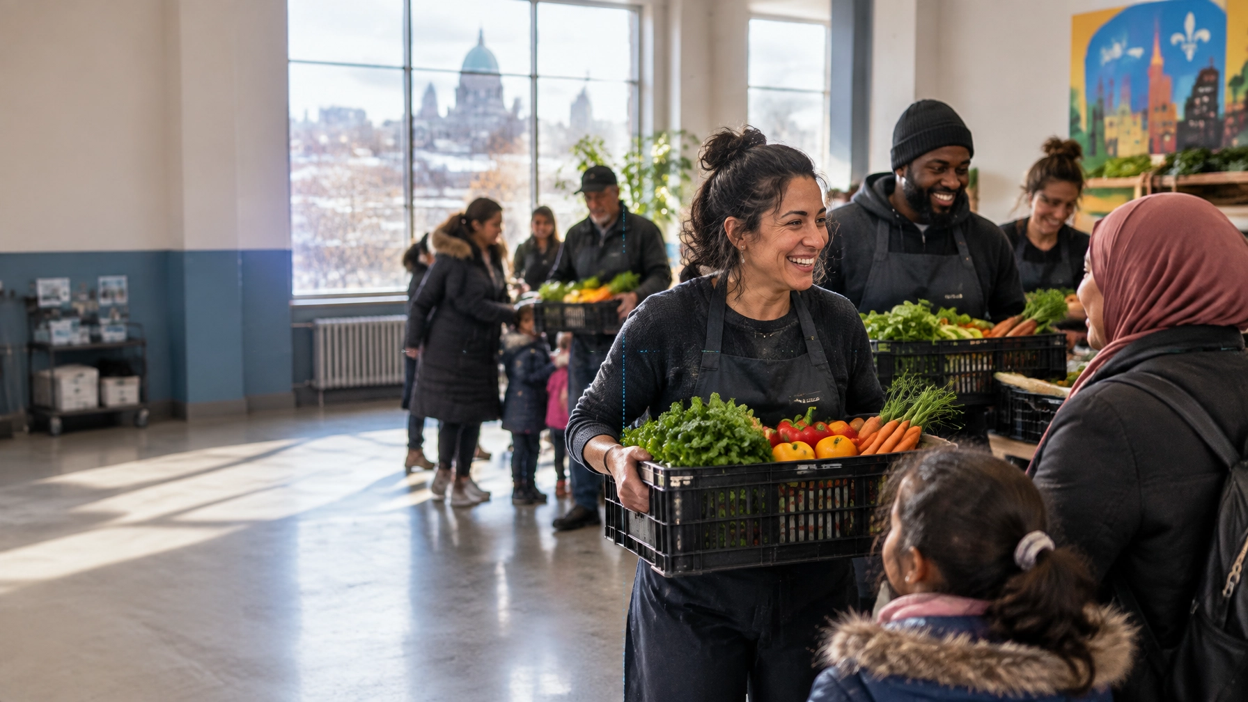
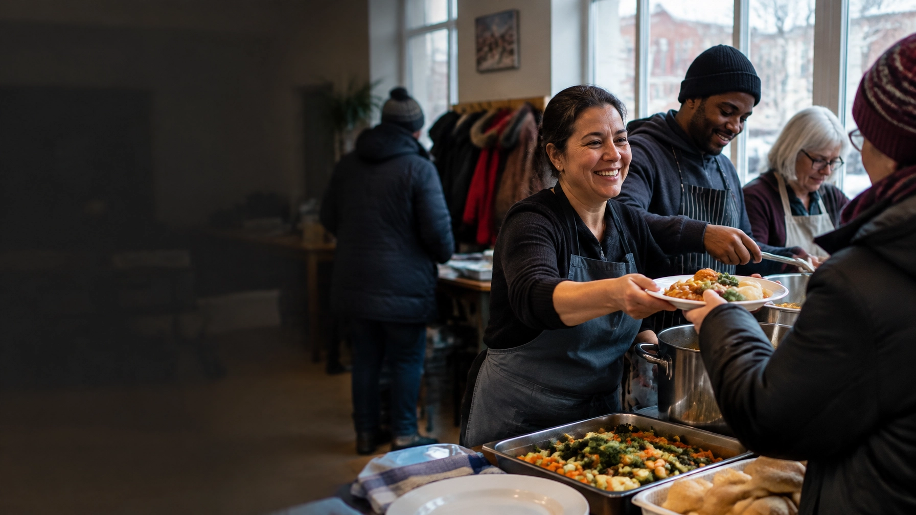
Community volunteers serving a meal together at a neighborhood kitchen in Canada

Your organization has meaningful work to do. But when someone visits your website ready to help, can they quickly find the right volunteer role, or do they hit a generic “Get involved” form and give up?

Many nonprofits put volunteer information in the footer, combine every opportunity into one vague page, and ask visitors to contact them for details. That creates friction at the very moment someone is offering their time.

A better approach is to treat your website as a volunteer pipeline: a clear path from interest to a suitable role, a completed application, and a supported first shift.

TL;DR

  • Make volunteering easy to find, with a dedicated section and one clear “Become a volunteer” CTA.
  • List roles like real opportunities: duties, time, location, requirements, and next steps.
  • Use short, mobile-first applications and tell people what happens after they apply.
  • Answer volunteer questions in plain language to support search visibility and answer-engine optimization (AEO).
  • Track applications and completed placements, not just page views.

Build a volunteer pathway, not a generic contact form

A visitor may be looking for a food-bank shift, a board role, a mentor position, or a one-day community cleanup. If the only option is a general enquiry form, they have to do the work of figuring out where they fit.

Make the first step simple:

  1. Add Volunteer to your main navigation.
  2. Create a dedicated volunteer landing page that explains the impact and shows open roles.
  3. Give every role its own page and application CTA.
  4. Offer an alternative for people who don’t see a fit, such as an interest form or an alert when new roles open.

The goal is not to make every role sound exciting to everyone. It’s to help the right person recognize, quickly, that a role could work for them.

Describe roles like opportunities people can evaluate

A role title such as “Saturday Food-Bank Shift Volunteer” tells people more than “General Volunteer.” On each role page, answer the practical questions people need to decide:

  • What will I do? Be specific about tasks and impact.
  • How much time is required? Include shift length, frequency, and minimum commitment.
  • Where is it? Give the city, neighbourhood, transit or parking details, or clarify that it’s remote.
  • Who can apply? Describe age, skills, language, and experience requirements.
  • Is training provided? Explain onboarding and any screening or background checks.
  • What happens next? Set expectations for review, follow-up, orientation, and scheduling.

Feature one prominent “Become a volunteer” CTA, then repeat a relevant action on each role page, such as “Apply for this mentoring role.” That way, visitors don’t have to return to a generic contact page to take the next step.

A volunteer mentor speaking with a young person at a community table

Make the application easy to complete on a phone

A long, multi-column form can be a tough first impression. Start with the information your team genuinely needs to respond: name, contact details, role of interest, availability, and essential eligibility questions. Request more sensitive details later in the process when appropriate.

Use a single-column, mobile-first form with clear field labels and a visible submit button. After submission, show a confirmation that explains what happens next and when the applicant should expect to hear from you. If your organization has an actual response-time target, share it. If not, don’t promise one you can’t reliably meet.

A short volunteer testimonial can also make the page feel more human. Ask current volunteers what they do, what surprised them, and why they stay. Use real stories with permission, not generic praise that could belong to any organization.

Use AEO to answer the questions volunteers actually ask

Answer-engine optimization is not a special shortcut to AI visibility. It starts with useful, accessible content that search engines and people can understand. Google says its AI search features rely on foundational SEO practices, including helpful content, crawlable pages, and important information available as text. Google’s guidance on AI features is a useful starting point.

Try question-shaped headings on your volunteer pages. Put a clear, plain-language answer right underneath each one.

How do I volunteer at [organization]?

Start by browsing our open roles and choosing one that fits your interests and availability. Submit the short application on the role page, and our volunteer team will follow up with the next steps.

Do I need experience to volunteer?

Not for every role. Each listing explains whether previous experience is required and whether training or orientation is provided.

Can students volunteer for hours?

Some roles may suit students seeking volunteer hours. Check the age and time requirements on each listing, or contact the volunteer team if you need documentation for a school program.

Build your FAQ from real enquiries, not guesses. Depending on your programs, people may want to know about minimum age, time commitment, screening or background checks, group volunteering, corporate team days, accessibility, or language requirements. Keep answers accurate, specific, and consistent across the site.

Your organization name, city, contact details, and service locations should also match across relevant pages and public profiles. For technical structure, Google recommends using accurate, visible-content-matching structured data where appropriate. Its introduction to structured data explains the basics. Structured data does not guarantee rich results or AI citations. It helps describe page content; it can’t replace clear, useful information.

Make volunteer content manageable with Webflow

If your team needs to update opportunities regularly, Webflow CMS can support a practical workflow. A collection for volunteer roles can let staff publish or unpublish listings without asking a developer to rebuild the page. Reusable templates keep each role page consistent, while dynamic lists can be filtered by location or role type.

You can also connect forms to the right inbox or application workflow, and launch campaign pages for seasonal drives without starting from scratch. That flexibility matters when a food-bank shift needs filling next week or an event recruitment push has a fixed deadline.

There are trade-offs. CMS structure, integrations, hosting, staff training, and ongoing maintenance all affect the total cost of ownership. Compare your requirements with Webflow’s current plans and pricing before choosing a setup. The right platform is the one your team can realistically maintain.

Design for the community you’re recruiting in

A volunteer experience should reflect local needs, not just the organization’s address. For Canadian organizations recruiting across different cities, small details can make a role feel more accessible.

  • Montreal: Make bilingual recruitment intentional. Where your team can support it, offer French-first applications and clear information in both languages. Recognize the city’s strong community-organization culture by explaining how the role connects to local people and programs.
  • Toronto: Help applicants assess fit in a competitive volunteer landscape. Include transit-friendly location details, flexible schedules where possible, and clear information for corporate volunteer days.
  • Ottawa: State language requirements plainly. For federal or public-sector applicants, explain relevant screening and the process for sensitive roles so there are no surprises.
  • Vancouver: Make episodic and outdoor opportunities easy to find. Flexible, short-shift or micro-volunteering options can help people fit service around work, caregiving, and the city’s cost pressures.

Volunteers planting a young tree during a community cleanup in Vancouver

Measure the whole path from click to placement

A page visit is a starting point, not the outcome. Track the steps that show where people are moving forward, or getting stuck:

  • Volunteer page visits and role-page visits
  • Clicks on role-specific CTAs
  • Form starts and applications submitted
  • Qualified applicants and placements completed
  • Where volunteers heard about you
  • Time from application to first response and orientation

Ask applicants how they found the opportunity, using a simple dropdown or optional question. Over time, compare results by role, device, location, and source. If lots of people start but don’t finish an application, review the form. If applications come in but placements don’t, look at screening, follow-up, and role fit.

Then close the loop. A timely, respectful response, even when a role is full, helps people feel their offer of time mattered. A thoughtful orientation, clear first-shift instructions, and a check-in after someone starts can turn a one-time application into a lasting relationship.

The takeaway? Your website can do more than describe your mission. It can help a willing person find a role, understand what to expect, and take a confident first step.

At Arch Impact Studio, we build websites around what you need visitors to do, not just what pages you need to publish. Book a free consultation and volunteer-flow review, and we’ll help you spot the gaps between “I want to help” and “I’m ready to start.”

Conclusion

Continue your reading with these value-packed posts
mins read
Ship Fast, Donate Faster: How Webflow + AEO Power Conversion-Focused Nonprofit Websites in Canada

Your next fundraising campaign should not be held back by your website. Yet that happens all the time. A campaign is approved, the creative is ready, and the email is scheduled. Then everyone waits for a page to be designed, developed, reviewed, translated, tested, and published. By the time the donation page is live, the moment has passed. Canadian nonprofits need websites that can move at the speed of their mission. That is where Webflow and Answer Engine Optimization (AEO) work especially well together. Webflow gives your team a scalable system for launching donation pages, campaign stories, and program updates quickly. AEO helps people, and AI-driven search tools, find and understand those pages in the first place. The result is simple: more visibility, less production friction, and more opportunities to turn attention into action. TL;DR Webflow components let you build donation-focused layouts once and reuse them across campaigns. Webflow CMS makes campaign pages, impact stories, and FAQs easier to launch and maintain. A 50% nonprofit discount may be available on one eligible annual site plan, subject to Webflow’s current requirements. AEO uses question-based headings, direct answers, FAQ content, and structured data to improve visibility in AI-driven search. Canadian nonprofits should adapt their digital experience to local realities in Montreal, Toronto, Ottawa, and Vancouver . With the right architecture, a campaign page can launch in days instead of months . Why campaign velocity matters for nonprofits A nonprofit website is not a brochure. It is part of your fundraising infrastructure. Your website may need to support: A year-end giving campaign A crisis response appeal Monthly donations Volunteer recruitment Corporate partnerships Grant and funder credibility Event registration Program applications Impact reporting These needs change constantly. A static website forces your team to start from scratch every time. That creates delays. It also creates inconsistency. One campaign has a strong story and clear donation flow. Another uses an outdated template, a buried call to action, or a form that does not work well on mobile. The solution is not more pages. It is a better system for producing the right pages quickly. Webflow’s biggest nonprofit advantage: reusable donation components Webflow allows your design and development team to create reusable components that can appear across the site. For a nonprofit, that might include: A persistent Donate button A campaign hero section A donation impact block A monthly giving prompt A donor trust section A testimonial or community voice block A campaign progress section A newsletter signup A volunteer CTA A bilingual language switcher Build these once. Then reuse them wherever they make sense. A new campaign page does not need a brand-new layout. Your team can choose the right components, add the campaign content, connect the donation form, and publish. That is how you move from a six-week page production cycle to a repeatable launch process. What does a reusable donation page look like? A reusable donation page should give every campaign a clear, trustworthy structure: A specific headline that explains the need A real image showing the people or community affected One primary donation CTA A clear explanation of what gifts support Short impact examples , such as what $25, $50, or $100 can help provide Trust signals , including registration details, financial information, and privacy reassurance A secure donation form FAQs that answer common donor concerns The content changes. The conversion architecture stays consistent. That consistency makes your campaigns easier to manage and easier for donors to understand. Webflow CMS turns campaign creation into content entry Webflow CMS is especially useful when your nonprofit regularly publishes campaigns, impact stories, events, or program updates. You can create collections such as: Campaigns Impact stories Programs Events FAQs News and resources Each campaign can include fields for: Campaign name Goal Deadline Hero image Short description Donation link Impact statistics Featured story Related program Status: active, completed, or archived Once the template is built, your team can create a new campaign page by adding a CMS item instead of commissioning a new design. That is the difference between a website that requires constant production work and one that gives your team leverage. It also makes scaling easier. If your organization expands from three campaigns a year to twelve, your website architecture does not need to be rebuilt each time. Webflow’s community and nonprofit template library can also help teams explore starting points. But templates should be adapted to your mission, audience, and donation journey, not used as a substitute for strategy. The Webflow nonprofit discount can improve the economics Webflow’s official nonprofit program has offered 50% off one eligible annual site plan for 12 months , including selected Basic, CMS, and Business plans. Eligibility, documentation, renewal terms, and plan coverage can change, so confirm the current requirements directly through Webflow’s nonprofit discount information . For many organizations, the CMS plan is the practical choice because it supports dynamic campaign content, stories, FAQs, and resources. The discount does not eliminate all costs. You may still need: Donation software CRM integrations Email marketing tools Translation support Accessibility testing Professional copywriting and design Ongoing content management Webflow also does not act as a native donation processor. Your donation form may need to be integrated with a platform such as Donorbox or Givebutter , depending on your operational needs. The important point is this: the platform cost is only one part of the business case. The bigger value comes from launching campaigns faster, updating content without developer bottlenecks, and reducing repeated design work. AEO helps donors and AI tools find the right answer AEO, Answer Engine Optimization, is the practice of structuring content so search engines and AI assistants can understand, extract, and present useful answers. For nonprofits, this matters because people increasingly search in natural language: “Which charities help newcomers in Montreal?” “How can I support food security in Toronto?” “Are donations to Canadian charities tax-deductible?” “What does this nonprofit do in Ottawa?” “Where can I volunteer for environmental restoration in Vancouver?” Your website needs to answer these questions clearly. How should a nonprofit structure content for AEO? Start with question-based headings. Then answer each question directly in one or two sentences before expanding with supporting detail. For example: How does monthly giving help our organization? Monthly giving provides predictable revenue that helps us plan programs, retain staff, and support community members throughout the year. Even a small recurring gift can create more stability than a one-time donation. That answer-first format is easy for people to scan and easier for answer engines to interpret. Your AEO system should include: Natural-language question headings Direct answers near the top of each section Short paragraphs Clearly labelled FAQs Specific Canadian terminology Updated program and impact information Internal links between campaigns, programs, and stories Standard schema markup, including Article , FAQPage , Organization , and Event where appropriate Google explains that structured data provides “explicit clues” about the meaning of a page. It also recommends JSON-LD as a practical implementation format. Structured data does not guarantee visibility. It is not a shortcut. But it helps machines understand what your content represents. AEO works best when it supports genuinely useful content, not when it tries to manipulate search results. Four Canadian markets. Four digital priorities. A scalable system should still feel local. Here is how the same conversion-focused framework may need to adapt across Canada’s major nonprofit markets. Montreal: make bilingual giving genuinely equal For Montreal organizations, French and English parity should extend beyond the homepage. Your donation flow should make it easy to: Read the campaign story in either language Switch languages without losing progress Understand tax receipt information Complete the donation form in the preferred language Receive confirmation and stewardship messages consistently A translated navigation menu is not enough. Language parity needs to continue through the moment of donation. Toronto: support major gifts and corporate partnerships Toronto’s nonprofit landscape is crowded and sophisticated. Many organizations compete for major gifts, corporate partnerships, and foundation attention. Your website should make it easy for larger supporters to find: Partnership opportunities Sponsorship packages Board and leadership information Financial accountability Measurable outcomes Contact pathways for development staff A donation page designed only for small gifts may underserve your highest-value relationships. Ottawa: clarify national versus local impact Ottawa nonprofits often speak to government-adjacent funders, national networks, policy audiences, and local communities at the same time. That can create a messaging problem. Your website should quickly answer: Where do you work? Who benefits? Is your impact local, national, or both? What role do policy, research, or public partnerships play? What can a local donor do today? Clear program and geography pages are valuable for both AEO and human readers. Vancouver: prove local specificity Vancouver has a strong environmental, social justice, housing, and community action ecosystem. Donors often want to know whether an organization understands the local context. Use specific details: Neighbourhoods served Local partnerships Regional ecosystems Community-led programs Indigenous relationships and accountability Local outcomes Local specificity creates trust. “We support communities across Canada” is less compelling than a clear explanation of what is happening in the Downtown Eastside, Surrey, Burnaby, or the Fraser Valley, when those places are genuinely part of your work. A practical launch model A high-velocity nonprofit website project can follow this sequence: Define your conversion goals. Donations, volunteers, applicants, partners, or all four. Create the content model. Campaigns, stories, programs, FAQs, and events. Build the reusable components. Donation blocks, CTAs, trust sections, and language controls. Create the CMS templates. Make campaign creation a content task, not a design task. Integrate donation tools. Test one-time, recurring, mobile, confirmation, and receipt flows. Write AEO content. Use real questions from donors, volunteers, staff, and funders. Add structured data. Validate it with Google’s Rich Results Test. Launch, measure, improve. Track donation starts, completions, recurring gifts, campaign traffic, and assisted conversions. A strong nonprofit website is never finished. But it should become easier to improve every time you use it. We have seen the value of mission-driven digital systems through projects such as N3O , a nonprofit platform helping charities manage donors, collect funds, and grow fundraising. The takeaway: build once, move faster, create more impact Your organization should not need a custom website project every time a new need emerges. With Webflow’s reusable components and CMS, you can create a flexible foundation for donation pages, campaigns, stories, and FAQs. With AEO, you can structure that content so the right people, and increasingly, the right AI-driven answers, can find it. Speed is not about cutting corners. It is about removing repeated work so your team can focus on the mission. If you are an executive director, development director, or board member asking whether your website is ready for the next campaign, start with one question: Can our team launch a clear, trustworthy, donation-focused page in days, not months? If the answer is no, book a conversation with Arch Impact Studio . We will help you identify the bottlenecks, prioritize the highest-impact improvements, and design a scalable digital system your mission can grow into.