


You have a board meeting next week. Someone asks the question you knew was coming: “What will the website investment actually achieve?”
“More traffic” probably won’t make the case. Your board needs to understand how the site will help more people donate, volunteer, apply for a program, or access support, and how you’ll report the results.
That’s the practical case for combining conversion-focused web design with Answer Engine Optimization (AEO). One helps the right people find clear, useful answers about your work. The other makes it easier for them to take the next step. Together, they turn digital attention into actions you can measure.
TL;DR: What to bring to the board
- Make the case in terms of completed actions and mission outcomes, not just visits.
- Build a clear path to donate, volunteer, apply, or get help. Test it on mobile.
- Create useful, direct answers that search engines and AI tools can understand and potentially cite.
- Track a baseline before changing the site, then report conversion rates, revenue, form errors, and qualified enquiries.
- Consider Webflow when your team needs flexible campaign pages and a CMS it can manage, but assess the full cost and platform fit before committing.
What should a board-ready website report show?
A board doesn’t need a tour of your analytics dashboard. It needs a short, credible account of what the website is contributing to the organization.
Bring a one-page scorecard with:
- A baseline: donations, applications, volunteer enquiries, or other key actions before changes.
- The conversion rate: the share of relevant visitors who complete that action.
- The value of those actions: such as donation revenue, recurring gifts, qualified applications, or volunteer sign-ups.
- A breakdown by device and channel: especially mobile versus desktop.
- What changed, what you learned, and what you’ll test next.
Agree on how you’ll measure success before launch. Record the dates of campaigns, changes, outages, or other factors that could affect results. And reconcile online donation counts with your payment processor or CRM: analytics tools can miss or duplicate events.
The takeaway? Report a clear line from the website change to visitor behaviour to an outcome the board cares about. Don’t promise a conversion lift before you have evidence.
How can the donation experience make giving easier?
A visitor can believe in your mission and still abandon a confusing donation journey. The solution is to remove avoidable effort and make the next step obvious.
Put giving where people can find it
Use one prominent donation call to action in the main navigation and repeat it at natural points on relevant pages. A donation page should make the basics clear: where the gift goes, whether it’s one-time or monthly, and what happens after the donor gives.
Treat “three clicks to give” as a useful design rule of thumb, not a guaranteed conversion formula. A donor shouldn’t have to hunt across multiple menus or pages to reach the giving form.
Design for mobile giving
Many supporters will meet your organization on a phone. Make the donation form easy to use on a small screen:
- Use a single-column layout with legible labels and large, easy-to-tap controls.
- Keep required fields to a minimum. Enable autofill where possible.
- Explain errors beside the field that needs attention.
- Offer payment methods your processor supports, including digital wallets where available.
- Test the complete journey on real iPhone and Android devices.
Every extra field or unclear instruction is a chance for someone to stop. Test the full journey, including the payment step, not just how the page looks.
Build trust and close the loop
Show credible trust signals near the giving action: your legal organization name, accurate charitable registration details if applicable, a clear privacy explanation, and specific information about how gifts support your work.
After a donation, provide a clear confirmation and next step. Make sure the thank-you page and receipting flow work as expected, and explain when donors will receive an official receipt. Confirm receipt requirements with your finance team or advisor; don’t make tax-receipt promises your organization can’t support.
Program pages should also end with a relevant action. A page about a youth program might invite someone to refer a participant, volunteer, or fund the program. An impact story can lead to a donation or newsletter sign-up. Avoid sending every visitor to the same generic “Contact us” page.
Measure completed actions, not just traffic. Track donation-page visits, form starts, successful gifts, errors, and conversion rate, then compare mobile and desktop performance. Keep sensitive payment information in an appropriate payment platform, not in your website CMS.

How does AEO help the right people find your organization?
People increasingly ask full questions in tools such as ChatGPT, Perplexity, Google AI Overviews, and Copilot. AEO, Answer Engine Optimization, is the practice of making your organization’s information clear and structured enough to be understood and surfaced in those answers.
No site can guarantee it will be cited by an AI tool. And Google says its AI features don’t require a special optimization formula. Strong, useful content remains the foundation.
What content helps answer engines understand your work?
Write the answers your community, donors, and funders are already looking for.
- Use question-shaped headings, such as “Who can access our food program?”
- Put one clear answer directly below each question, then add details and context.
- Keep FAQs grounded in real enquiries: eligibility, service area, hours, referrals, donations, and volunteering.
- State your mission, programs, geography, and registration details consistently across your site.
For instance, rather than writing, “We are committed to food security,” answer a practical question: “Who can access the community pantry?” Then explain who it serves, where it operates, and how to get help.
Use structured data, such as relevant Organization markup, to give search engines additional context about your organization. Follow Google’s structured data guidance: markup should accurately match information people can see on the page. It can help machines interpret your content, but it does not guarantee a rich result, AI citation, or ranking.
Aim to be clear, accurate, and quotable. Keep dates, service areas, eligibility details, and impact claims current. The same plain-language answers that help an AI tool interpret your work also help a donor decide whether to trust you.
AEO and conversion design reinforce each other: clarity helps a potential supporter find an answer, trust it, and act on it.
What should Canadian nonprofits adapt by region?
A board-ready digital plan should reflect where your organization works and what local audiences need to know.
- Montreal: If you serve French- and English-speaking communities, plan for bilingual content from the start. Make sure essential program, donation, and contact information is equally findable in both languages. Consider the expectations of Quebec donors and funders in how you explain local impact and stewardship.
- Toronto: With dense nonprofit competition and costly fundraising acquisition, conversion efficiency matters. Make your distinction, program outcomes, and donation path easy to understand before a visitor moves on.
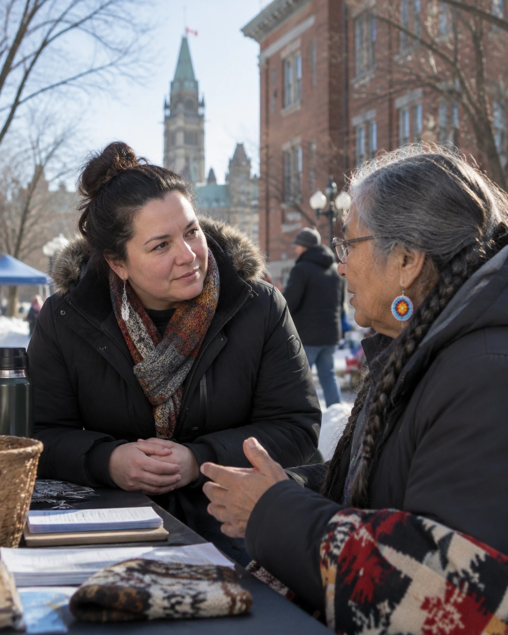
- Ottawa: Federal grants, policy audiences, and associations make credibility especially important. Clearly explain your mandate, evidence, and accountability. Bilingual content may also be important for the people you serve.
- Vancouver: A major funder ecosystem and strong interest in sustainability and social-purpose work make transparency essential. Be specific about how funding supports programs and how you measure progress.
These are useful prompts, not assumptions about every donor. Use your own audience data to decide which languages, messages, and calls to action deserve priority.
Where can Webflow fit into a nonprofit’s digital plan?
Webflow can be a practical option when a small communications team needs to publish and update pages without routing every change through a developer.
A thoughtfully built Webflow site can support:
- Reusable donation, program, and campaign layouts that can be adapted for new initiatives.
- CMS collections for program pages, impact stories, locations, and FAQs.
- Landing pages for fundraising campaigns and tests.
- A shared design system that supports growth as programs multiply.
For a two-person comms team, the CMS can make routine publishing more manageable. Performance still depends on how the site is built: image sizes, scripts, embeds, and page complexity all matter. Test Core Web Vitals and the donation journey on real devices instead of assuming a platform guarantees speed.
Webflow may also reduce ongoing developer involvement for common content updates, but it isn’t automatically the lowest-cost choice. Compare the current Webflow plans with your hosting, localization, accessibility, testing, donation-processing, and support needs. For a board-tight budget, evaluate the total cost of ownership, not just the initial build.
What should you ask the board to approve?
Bring a specific plan, not a promise. Ask to approve:
- A defined outcome: for example, more completed donations, volunteer applications, or program referrals.
- A baseline and measurement plan: including a donation or application funnel and device-level reporting.
- A focused first phase: such as improving the donation journey and priority program pages.
- A review date: when you’ll share the results, what you learned, and what you recommend next.
Then show how clear program content and a well-designed path to action support that outcome. A better website isn’t the mission itself. It’s infrastructure that helps more people connect with the mission and take part.
Want to bring a clearer digital-impact case to your board? Arch Impact Studio offers a free consultation and digital impact review for Canadian social impact leaders. We’ll look at your key visitor journeys, content clarity, and measurement opportunities, and help you identify what to bring into your next board discussion. Book a conversation.