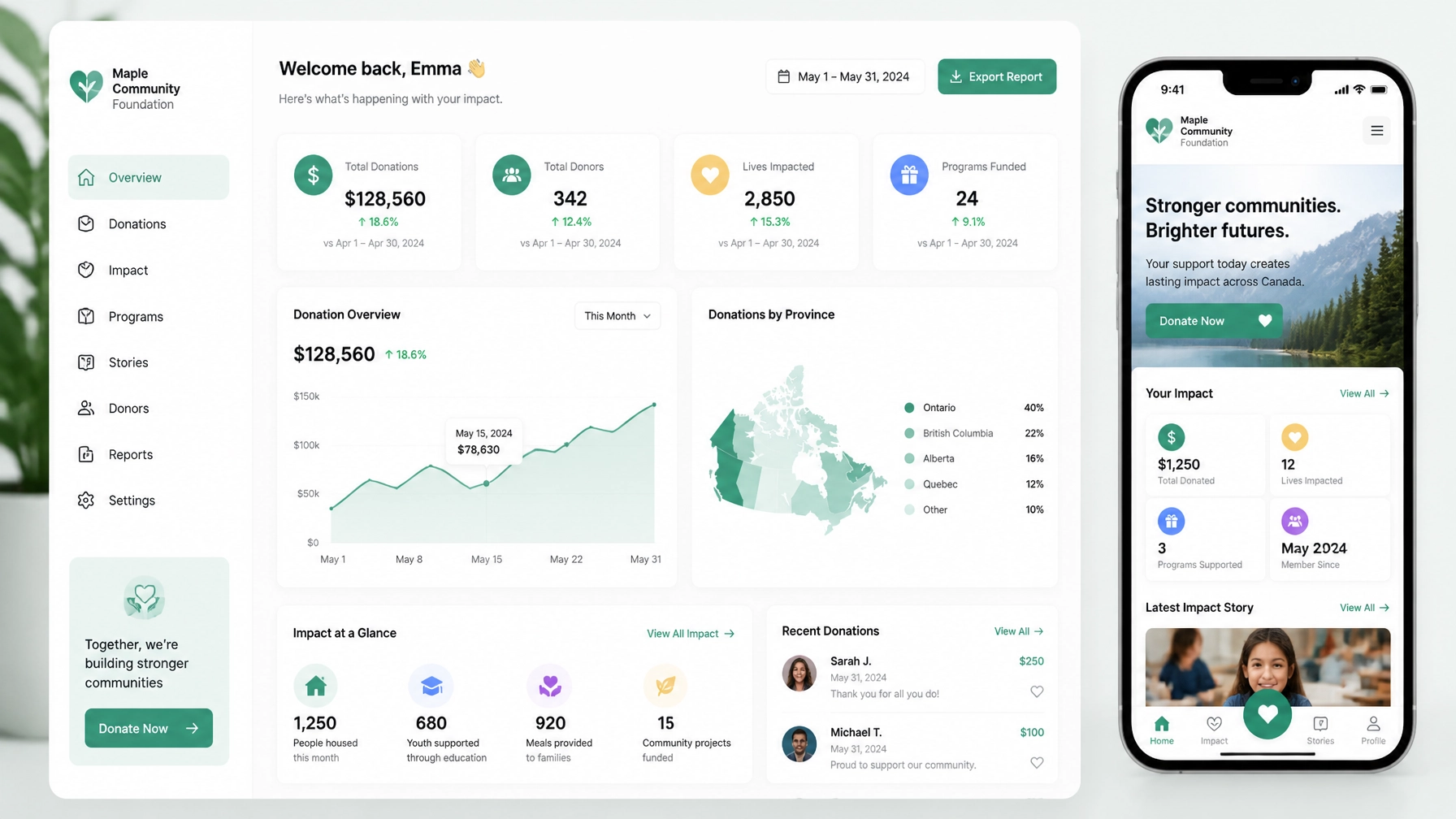
Your annual report may contain the most persuasive content your nonprofit has ever produced.
It may show how many people you served, how many meals you delivered, how many trees you planted, or how a program changed lives.
But too often, that proof is buried in a PDF.
That creates a conversion problem. It also creates an Answer Engine Optimization (AEO) problem.
Donors, volunteers, funders and potential partners are increasingly asking search engines and AI assistants questions such as:
- “Where can I donate in Toronto?”
- “Which charities support climate action in Vancouver?”
- “What does this Montreal nonprofit actually do?”
- “Which organizations help newcomers in Ottawa?”
If your impact data is difficult for people and machines to find, your nonprofit may be doing excellent work without receiving the visibility or support it deserves.
The solution is to move your strongest evidence out of the annual report and into the places where decisions happen: your homepage, program pages, donation pages and answer-focused content.
TL;DR: Your impact report is a conversion asset
Your report should not be the final destination for your results.
Instead:
- Turn major statistics into homepage proof points.
- Turn program outcomes into donation-page content.
- Turn recurring donor questions into Q&A sections.
- Structure your content so AI answer engines can understand and cite it.
- Use Webflow CMS and reusable components to launch, test and update pages quickly.
- Track outcomes your board can understand: donation clicks, completed gifts, monthly donors, volunteer applications and qualified partnership inquiries.
Your impact data already exists. The opportunity is to make it work harder.
Why annual reports rarely convert on their own
Annual reports are usually written for accountability. That matters.
They provide financial information, program updates, governance details and a record of the year. They help funders and existing supporters understand what happened.
But they are not always designed for someone visiting your website for the first time.
A new donor may not read a 40-page PDF before deciding whether to give. They may need to understand three things in under a minute:
- What problem do you address?
- What changed because of your work?
- What can I do next?
Your website should answer those questions immediately.
For example, instead of hiding this sentence on page 18 of a report:
“In 2025, our employment program supported 642 newcomers across Greater Montreal.”
Turn it into homepage content:
642 newcomers supported across Greater Montreal in 2025.
Your donation helps provide language training, employment coaching and practical support.
That is not just a design improvement. It is a clearer path from evidence to action.
Canadian online giving continues to grow. CanadaHelps reported more than $430 million in online donations in 2023, while research from Blackbaud’s Status of Canadian Fundraising report continues to connect digital maturity with stronger fundraising outcomes.
The takeaway? Your website needs to make your impact easy to see, easy to trust and easy to act on.
Step 1: Extract the proof from your impact report
Start with a simple content audit.
Look through your annual or impact report and identify:
- Outcome statistics: people served, meals delivered, homes built, species protected or students supported.
- Before-and-after evidence: what changed for a person, community or environment?
- Geographic proof: where did your work happen?
- Program milestones: what did you launch, expand or improve?
- Human stories: which participant, volunteer or community voice illustrates the result?
- Trust signals: partners, funders, certifications, years of service and financial transparency.
Then assign each piece of evidence to a page.
| Impact evidence |
Best website location |
| Top three annual results |
Homepage |
| Program-specific outcomes |
Program landing pages |
| Cost or gift impact |
Donation page |
| Participant story |
Campaign landing page |
| Volunteer outcomes |
Volunteer page |
| Financial and governance information |
About or transparency page |
| Common donor questions |
FAQ section |
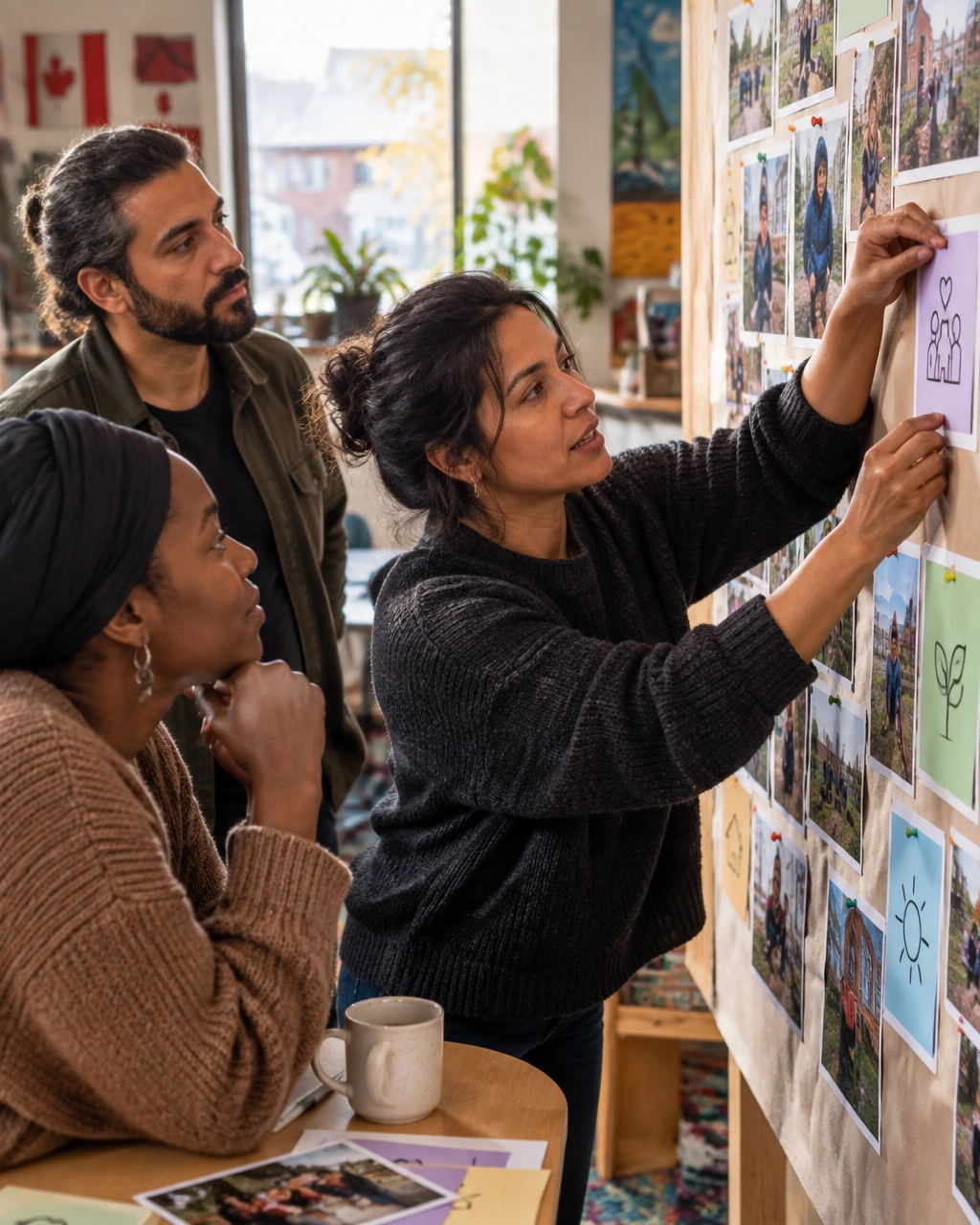
Do not publish statistics without context. A number becomes persuasive when it explains why it matters.
Weak:
2,400 meals distributed.
Stronger:
2,400 nutritious meals delivered in 2025, helping seniors and families facing food insecurity access consistent support close to home.
Strongest:
2,400 meals delivered in 2025. A $35 monthly gift can help provide reliable food support to neighbours facing food insecurity.
Keep your claims accurate, dated and connected to a clear next step.
Step 2: Design the homepage around donor decisions
A conversion-focused nonprofit homepage does not need to tell your entire story.
It needs to help the right visitor make a confident decision.
A practical structure might look like this:
1. State the mission clearly
Use plain language.
We help youth in Ottawa access mental health support before a crisis becomes an emergency.
Avoid vague headlines such as “Creating a better future together.” They may sound positive, but they do not tell visitors what you actually do.
2. Show the most important results
Use three to five proof points. Include the year and geography where relevant.
- 1,240 youth supported in Ottawa in 2025
- 87% of participants reported improved access to care
- 14 community partners involved
- $0 cost to youth and families
3. Add a human story
A short quote or case study can give meaning to the data. Use consent-based storytelling and protect privacy where necessary.
4. Offer one primary action
Your primary call to action may be:
- Donate now
- Become a monthly donor
- Volunteer
- Apply for support
- Partner with us
You can offer secondary actions, but make the main path obvious.
5. Remove donation anxiety
Explain where gifts go. Show payment options. Make monthly giving visible. Link to financial information and your latest impact report.
Trust is not a decorative section at the bottom of the page. It is part of the conversion experience.
Step 3: Turn impact content into AEO-ready answers
AEO is not a magic markup or a shortcut to guaranteed AI visibility.
It is the practice of publishing clear, authoritative content that answer engines can understand, verify and potentially cite.
The best place to start is with the questions people already ask.
What does your nonprofit do?
Answer in one or two direct sentences.
Arch Impact Foundation provides free legal support to low-income tenants across Montreal and Laval.
Who do you serve?
Be specific about eligibility, audience and geography.
What impact did you have last year?
Give a dated, quotable answer.
In 2025, we supported 642 newcomers through employment coaching, language programs and employer connections.
How can someone donate?
Explain the available options and link directly to the donation flow.
Where does the money go?
Describe the relationship between donations and programs in plain language.
Use question-style headings, short paragraphs, lists and tables. This helps people skim and gives machines clear units of meaning.
You should also implement standard structured data where appropriate, including:
Organization or NonprofitOrganizationWebSiteArticle or ReportFAQPageEventBreadcrumbList
There is no special “AI schema.” Structured data should accurately describe the content already visible on the page. It should never be used to make claims that visitors cannot see.
For a broader AEO foundation, publish:
- Your legal name and charitable registration details.
- Your mission and service area.
- Clear program descriptions.
- Dated impact statistics.
- Leadership and governance information.
- Financial and annual reports.
- Consistent profiles across trusted external platforms.
That gives answer engines more information to cross-check when someone asks for recommendations such as “best charities in Vancouver” or “where can I donate in Toronto.”
Step 4: Use Webflow to scale the system
Webflow is useful for this work because your impact content is not static. It changes every year, every campaign and sometimes every month.
With Webflow CMS Collections, you can create structured content types for:
- Programs
- Impact statistics
- Stories
- Reports
- Events
- Team members
- Service locations
- FAQs
Each Collection can have a reusable template. Update the template once, and the change can flow across every relevant CMS page.
Webflow’s Collection page system also helps your team manage repeatable content without rebuilding every page from scratch.
For example, you could create a reusable impact statistic component with fields for:
- Number
- Label
- Time period
- Geography
- Supporting explanation
- Source or report link
Then use that component across your homepage, program pages and campaign landing pages.
You can also create reusable donation-focused layouts:
- General donation page
- Monthly giving page
- Emergency campaign page
- Corporate partnership page
- Peer-to-peer fundraising page
That makes it easier to launch a new campaign quickly while keeping the experience consistent.
Webflow also supports design systems and reusable components. Your team can update approved content blocks, calls to action and page sections without waiting for a developer for every small change.
That matters when your budget is real but tight.
What about A/B testing donation pages?
Webflow makes it faster to create and update page variants, but it does not replace a dedicated experimentation platform.
A practical workflow is:
- Create Version A and Version B using reusable Webflow components.
- Change one meaningful variable, such as the headline, gift framing or donation frequency.
- Use an external testing or analytics tool to split traffic.
- Track completed donations, average gift, monthly donor starts and abandonment.
- Keep the winning version only when the sample size and context justify the decision.
Do not test button colour while ignoring a confusing donation form.
Start with higher-impact questions:
- Does “Give monthly” outperform “Donate now” for this audience?
- Does a concrete impact statement increase completed gifts?
- Does a short donation page outperform a page with more trust information?
- Does a local framing improve conversion in a city-specific campaign?

Make the local context work for you
Your city should influence how you frame impact, not just which address appears in the footer.
Montreal
Bilingual expectations are important, especially for organizations serving the public across Quebec. Your French and English experiences should be intentional, not an afterthought.
Make sure mission statements, donation flows, program descriptions and key impact statistics are available in the language your audiences expect. If your work is neighbourhood-specific, name the communities you serve.
Toronto
Toronto has a competitive donor and corporate-partnership landscape. Your website should make your distinct contribution obvious.
Show outcomes by neighbourhood or population served. Create a clear corporate partnership pathway. Make it easy for a potential partner to understand your audience, reach, program model and measurable results.
Ottawa
Ottawa is home to national charities, policy organizations, funders and government-adjacent institutions.
Your website should clarify whether your work is local, national or both. Make your research, policy influence, program reach and funding model easy to find. This can support both donor trust and institutional conversations.
Vancouver
Vancouver’s philanthropic and environmental ecosystem creates strong opportunities for organizations working in climate, conservation, housing, food security and community resilience.
Connect your broader mission to specific local outcomes. Show the places, people and ecosystems involved. Avoid generic environmental language when you can explain exactly what changed.
Across all four markets, local specificity is a trust signal.
Measure what your board needs to see
A redesigned website should produce a reportable measurement plan.
Track:
- Impact report visitors.
- Clicks from impact content to donation pages.
- Donation completion rate.
- Average online gift.
- Monthly donor starts.
- Volunteer applications.
- Newsletter sign-ups.
- Corporate partnership inquiries.
- Top landing pages and traffic sources.
- Questions that lead visitors to your site.
You do not need to promise a specific conversion rate before you have baseline data.
Instead, establish a clear before-and-after comparison:
Before redesign: 3.1% of impact report visitors clicked to donate.
After redesign: 5.4% clicked to donate, with monthly giving starts up 22%.
That is the kind of story a board can understand.
The next step: make your impact visible
Your annual report already contains the raw material for a stronger digital presence.
The next step is to turn that material into a structured journey:
Impact proof → trust → relevant action → measurable outcome.
At Arch Impact Studio, we help mission-driven organizations build brands and Webflow websites that do more than look polished. We connect your mission, evidence and calls to action so your website can help generate donations, volunteers, applicants and partnerships.
If your impact report is full of results but your homepage still feels generic, book a conversation with Arch Impact Studio. We’ll help you identify the proof worth elevating, the pages worth building and the outcomes worth measuring.
Conclusion
Your annual report may contain the most persuasive content your nonprofit has ever produced.
It may show how many people you served, how many meals you delivered, how many trees you planted, or how a program changed lives.
But too often, that proof is buried in a PDF.
That creates a conversion problem. It also creates an Answer Engine Optimization (AEO) problem.
Donors, volunteers, funders and potential partners are increasingly asking search engines and AI assistants questions such as:
- “Where can I donate in Toronto?”
- “Which charities support climate action in Vancouver?”
- “What does this Montreal nonprofit actually do?”
- “Which organizations help newcomers in Ottawa?”
If your impact data is difficult for people and machines to find, your nonprofit may be doing excellent work without receiving the visibility or support it deserves.
The solution is to move your strongest evidence out of the annual report and into the places where decisions happen: your homepage, program pages, donation pages and answer-focused content.
TL;DR: Your impact report is a conversion asset
Your report should not be the final destination for your results.
Instead:
- Turn major statistics into homepage proof points.
- Turn program outcomes into donation-page content.
- Turn recurring donor questions into Q&A sections.
- Structure your content so AI answer engines can understand and cite it.
- Use Webflow CMS and reusable components to launch, test and update pages quickly.
- Track outcomes your board can understand: donation clicks, completed gifts, monthly donors, volunteer applications and qualified partnership inquiries.
Your impact data already exists. The opportunity is to make it work harder.
Why annual reports rarely convert on their own
Annual reports are usually written for accountability. That matters.
They provide financial information, program updates, governance details and a record of the year. They help funders and existing supporters understand what happened.
But they are not always designed for someone visiting your website for the first time.
A new donor may not read a 40-page PDF before deciding whether to give. They may need to understand three things in under a minute:
- What problem do you address?
- What changed because of your work?
- What can I do next?
Your website should answer those questions immediately.
For example, instead of hiding this sentence on page 18 of a report:
“In 2025, our employment program supported 642 newcomers across Greater Montreal.”
Turn it into homepage content:
642 newcomers supported across Greater Montreal in 2025.
Your donation helps provide language training, employment coaching and practical support.
That is not just a design improvement. It is a clearer path from evidence to action.
Canadian online giving continues to grow. CanadaHelps reported more than $430 million in online donations in 2023, while research from Blackbaud’s Status of Canadian Fundraising report continues to connect digital maturity with stronger fundraising outcomes.
The takeaway? Your website needs to make your impact easy to see, easy to trust and easy to act on.
Step 1: Extract the proof from your impact report
Start with a simple content audit.
Look through your annual or impact report and identify:
- Outcome statistics: people served, meals delivered, homes built, species protected or students supported.
- Before-and-after evidence: what changed for a person, community or environment?
- Geographic proof: where did your work happen?
- Program milestones: what did you launch, expand or improve?
- Human stories: which participant, volunteer or community voice illustrates the result?
- Trust signals: partners, funders, certifications, years of service and financial transparency.
Then assign each piece of evidence to a page.
| Impact evidence |
Best website location |
| Top three annual results |
Homepage |
| Program-specific outcomes |
Program landing pages |
| Cost or gift impact |
Donation page |
| Participant story |
Campaign landing page |
| Volunteer outcomes |
Volunteer page |
| Financial and governance information |
About or transparency page |
| Common donor questions |
FAQ section |
Do not publish statistics without context. A number becomes persuasive when it explains why it matters.
Weak:
2,400 meals distributed.
Stronger:
2,400 nutritious meals delivered in 2025, helping seniors and families facing food insecurity access consistent support close to home.
Strongest:
2,400 meals delivered in 2025. A $35 monthly gift can help provide reliable food support to neighbours facing food insecurity.
Keep your claims accurate, dated and connected to a clear next step.
Step 2: Design the homepage around donor decisions
A conversion-focused nonprofit homepage does not need to tell your entire story.
It needs to help the right visitor make a confident decision.
A practical structure might look like this:
1. State the mission clearly
Use plain language.
We help youth in Ottawa access mental health support before a crisis becomes an emergency.
Avoid vague headlines such as “Creating a better future together.” They may sound positive, but they do not tell visitors what you actually do.
2. Show the most important results
Use three to five proof points. Include the year and geography where relevant.
- 1,240 youth supported in Ottawa in 2025
- 87% of participants reported improved access to care
- 14 community partners involved
- $0 cost to youth and families
3. Add a human story
A short quote or case study can give meaning to the data. Use consent-based storytelling and protect privacy where necessary.
4. Offer one primary action
Your primary call to action may be:
- Donate now
- Become a monthly donor
- Volunteer
- Apply for support
- Partner with us
You can offer secondary actions, but make the main path obvious.
5. Remove donation anxiety
Explain where gifts go. Show payment options. Make monthly giving visible. Link to financial information and your latest impact report.
Trust is not a decorative section at the bottom of the page. It is part of the conversion experience.
Step 3: Turn impact content into AEO-ready answers
AEO is not a magic markup or a shortcut to guaranteed AI visibility.
It is the practice of publishing clear, authoritative content that answer engines can understand, verify and potentially cite.
The best place to start is with the questions people already ask.
What does your nonprofit do?
Answer in one or two direct sentences.
Arch Impact Foundation provides free legal support to low-income tenants across Montreal and Laval.
Who do you serve?
Be specific about eligibility, audience and geography.
What impact did you have last year?
Give a dated, quotable answer.
In 2025, we supported 642 newcomers through employment coaching, language programs and employer connections.
How can someone donate?
Explain the available options and link directly to the donation flow.
Where does the money go?
Describe the relationship between donations and programs in plain language.
Use question-style headings, short paragraphs, lists and tables. This helps people skim and gives machines clear units of meaning.
You should also implement standard structured data where appropriate, including:
Organization or NonprofitOrganizationWebSiteArticle or ReportFAQPageEventBreadcrumbList
There is no special “AI schema.” Structured data should accurately describe the content already visible on the page. It should never be used to make claims that visitors cannot see.
For a broader AEO foundation, publish:
- Your legal name and charitable registration details.
- Your mission and service area.
- Clear program descriptions.
- Dated impact statistics.
- Leadership and governance information.
- Financial and annual reports.
- Consistent profiles across trusted external platforms.
That gives answer engines more information to cross-check when someone asks for recommendations such as “best charities in Vancouver” or “where can I donate in Toronto.”
Step 4: Use Webflow to scale the system
Webflow is useful for this work because your impact content is not static. It changes every year, every campaign and sometimes every month.
With Webflow CMS Collections, you can create structured content types for:
- Programs
- Impact statistics
- Stories
- Reports
- Events
- Team members
- Service locations
- FAQs
Each Collection can have a reusable template. Update the template once, and the change can flow across every relevant CMS page.
Webflow’s Collection page system also helps your team manage repeatable content without rebuilding every page from scratch.
For example, you could create a reusable impact statistic component with fields for:
- Number
- Label
- Time period
- Geography
- Supporting explanation
- Source or report link
Then use that component across your homepage, program pages and campaign landing pages.
You can also create reusable donation-focused layouts:
- General donation page
- Monthly giving page
- Emergency campaign page
- Corporate partnership page
- Peer-to-peer fundraising page
That makes it easier to launch a new campaign quickly while keeping the experience consistent.
Webflow also supports design systems and reusable components. Your team can update approved content blocks, calls to action and page sections without waiting for a developer for every small change.
That matters when your budget is real but tight.
What about A/B testing donation pages?
Webflow makes it faster to create and update page variants, but it does not replace a dedicated experimentation platform.
A practical workflow is:
- Create Version A and Version B using reusable Webflow components.
- Change one meaningful variable, such as the headline, gift framing or donation frequency.
- Use an external testing or analytics tool to split traffic.
- Track completed donations, average gift, monthly donor starts and abandonment.
- Keep the winning version only when the sample size and context justify the decision.
Do not test button colour while ignoring a confusing donation form.
Start with higher-impact questions:
- Does “Give monthly” outperform “Donate now” for this audience?
- Does a concrete impact statement increase completed gifts?
- Does a short donation page outperform a page with more trust information?
- Does a local framing improve conversion in a city-specific campaign?
Make the local context work for you
Your city should influence how you frame impact, not just which address appears in the footer.
Montreal
Bilingual expectations are important, especially for organizations serving the public across Quebec. Your French and English experiences should be intentional, not an afterthought.
Make sure mission statements, donation flows, program descriptions and key impact statistics are available in the language your audiences expect. If your work is neighbourhood-specific, name the communities you serve.
Toronto
Toronto has a competitive donor and corporate-partnership landscape. Your website should make your distinct contribution obvious.
Show outcomes by neighbourhood or population served. Create a clear corporate partnership pathway. Make it easy for a potential partner to understand your audience, reach, program model and measurable results.
Ottawa
Ottawa is home to national charities, policy organizations, funders and government-adjacent institutions.
Your website should clarify whether your work is local, national or both. Make your research, policy influence, program reach and funding model easy to find. This can support both donor trust and institutional conversations.
Vancouver
Vancouver’s philanthropic and environmental ecosystem creates strong opportunities for organizations working in climate, conservation, housing, food security and community resilience.
Connect your broader mission to specific local outcomes. Show the places, people and ecosystems involved. Avoid generic environmental language when you can explain exactly what changed.
Across all four markets, local specificity is a trust signal.
Measure what your board needs to see
A redesigned website should produce a reportable measurement plan.
Track:
- Impact report visitors.
- Clicks from impact content to donation pages.
- Donation completion rate.
- Average online gift.
- Monthly donor starts.
- Volunteer applications.
- Newsletter sign-ups.
- Corporate partnership inquiries.
- Top landing pages and traffic sources.
- Questions that lead visitors to your site.
You do not need to promise a specific conversion rate before you have baseline data.
Instead, establish a clear before-and-after comparison:
Before redesign: 3.1% of impact report visitors clicked to donate.
After redesign: 5.4% clicked to donate, with monthly giving starts up 22%.
That is the kind of story a board can understand.
The next step: make your impact visible
Your annual report already contains the raw material for a stronger digital presence.
The next step is to turn that material into a structured journey:
Impact proof → trust → relevant action → measurable outcome.
At Arch Impact Studio, we help mission-driven organizations build brands and Webflow websites that do more than look polished. We connect your mission, evidence and calls to action so your website can help generate donations, volunteers, applicants and partnerships.
If your impact report is full of results but your homepage still feels generic, book a conversation with Arch Impact Studio. We’ll help you identify the proof worth elevating, the pages worth building and the outcomes worth measuring.