You’re doing incredible work in the 6ix. Whether you’re tackling food insecurity in Scarborough or supporting the arts in the Distillery District, your mission is the heartbeat of Toronto. But let’s be honest: if your website looks like it was built during the era of the SkyDome (yes, before it was the Rogers Centre), you’re leaving money on the table.
In a city that moves as fast as a Tuesday morning commute on the 401, your potential donors don’t have time for a clunky digital experience. If they can't figure out how to help you in under 10 seconds, they’re gone.
TL;DR: The Fix
- Speed is non-negotiable: Optimize for under 3-second load times.
- Accessibility is law: Ontario nonprofits must follow AODA/WCAG guidelines.
- Friction kills donations: Use one-click payments (Apple/Google Pay) and Canadian-friendly tools.
- Webflow is the answer: It’s the platform of choice for mission-driven orgs that need speed and style.
1. The "Where’s Waldo" Donate Button
We’ve seen it a thousand times. You land on a Toronto charity website, and you’re ready to give. But where is the button? Is it under "Ways to Give"? Is it buried in the footer next to the 2018 tax audit?
The Fix: Your "Donate" button needs to be the North Star of your header. Use a high-contrast colour that stands out from your brand palette. It should be visible on every single page, especially on mobile. Don't call it "Support Us" or "Get Involved": call it "Donate."
2. The "GO Train Delay" Loading Speeds
Torontonians have zero patience for delays. If your site takes more than four seconds to load, 25% of your visitors will bounce. Most nonprofit sites are weighed down by massive, unoptimized images of galas past or PDF reports that haven't been opened since the pre-pandemic era.
The Fix: Switch to a high-performance platform like Webflow. We specialize in building Webflow websites for mission-driven organizations because they are lightning-fast out of the box. Compress your images, ditch the heavy plugins, and ensure your hosting can handle a sudden influx of traffic during GivingTuesday.
3. Ignoring the AODA (Accessibility for Ontarians with Disabilities Act)
In Ontario, accessibility isn't just a "nice to have": it’s a legal requirement. If your site isn't WCAG 2.1 compliant, you’re not just risking a fine; you’re alienating a massive segment of potential donors who rely on screen readers or keyboard navigation.
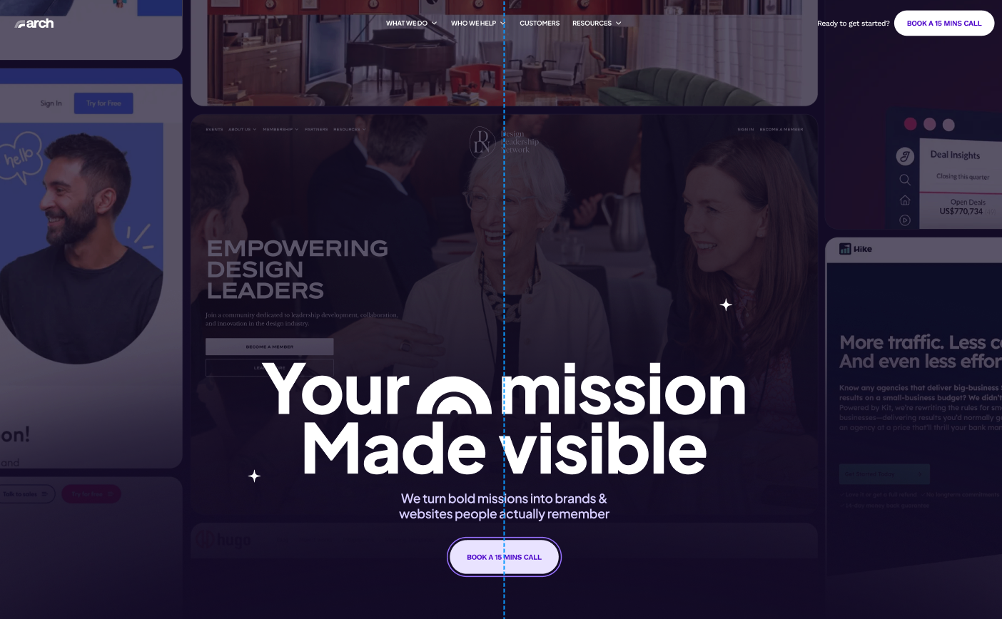
The Fix: Conduct an accessibility audit. Ensure your colour contrast is high enough, your images have descriptive alt text, and your forms are navigable without a mouse. At Arch Impact Studio, we build with an accessibility-first mindset because inclusion is a conversion strategy.
4. US-Centric Payment Tools
Nothing kills the "local impact" vibe faster than a donation form that defaults to USD or doesn't mention Canadian tax receipts. If a donor in Etobicoke sees a "Zip Code" field instead of "Postal Code," they’ll wonder if their money is even staying in the country.
The Fix: Use Canadian-friendly donation processors like CanadaHelps, Zeffy, or custom Webflow integrations that handle CAD natively. Ensure your "Thank You" page explicitly mentions that a CRA-compliant tax receipt is on its way.
5. Mobile Friction (The "Commuter Test")
Think about your donors. They’re likely browsing your site while sitting on the TTC or waiting for a latte at a Leslieville cafe. If your donation form requires them to type in their 16-digit credit card number while the streetcar is screeching around a corner, they’re going to quit.
The Fix: Implement Express Checkout. Adding Apple Pay, Google Pay, or Interac e-Transfer options can increase mobile conversion rates by over 50%. Your site must be fully responsive, meaning it looks and works perfectly on an iPhone 15 or a 27-inch iMac.
6. The "Wall of Text" Problem
We get it: your mission is complex. But a donor's attention span is short. If your homepage looks like a legal brief, people will stop reading before they get to the "Impact" section.
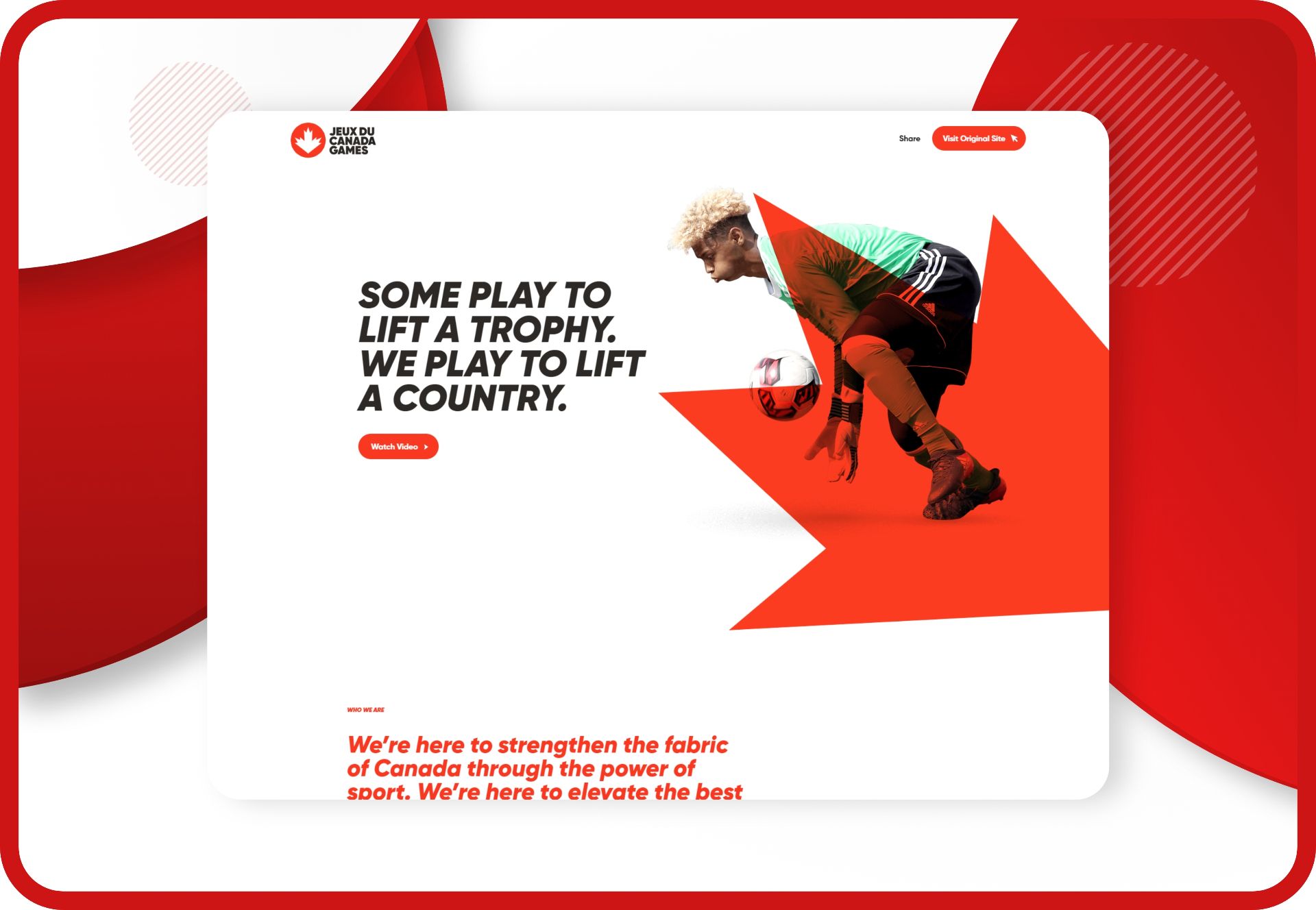
The Fix: Use visual storytelling. Show, don't just tell. High-quality photography of your actual work in Toronto is worth 10,000 words of "strategic pillar" jargon. Break up text with bold headers, bullet points, and "Impact Cards" (e.g., "$50 provides 10 hot meals in the Downtown Eastside").
7. Clunky, Multi-Step Forms
Every extra field on your donation form decreases the likelihood of a completed gift. Do you really need their middle name, their fax number, and "How did you hear about us?" right now?
The Fix: Keep it simple. Ask for the essentials: Name, Email, Amount, Payment. You can collect more data later through your stewardship emails. Aim for a single-page checkout experience. If you must use multiple steps, show a progress bar so the donor knows they’re almost done.
8. Lack of Local Social Proof
Toronto is a "word of mouth" city. Donors want to know that people they trust are also supporting you. If your site doesn't show testimonials, partner logos (like the Toronto Foundation or local BIA), or real-time impact stats, it feels "ghostly."
The Fix: Feature logos of your local partners and quotes from donors or beneficiaries. Even better, show a "Live Impact Tracker" that updates as goals are met. It builds trust and creates a sense of community momentum.
9. Vague Calls to Action (CTAs)
"Click here" is not a CTA. "Learn More" is a suggestion, not a direction. If your website doesn't tell the visitor exactly what to do next, they’ll do nothing.
The Fix: Be tactical and urgent. Use buttons like "Feed a Family Today" or "Protect Toronto’s Greenbelt." Make the action tied to the outcome. When the donor clicks, they should feel like they are solving a specific problem, not just filling a bank account.
10. The Ghost Town Blog (SEO/AEO Issues)
If your last "News" post was about your 2022 holiday party, your organization looks inactive. Furthermore, in the age of AI search (AEO), having fresh, relevant content is the only way to show up when someone asks Siri, "Where can I donate to youth programs in Toronto?"
The Fix: Maintain a consistent content schedule. Write about local issues, share success stories, and optimize for Toronto web design and non-profit web design keywords. This isn't just for Google; it’s for building authority with your supporters. Check out our 7-step process for how we help orgs stay relevant.
The Takeaway?
Your website is your most important employee. It works 24/7, it speaks to thousands of people at once, and it should be your #1 source of revenue. If it’s not converting, it’s time for a change.
At Arch Impact Studio, we’ve moved away from the generic SaaS world to focus on what matters: helping Canadian nonprofits and charities make a real dent in the universe. We’re Montreal-based, but our heart (and a lot of our clients) is in the GTA. We don't just build "pretty" sites; we build high-performing Webflow websites that turn visitors into long-term donors.
Ready to stop losing donors? Let’s audit your site and see where the leaks are. No fluff, just outcomes.
Book a Strategy Call with Rhami
Conclusion
You’re doing incredible work in the 6ix. Whether you’re tackling food insecurity in Scarborough or supporting the arts in the Distillery District, your mission is the heartbeat of Toronto. But let’s be honest: if your website looks like it was built during the era of the SkyDome (yes, before it was the Rogers Centre), you’re leaving money on the table.
In a city that moves as fast as a Tuesday morning commute on the 401, your potential donors don’t have time for a clunky digital experience. If they can't figure out how to help you in under 10 seconds, they’re gone.
TL;DR: The Fix
- Speed is non-negotiable: Optimize for under 3-second load times.
- Accessibility is law: Ontario nonprofits must follow AODA/WCAG guidelines.
- Friction kills donations: Use one-click payments (Apple/Google Pay) and Canadian-friendly tools.
- Webflow is the answer: It’s the platform of choice for mission-driven orgs that need speed and style.
1. The "Where’s Waldo" Donate Button
We’ve seen it a thousand times. You land on a Toronto charity website, and you’re ready to give. But where is the button? Is it under "Ways to Give"? Is it buried in the footer next to the 2018 tax audit?
The Fix: Your "Donate" button needs to be the North Star of your header. Use a high-contrast colour that stands out from your brand palette. It should be visible on every single page, especially on mobile. Don't call it "Support Us" or "Get Involved": call it "Donate."
2. The "GO Train Delay" Loading Speeds
Torontonians have zero patience for delays. If your site takes more than four seconds to load, 25% of your visitors will bounce. Most nonprofit sites are weighed down by massive, unoptimized images of galas past or PDF reports that haven't been opened since the pre-pandemic era.
The Fix: Switch to a high-performance platform like Webflow. We specialize in building Webflow websites for mission-driven organizations because they are lightning-fast out of the box. Compress your images, ditch the heavy plugins, and ensure your hosting can handle a sudden influx of traffic during GivingTuesday.
3. Ignoring the AODA (Accessibility for Ontarians with Disabilities Act)
In Ontario, accessibility isn't just a "nice to have": it’s a legal requirement. If your site isn't WCAG 2.1 compliant, you’re not just risking a fine; you’re alienating a massive segment of potential donors who rely on screen readers or keyboard navigation.
The Fix: Conduct an accessibility audit. Ensure your colour contrast is high enough, your images have descriptive alt text, and your forms are navigable without a mouse. At Arch Impact Studio, we build with an accessibility-first mindset because inclusion is a conversion strategy.
4. US-Centric Payment Tools
Nothing kills the "local impact" vibe faster than a donation form that defaults to USD or doesn't mention Canadian tax receipts. If a donor in Etobicoke sees a "Zip Code" field instead of "Postal Code," they’ll wonder if their money is even staying in the country.
The Fix: Use Canadian-friendly donation processors like CanadaHelps, Zeffy, or custom Webflow integrations that handle CAD natively. Ensure your "Thank You" page explicitly mentions that a CRA-compliant tax receipt is on its way.
5. Mobile Friction (The "Commuter Test")
Think about your donors. They’re likely browsing your site while sitting on the TTC or waiting for a latte at a Leslieville cafe. If your donation form requires them to type in their 16-digit credit card number while the streetcar is screeching around a corner, they’re going to quit.
The Fix: Implement Express Checkout. Adding Apple Pay, Google Pay, or Interac e-Transfer options can increase mobile conversion rates by over 50%. Your site must be fully responsive, meaning it looks and works perfectly on an iPhone 15 or a 27-inch iMac.
6. The "Wall of Text" Problem
We get it: your mission is complex. But a donor's attention span is short. If your homepage looks like a legal brief, people will stop reading before they get to the "Impact" section.
The Fix: Use visual storytelling. Show, don't just tell. High-quality photography of your actual work in Toronto is worth 10,000 words of "strategic pillar" jargon. Break up text with bold headers, bullet points, and "Impact Cards" (e.g., "$50 provides 10 hot meals in the Downtown Eastside").
7. Clunky, Multi-Step Forms
Every extra field on your donation form decreases the likelihood of a completed gift. Do you really need their middle name, their fax number, and "How did you hear about us?" right now?
The Fix: Keep it simple. Ask for the essentials: Name, Email, Amount, Payment. You can collect more data later through your stewardship emails. Aim for a single-page checkout experience. If you must use multiple steps, show a progress bar so the donor knows they’re almost done.
8. Lack of Local Social Proof
Toronto is a "word of mouth" city. Donors want to know that people they trust are also supporting you. If your site doesn't show testimonials, partner logos (like the Toronto Foundation or local BIA), or real-time impact stats, it feels "ghostly."
The Fix: Feature logos of your local partners and quotes from donors or beneficiaries. Even better, show a "Live Impact Tracker" that updates as goals are met. It builds trust and creates a sense of community momentum.
9. Vague Calls to Action (CTAs)
"Click here" is not a CTA. "Learn More" is a suggestion, not a direction. If your website doesn't tell the visitor exactly what to do next, they’ll do nothing.
The Fix: Be tactical and urgent. Use buttons like "Feed a Family Today" or "Protect Toronto’s Greenbelt." Make the action tied to the outcome. When the donor clicks, they should feel like they are solving a specific problem, not just filling a bank account.
10. The Ghost Town Blog (SEO/AEO Issues)
If your last "News" post was about your 2022 holiday party, your organization looks inactive. Furthermore, in the age of AI search (AEO), having fresh, relevant content is the only way to show up when someone asks Siri, "Where can I donate to youth programs in Toronto?"
The Fix: Maintain a consistent content schedule. Write about local issues, share success stories, and optimize for Toronto web design and non-profit web design keywords. This isn't just for Google; it’s for building authority with your supporters. Check out our 7-step process for how we help orgs stay relevant.
The Takeaway?
Your website is your most important employee. It works 24/7, it speaks to thousands of people at once, and it should be your #1 source of revenue. If it’s not converting, it’s time for a change.
At Arch Impact Studio, we’ve moved away from the generic SaaS world to focus on what matters: helping Canadian nonprofits and charities make a real dent in the universe. We’re Montreal-based, but our heart (and a lot of our clients) is in the GTA. We don't just build "pretty" sites; we build high-performing Webflow websites that turn visitors into long-term donors.
Ready to stop losing donors? Let’s audit your site and see where the leaks are. No fluff, just outcomes.
Book a Strategy Call with Rhami