Conversion-Focused Web Design & AEO: How Canadian Nonprofits Turn Visitors Into Donors

Your nonprofit may already be doing meaningful work. But if your website is unclear, difficult to navigate, or slow to trust, visitors may never become donors, volunteers, applicants, or supporters. That is the gap between a brochure website and a conversion-focused non-profit website . In Canada, online giving is becoming a more important part of the donor journey. CanadaHelps’ Giving Report 2026 highlights the continued evolution of online donations, monthly giving, securities donations, and local philanthropy. The opportunity is clear. Your website should not simply describe your mission. It should help more people understand it, trust it, and act on it. TL;DR: Conversion-focused web design creates clearer paths to donate, volunteer, or get help. Answer Engine Optimization helps AI-driven search tools understand and recommend your organization. Webflow brings the two together with flexible CMS tools, fast deployment, integrated SEO, and room to scale. Your website is part of your fundraising infrastructure Many nonprofit websites are organized around internal structures: About us Our history Our board Our programs News That information matters. But it is not always arranged around what visitors need to know before taking action. A first-time donor is usually asking: Who does this organization help? Does this issue affect my community? What will my donation make possible? Is this charity legitimate and transparent? Can I donate quickly from my phone? Will I receive a Canadian tax receipt? A conversion-focused structure answers these questions in the right order. Your homepage should make four things immediately clear: What you do Who you serve Why the work matters now What the visitor can do next That next step may be a donation. It may be registering for a program, applying for support, joining an event, or becoming a volunteer. The takeaway? Conversion does not mean pressuring people. It means removing uncertainty so the right people can move forward with confidence. Four design decisions that increase digital impact 1. Give every audience a clear path Your audiences are not all the same. A donor needs impact and trust. A volunteer needs time commitments and expectations. A person seeking support needs clear eligibility information and a safe way to contact you. Do not force everyone through the same journey. Use clear pathways such as: Donate Get help Volunteer Partner with us See our impact Each important page should have one primary action. Secondary actions can exist, but they should not compete with it. 2. Make the impact of giving concrete “Support our mission” is sincere. It is also vague. Where your data supports it, connect donations to tangible outcomes: $25 helps provide... $75 supports... $500 funds... A monthly gift helps us... Avoid making claims that your finance or program team cannot verify. Donors do not need exaggerated promises. They need specific, honest information. Include: Recent program outcomes Annual reports Community stories, with consent Charity registration details Donation and receipt information A clear explanation of recurring giving 3. Reduce friction in the donation journey A donor may be ready to give and still abandon the process because: The Donate button is hard to find The form opens on an unfamiliar domain There are too many fields Monthly giving is hidden The page is difficult to use on mobile Payment and receipt information is unclear Your donation page should be focused and reassuring. Use a prominent call to action, short forms, accessible contrast, mobile-friendly layouts, and plain-language explanations. If you use an external donation platform, make the transition feel consistent and trustworthy. 4. Design for trust before asking for action Trust is built through details. Show the people behind the work. Publish current impact information. Explain where donations go. Make contact information easy to find. Use real photography instead of generic stock images that could belong to any organization. Arch Impact Studio’s N3O case study is a useful example of mission-focused web design. N3O supports charities with donor management, fundraising, sponsorships, and relationship-building. Its redesign demonstrates how a nonprofit-adjacent organization can make a complex value proposition easier to understand. A Canadian strategy needs local context A national nonprofit and a neighbourhood charity may share a cause. Their digital strategies should still be different. Montreal: bilingual clarity is part of conversion For Montreal organizations, bilingual content is not a decorative add-on. It is part of accessibility, trust, and discoverability. Your French and English experiences should both include: Clear mission and program descriptions Donation instructions Impact stories Tax receipt information Calls to action Contact and location details Avoid launching an English-first site with partial French translations buried several clicks away. If your community operates in both languages, the user journey should work in both languages. For organizations competing in Montreal search results, thoughtful montreal web design also means creating locally relevant pages. Mention the neighbourhoods, communities, and services you actually support. Do not create thin city pages just to target keywords. Toronto: specificity matters in a dense nonprofit market Toronto has a large, diverse, and highly competitive nonprofit ecosystem. A broad statement such as “we help communities thrive” may be difficult to distinguish. Effective toronto web design should make your position clear: Which communities do you serve? What geographic area do your programs cover? What makes your approach different? What outcomes can you demonstrate? Why should a donor choose to support this work? Local stories, recognizable community contexts, and clear impact reporting can help your organization stand out without resorting to louder or more emotional messaging. Ottawa: explain systems, programs, and public value Ottawa organizations often speak to donors, volunteers, institutions, public-sector partners, and national networks. That means ottawa web design should balance human storytelling with operational clarity. Make it easy to understand: How your program works Who is eligible Who funds or supports the work How you measure outcomes How partners can get involved This is especially important when your organization addresses policy, public health, civic participation, research, or national issues. Vancouver: make community impact easy to find Vancouver’s geography, housing pressures, climate concerns, and multicultural communities create strong demand for locally relevant nonprofit information. Good vancouver web design should make location and access details highly visible: Where programs take place Whether services are available online or in person How people can reach your team Which communities and neighbourhoods you serve What support is available immediately In every city, local search competition rewards clarity. It is not enough to say that your organization is Canadian. Explain where your work happens. What is Answer Engine Optimization? Answer Engine Optimization , or AEO, is the practice of organizing your content so search engines and AI tools can understand and use it as a direct answer. That includes: ChatGPT Perplexity Google AI Overviews Google AI Mode Microsoft Copilot Traditional SEO often focuses on ranking for a phrase such as “Montreal food charity.” AEO asks a broader question: “Can an AI system confidently explain what this organization does, who it serves, where it operates, and how someone can support it?” Google’s official guidance on generative AI search is refreshingly practical. It recommends continuing to apply foundational SEO: useful content, clear technical structure, crawlable pages, strong page experience, and original information. There is no secret AI markup that guarantees visibility. The best AEO strategy is still to publish accurate, helpful content for people. A practical AEO framework for nonprofits Use question-based headings Write headings around real questions: Who does your organization serve? How does my donation help? Is my donation tax-deductible in Canada? Where are your programs available? How can I volunteer? What results did you achieve last year? Then answer each question directly. Keep answers self-contained An AI tool should not need to combine five vague paragraphs to understand your answer. Instead of: Learn more about our approach here. Write: We provide employment coaching and skills training for newcomers in Montreal, helping participants prepare for interviews, build professional networks, and find long-term work. Short, specific answers are easier for people and machines to understand. Build structured content in your CMS A strong Webflow CMS can organize: Programs Impact stories Events Resources FAQs Locations Team members Annual reports This turns your website into a maintainable knowledge base rather than a collection of one-off pages. Use schema accurately Schema can help search engines understand organizations, events, services, and FAQs. But only mark up content that is visible and accurate on the page. For an FAQ section, use one clear answer per question. Keep the wording natural. Do not create FAQ content solely to insert keywords. Why Webflow fits mission-driven organizations Webflow is not a nonprofit platform. Your donation processor, CRM, and email tools still need to be selected carefully. But Webflow offers several advantages for charities and purpose-led organizations. Scalable CMS structure As programs and campaigns grow, your team can add new CMS items without rebuilding every page. A structured system makes it easier to publish consistent program pages, stories, resources, and event information. Rapid deployment of donation-centric layouts Webflow makes it possible to create focused landing pages for: Giving Tuesday Emergency appeals Monthly donor campaigns Peer-to-peer fundraising Event registrations Volunteer recruitment You can launch campaign-specific layouts quickly while keeping the core brand consistent. No-code flexibility Your communications team can update content through Webflow’s Editor and CMS without waiting for a developer for every small change. As outlined in Arch’s Webflow training guide , teams can manage structured content, publish updates, and collaborate within the platform. Integrated SEO controls Webflow provides control over page titles, meta descriptions, slugs, redirects, responsive layouts, and other core SEO requirements. It can also support localized site structures through tools such as Webflow Localization . That makes Webflow a strong foundation for a webflow developer canada can build, maintain, and expand with your organization. The right partner understands outcomes You do not need another vendor who only talks about colours, animations, and trends. You need a charity website agency or mission-driven website agency that understands board scrutiny, limited budgets, stakeholder approvals, accessibility, donor trust, and measurable outcomes. At Arch Impact Studio, we bring conversion strategy, branding, Webflow development, and AEO thinking into the same process. Our work has included purpose-led projects such as N3O , alongside broader experience in conversion-focused websites and SEO performance. The goal is simple: Help more of the right people find your organization, understand your work, and take meaningful action. FAQ: Non-profit web design, Webflow, and AEO What is conversion-focused non-profit web design? Conversion-focused non-profit web design organizes your website around measurable actions such as donations, volunteer registrations, program applications, newsletter signups, and support requests. It combines clear messaging, accessible layouts, strong calls to action, trust signals, and low-friction user journeys. What is Answer Engine Optimization for a charity website? Answer Engine Optimization helps AI-driven search tools understand and reference your organization. It uses clear headings, natural-language answers, structured content, accurate metadata, strong internal linking, and trustworthy impact information. It supports visibility in tools such as ChatGPT, Perplexity, Google AI Overviews, and Copilot. Is Webflow a good platform for a non-profit website? Webflow can be a strong platform for a non-profit website because it combines visual design, CMS functionality, hosting, responsive layouts, and SEO controls. It can support growing program libraries and campaign pages. Donation processing usually requires an appropriate third-party platform or integration. Does a Montreal nonprofit need a bilingual website? If your organization serves French- and English-speaking communities in Montreal or elsewhere in Quebec, a bilingual website is usually the most inclusive approach. Both language versions should provide complete access to mission information, programs, donation details, impact content, and calls to action. How should a nonprofit measure website success? Measure actions connected to your mission. Useful metrics include completed donations, monthly donor signups, volunteer applications, program inquiries, event registrations, newsletter subscriptions, organic traffic, and conversion rates by page and campaign. Traffic alone does not show whether your website is creating impact. Ready to make your mission more visible? If your current website is not pulling its weight, start with a focused conversation. Book a consultation with Arch Impact Studio to discuss your organization’s goals, audiences, donation journey, local search opportunities, and Webflow roadmap. No pressure. Just a practical look at how your website can help more people support the work you are already doing.

Rhami Aboud
Want Help With Your Website?

Book a call directly with our CEO, Rhami Aboud. We have 7 years experience creating high-converting SaaS websites that elevate your brand and are built to generate leads.

Book A Call
CEO - Rhami Aboud

Your nonprofit may already be doing meaningful work. But if your website is unclear, difficult to navigate, or slow to trust, visitors may never become donors, volunteers, applicants, or supporters.

That is the gap between a brochure website and a conversion-focused non-profit website.

In Canada, online giving is becoming a more important part of the donor journey. CanadaHelps’ Giving Report 2026 highlights the continued evolution of online donations, monthly giving, securities donations, and local philanthropy.

The opportunity is clear.

Your website should not simply describe your mission. It should help more people understand it, trust it, and act on it.

TL;DR: Conversion-focused web design creates clearer paths to donate, volunteer, or get help. Answer Engine Optimization helps AI-driven search tools understand and recommend your organization. Webflow brings the two together with flexible CMS tools, fast deployment, integrated SEO, and room to scale.

Your website is part of your fundraising infrastructure

Many nonprofit websites are organized around internal structures:

  • About us
  • Our history
  • Our board
  • Our programs
  • News

That information matters. But it is not always arranged around what visitors need to know before taking action.

A first-time donor is usually asking:

  • Who does this organization help?
  • Does this issue affect my community?
  • What will my donation make possible?
  • Is this charity legitimate and transparent?
  • Can I donate quickly from my phone?
  • Will I receive a Canadian tax receipt?

A conversion-focused structure answers these questions in the right order.

Your homepage should make four things immediately clear:

  1. What you do
  2. Who you serve
  3. Why the work matters now
  4. What the visitor can do next

That next step may be a donation. It may be registering for a program, applying for support, joining an event, or becoming a volunteer.

The takeaway? Conversion does not mean pressuring people. It means removing uncertainty so the right people can move forward with confidence.

Four design decisions that increase digital impact

1. Give every audience a clear path

Your audiences are not all the same.

A donor needs impact and trust. A volunteer needs time commitments and expectations. A person seeking support needs clear eligibility information and a safe way to contact you.

Do not force everyone through the same journey.

Use clear pathways such as:

  • Donate
  • Get help
  • Volunteer
  • Partner with us
  • See our impact

Each important page should have one primary action. Secondary actions can exist, but they should not compete with it.

2. Make the impact of giving concrete

“Support our mission” is sincere. It is also vague.

Where your data supports it, connect donations to tangible outcomes:

  • $25 helps provide...
  • $75 supports...
  • $500 funds...
  • A monthly gift helps us...

Avoid making claims that your finance or program team cannot verify. Donors do not need exaggerated promises. They need specific, honest information.

Include:

  • Recent program outcomes
  • Annual reports
  • Community stories, with consent
  • Charity registration details
  • Donation and receipt information
  • A clear explanation of recurring giving

3. Reduce friction in the donation journey

A donor may be ready to give and still abandon the process because:

  • The Donate button is hard to find
  • The form opens on an unfamiliar domain
  • There are too many fields
  • Monthly giving is hidden
  • The page is difficult to use on mobile
  • Payment and receipt information is unclear

Your donation page should be focused and reassuring.

Use a prominent call to action, short forms, accessible contrast, mobile-friendly layouts, and plain-language explanations. If you use an external donation platform, make the transition feel consistent and trustworthy.

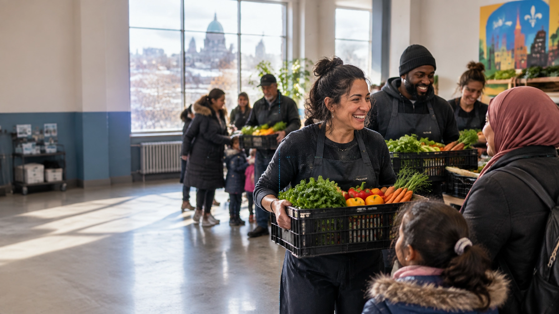
A donor and nonprofit program coordinator speaking with a family at a Toronto community centre

4. Design for trust before asking for action

Trust is built through details.

Show the people behind the work. Publish current impact information. Explain where donations go. Make contact information easy to find. Use real photography instead of generic stock images that could belong to any organization.

Arch Impact Studio’s N3O case study is a useful example of mission-focused web design. N3O supports charities with donor management, fundraising, sponsorships, and relationship-building. Its redesign demonstrates how a nonprofit-adjacent organization can make a complex value proposition easier to understand.

A Canadian strategy needs local context

A national nonprofit and a neighbourhood charity may share a cause. Their digital strategies should still be different.

Montreal: bilingual clarity is part of conversion

For Montreal organizations, bilingual content is not a decorative add-on. It is part of accessibility, trust, and discoverability.

Your French and English experiences should both include:

  • Clear mission and program descriptions
  • Donation instructions
  • Impact stories
  • Tax receipt information
  • Calls to action
  • Contact and location details

Avoid launching an English-first site with partial French translations buried several clicks away. If your community operates in both languages, the user journey should work in both languages.

For organizations competing in Montreal search results, thoughtful montreal web design also means creating locally relevant pages. Mention the neighbourhoods, communities, and services you actually support. Do not create thin city pages just to target keywords.

Toronto: specificity matters in a dense nonprofit market

Toronto has a large, diverse, and highly competitive nonprofit ecosystem. A broad statement such as “we help communities thrive” may be difficult to distinguish.

Effective toronto web design should make your position clear:

  • Which communities do you serve?
  • What geographic area do your programs cover?
  • What makes your approach different?
  • What outcomes can you demonstrate?
  • Why should a donor choose to support this work?

Local stories, recognizable community contexts, and clear impact reporting can help your organization stand out without resorting to louder or more emotional messaging.

Ottawa: explain systems, programs, and public value

Ottawa organizations often speak to donors, volunteers, institutions, public-sector partners, and national networks.

That means ottawa web design should balance human storytelling with operational clarity. Make it easy to understand:

  • How your program works
  • Who is eligible
  • Who funds or supports the work
  • How you measure outcomes
  • How partners can get involved

This is especially important when your organization addresses policy, public health, civic participation, research, or national issues.

Vancouver: make community impact easy to find

Vancouver’s geography, housing pressures, climate concerns, and multicultural communities create strong demand for locally relevant nonprofit information.

Good vancouver web design should make location and access details highly visible:

  • Where programs take place
  • Whether services are available online or in person
  • How people can reach your team
  • Which communities and neighbourhoods you serve
  • What support is available immediately

In every city, local search competition rewards clarity. It is not enough to say that your organization is Canadian. Explain where your work happens.

What is Answer Engine Optimization?

Answer Engine Optimization, or AEO, is the practice of organizing your content so search engines and AI tools can understand and use it as a direct answer.

That includes:

  • ChatGPT
  • Perplexity
  • Google AI Overviews
  • Google AI Mode
  • Microsoft Copilot

Traditional SEO often focuses on ranking for a phrase such as “Montreal food charity.”

AEO asks a broader question:

“Can an AI system confidently explain what this organization does, who it serves, where it operates, and how someone can support it?”

Google’s official guidance on generative AI search is refreshingly practical. It recommends continuing to apply foundational SEO: useful content, clear technical structure, crawlable pages, strong page experience, and original information.

There is no secret AI markup that guarantees visibility. The best AEO strategy is still to publish accurate, helpful content for people.

A practical AEO framework for nonprofits

Use question-based headings

Write headings around real questions:

  • Who does your organization serve?
  • How does my donation help?
  • Is my donation tax-deductible in Canada?
  • Where are your programs available?
  • How can I volunteer?
  • What results did you achieve last year?

Then answer each question directly.

Keep answers self-contained

An AI tool should not need to combine five vague paragraphs to understand your answer.

Instead of:

Learn more about our approach here.

Write:

We provide employment coaching and skills training for newcomers in Montreal, helping participants prepare for interviews, build professional networks, and find long-term work.

Short, specific answers are easier for people and machines to understand.

Build structured content in your CMS

A strong Webflow CMS can organize:

  • Programs
  • Impact stories
  • Events
  • Resources
  • FAQs
  • Locations
  • Team members
  • Annual reports

This turns your website into a maintainable knowledge base rather than a collection of one-off pages.

Use schema accurately

Schema can help search engines understand organizations, events, services, and FAQs. But only mark up content that is visible and accurate on the page.

For an FAQ section, use one clear answer per question. Keep the wording natural. Do not create FAQ content solely to insert keywords.

Why Webflow fits mission-driven organizations

Webflow is not a nonprofit platform. Your donation processor, CRM, and email tools still need to be selected carefully.

But Webflow offers several advantages for charities and purpose-led organizations.

Scalable CMS structure

As programs and campaigns grow, your team can add new CMS items without rebuilding every page. A structured system makes it easier to publish consistent program pages, stories, resources, and event information.

Rapid deployment of donation-centric layouts

Webflow makes it possible to create focused landing pages for:

  • Giving Tuesday
  • Emergency appeals
  • Monthly donor campaigns
  • Peer-to-peer fundraising
  • Event registrations
  • Volunteer recruitment

You can launch campaign-specific layouts quickly while keeping the core brand consistent.

No-code flexibility

Your communications team can update content through Webflow’s Editor and CMS without waiting for a developer for every small change. As outlined in Arch’s Webflow training guide, teams can manage structured content, publish updates, and collaborate within the platform.

Integrated SEO controls

Webflow provides control over page titles, meta descriptions, slugs, redirects, responsive layouts, and other core SEO requirements. It can also support localized site structures through tools such as Webflow Localization.

That makes Webflow a strong foundation for a webflow developer canada can build, maintain, and expand with your organization.
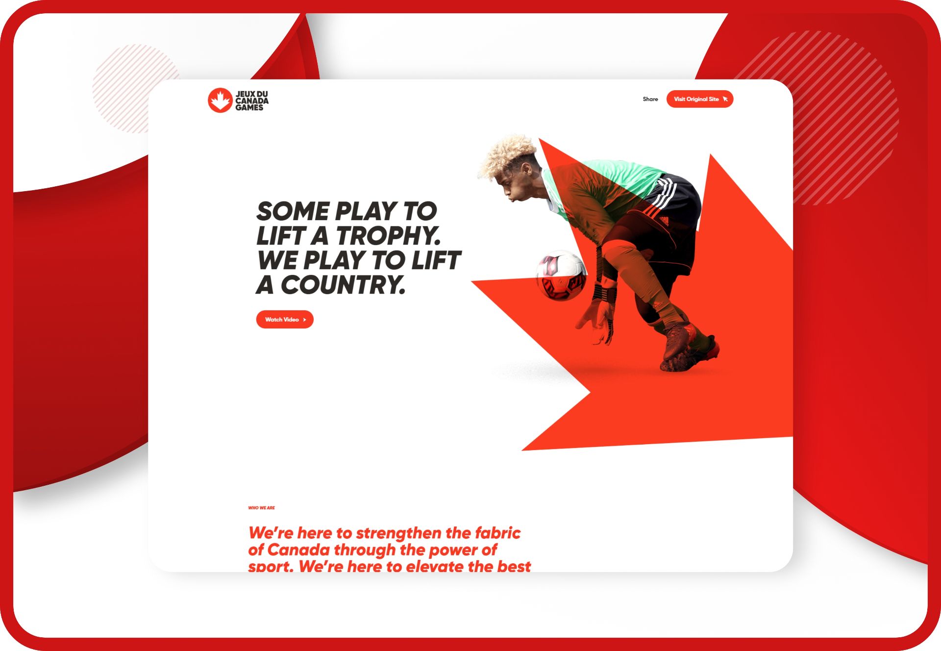
Canada Games website experience designed around community, participation, and national impact

The right partner understands outcomes

You do not need another vendor who only talks about colours, animations, and trends.

You need a charity website agency or mission-driven website agency that understands board scrutiny, limited budgets, stakeholder approvals, accessibility, donor trust, and measurable outcomes.

At Arch Impact Studio, we bring conversion strategy, branding, Webflow development, and AEO thinking into the same process. Our work has included purpose-led projects such as N3O, alongside broader experience in conversion-focused websites and SEO performance.

The goal is simple:

Help more of the right people find your organization, understand your work, and take meaningful action.

FAQ: Non-profit web design, Webflow, and AEO

What is conversion-focused non-profit web design?

Conversion-focused non-profit web design organizes your website around measurable actions such as donations, volunteer registrations, program applications, newsletter signups, and support requests. It combines clear messaging, accessible layouts, strong calls to action, trust signals, and low-friction user journeys.

What is Answer Engine Optimization for a charity website?

Answer Engine Optimization helps AI-driven search tools understand and reference your organization. It uses clear headings, natural-language answers, structured content, accurate metadata, strong internal linking, and trustworthy impact information. It supports visibility in tools such as ChatGPT, Perplexity, Google AI Overviews, and Copilot.

Is Webflow a good platform for a non-profit website?

Webflow can be a strong platform for a non-profit website because it combines visual design, CMS functionality, hosting, responsive layouts, and SEO controls. It can support growing program libraries and campaign pages. Donation processing usually requires an appropriate third-party platform or integration.

Does a Montreal nonprofit need a bilingual website?

If your organization serves French- and English-speaking communities in Montreal or elsewhere in Quebec, a bilingual website is usually the most inclusive approach. Both language versions should provide complete access to mission information, programs, donation details, impact content, and calls to action.

How should a nonprofit measure website success?

Measure actions connected to your mission. Useful metrics include completed donations, monthly donor signups, volunteer applications, program inquiries, event registrations, newsletter subscriptions, organic traffic, and conversion rates by page and campaign. Traffic alone does not show whether your website is creating impact.

Ready to make your mission more visible?

If your current website is not pulling its weight, start with a focused conversation.

Book a consultation with Arch Impact Studio to discuss your organization’s goals, audiences, donation journey, local search opportunities, and Webflow roadmap.

No pressure. Just a practical look at how your website can help more people support the work you are already doing.

Conclusion

Your nonprofit may already be doing meaningful work. But if your website is unclear, difficult to navigate, or slow to trust, visitors may never become donors, volunteers, applicants, or supporters.

That is the gap between a brochure website and a conversion-focused non-profit website.

In Canada, online giving is becoming a more important part of the donor journey. CanadaHelps’ Giving Report 2026 highlights the continued evolution of online donations, monthly giving, securities donations, and local philanthropy.

The opportunity is clear.

Your website should not simply describe your mission. It should help more people understand it, trust it, and act on it.

TL;DR: Conversion-focused web design creates clearer paths to donate, volunteer, or get help. Answer Engine Optimization helps AI-driven search tools understand and recommend your organization. Webflow brings the two together with flexible CMS tools, fast deployment, integrated SEO, and room to scale.

Your website is part of your fundraising infrastructure

Many nonprofit websites are organized around internal structures:

  • About us
  • Our history
  • Our board
  • Our programs
  • News

That information matters. But it is not always arranged around what visitors need to know before taking action.

A first-time donor is usually asking:

  • Who does this organization help?
  • Does this issue affect my community?
  • What will my donation make possible?
  • Is this charity legitimate and transparent?
  • Can I donate quickly from my phone?
  • Will I receive a Canadian tax receipt?

A conversion-focused structure answers these questions in the right order.

Your homepage should make four things immediately clear:

  1. What you do
  2. Who you serve
  3. Why the work matters now
  4. What the visitor can do next

That next step may be a donation. It may be registering for a program, applying for support, joining an event, or becoming a volunteer.

The takeaway? Conversion does not mean pressuring people. It means removing uncertainty so the right people can move forward with confidence.

Four design decisions that increase digital impact

1. Give every audience a clear path

Your audiences are not all the same.

A donor needs impact and trust. A volunteer needs time commitments and expectations. A person seeking support needs clear eligibility information and a safe way to contact you.

Do not force everyone through the same journey.

Use clear pathways such as:

  • Donate
  • Get help
  • Volunteer
  • Partner with us
  • See our impact

Each important page should have one primary action. Secondary actions can exist, but they should not compete with it.

2. Make the impact of giving concrete

“Support our mission” is sincere. It is also vague.

Where your data supports it, connect donations to tangible outcomes:

  • $25 helps provide...
  • $75 supports...
  • $500 funds...
  • A monthly gift helps us...

Avoid making claims that your finance or program team cannot verify. Donors do not need exaggerated promises. They need specific, honest information.

Include:

  • Recent program outcomes
  • Annual reports
  • Community stories, with consent
  • Charity registration details
  • Donation and receipt information
  • A clear explanation of recurring giving

3. Reduce friction in the donation journey

A donor may be ready to give and still abandon the process because:

  • The Donate button is hard to find
  • The form opens on an unfamiliar domain
  • There are too many fields
  • Monthly giving is hidden
  • The page is difficult to use on mobile
  • Payment and receipt information is unclear

Your donation page should be focused and reassuring.

Use a prominent call to action, short forms, accessible contrast, mobile-friendly layouts, and plain-language explanations. If you use an external donation platform, make the transition feel consistent and trustworthy.

A donor and nonprofit program coordinator speaking with a family at a Toronto community centre

4. Design for trust before asking for action

Trust is built through details.

Show the people behind the work. Publish current impact information. Explain where donations go. Make contact information easy to find. Use real photography instead of generic stock images that could belong to any organization.

Arch Impact Studio’s N3O case study is a useful example of mission-focused web design. N3O supports charities with donor management, fundraising, sponsorships, and relationship-building. Its redesign demonstrates how a nonprofit-adjacent organization can make a complex value proposition easier to understand.

A Canadian strategy needs local context

A national nonprofit and a neighbourhood charity may share a cause. Their digital strategies should still be different.

Montreal: bilingual clarity is part of conversion

For Montreal organizations, bilingual content is not a decorative add-on. It is part of accessibility, trust, and discoverability.

Your French and English experiences should both include:

  • Clear mission and program descriptions
  • Donation instructions
  • Impact stories
  • Tax receipt information
  • Calls to action
  • Contact and location details

Avoid launching an English-first site with partial French translations buried several clicks away. If your community operates in both languages, the user journey should work in both languages.

For organizations competing in Montreal search results, thoughtful montreal web design also means creating locally relevant pages. Mention the neighbourhoods, communities, and services you actually support. Do not create thin city pages just to target keywords.

Toronto: specificity matters in a dense nonprofit market

Toronto has a large, diverse, and highly competitive nonprofit ecosystem. A broad statement such as “we help communities thrive” may be difficult to distinguish.

Effective toronto web design should make your position clear:

  • Which communities do you serve?
  • What geographic area do your programs cover?
  • What makes your approach different?
  • What outcomes can you demonstrate?
  • Why should a donor choose to support this work?

Local stories, recognizable community contexts, and clear impact reporting can help your organization stand out without resorting to louder or more emotional messaging.

Ottawa: explain systems, programs, and public value

Ottawa organizations often speak to donors, volunteers, institutions, public-sector partners, and national networks.

That means ottawa web design should balance human storytelling with operational clarity. Make it easy to understand:

  • How your program works
  • Who is eligible
  • Who funds or supports the work
  • How you measure outcomes
  • How partners can get involved

This is especially important when your organization addresses policy, public health, civic participation, research, or national issues.

Vancouver: make community impact easy to find

Vancouver’s geography, housing pressures, climate concerns, and multicultural communities create strong demand for locally relevant nonprofit information.

Good vancouver web design should make location and access details highly visible:

  • Where programs take place
  • Whether services are available online or in person
  • How people can reach your team
  • Which communities and neighbourhoods you serve
  • What support is available immediately

In every city, local search competition rewards clarity. It is not enough to say that your organization is Canadian. Explain where your work happens.

What is Answer Engine Optimization?

Answer Engine Optimization, or AEO, is the practice of organizing your content so search engines and AI tools can understand and use it as a direct answer.

That includes:

  • ChatGPT
  • Perplexity
  • Google AI Overviews
  • Google AI Mode
  • Microsoft Copilot

Traditional SEO often focuses on ranking for a phrase such as “Montreal food charity.”

AEO asks a broader question:

“Can an AI system confidently explain what this organization does, who it serves, where it operates, and how someone can support it?”

Google’s official guidance on generative AI search is refreshingly practical. It recommends continuing to apply foundational SEO: useful content, clear technical structure, crawlable pages, strong page experience, and original information.

There is no secret AI markup that guarantees visibility. The best AEO strategy is still to publish accurate, helpful content for people.

A practical AEO framework for nonprofits

Use question-based headings

Write headings around real questions:

  • Who does your organization serve?
  • How does my donation help?
  • Is my donation tax-deductible in Canada?
  • Where are your programs available?
  • How can I volunteer?
  • What results did you achieve last year?

Then answer each question directly.

Keep answers self-contained

An AI tool should not need to combine five vague paragraphs to understand your answer.

Instead of:

Learn more about our approach here.

Write:

We provide employment coaching and skills training for newcomers in Montreal, helping participants prepare for interviews, build professional networks, and find long-term work.

Short, specific answers are easier for people and machines to understand.

Build structured content in your CMS

A strong Webflow CMS can organize:

  • Programs
  • Impact stories
  • Events
  • Resources
  • FAQs
  • Locations
  • Team members
  • Annual reports

This turns your website into a maintainable knowledge base rather than a collection of one-off pages.

Use schema accurately

Schema can help search engines understand organizations, events, services, and FAQs. But only mark up content that is visible and accurate on the page.

For an FAQ section, use one clear answer per question. Keep the wording natural. Do not create FAQ content solely to insert keywords.

Why Webflow fits mission-driven organizations

Webflow is not a nonprofit platform. Your donation processor, CRM, and email tools still need to be selected carefully.

But Webflow offers several advantages for charities and purpose-led organizations.

Scalable CMS structure

As programs and campaigns grow, your team can add new CMS items without rebuilding every page. A structured system makes it easier to publish consistent program pages, stories, resources, and event information.

Rapid deployment of donation-centric layouts

Webflow makes it possible to create focused landing pages for:

  • Giving Tuesday
  • Emergency appeals
  • Monthly donor campaigns
  • Peer-to-peer fundraising
  • Event registrations
  • Volunteer recruitment

You can launch campaign-specific layouts quickly while keeping the core brand consistent.

No-code flexibility

Your communications team can update content through Webflow’s Editor and CMS without waiting for a developer for every small change. As outlined in Arch’s Webflow training guide, teams can manage structured content, publish updates, and collaborate within the platform.

Integrated SEO controls

Webflow provides control over page titles, meta descriptions, slugs, redirects, responsive layouts, and other core SEO requirements. It can also support localized site structures through tools such as Webflow Localization.

That makes Webflow a strong foundation for a webflow developer canada can build, maintain, and expand with your organization.

Canada Games website experience designed around community, participation, and national impact

The right partner understands outcomes

You do not need another vendor who only talks about colours, animations, and trends.

You need a charity website agency or mission-driven website agency that understands board scrutiny, limited budgets, stakeholder approvals, accessibility, donor trust, and measurable outcomes.

At Arch Impact Studio, we bring conversion strategy, branding, Webflow development, and AEO thinking into the same process. Our work has included purpose-led projects such as N3O, alongside broader experience in conversion-focused websites and SEO performance.

The goal is simple:

Help more of the right people find your organization, understand your work, and take meaningful action.

FAQ: Non-profit web design, Webflow, and AEO

What is conversion-focused non-profit web design?

Conversion-focused non-profit web design organizes your website around measurable actions such as donations, volunteer registrations, program applications, newsletter signups, and support requests. It combines clear messaging, accessible layouts, strong calls to action, trust signals, and low-friction user journeys.

What is Answer Engine Optimization for a charity website?

Answer Engine Optimization helps AI-driven search tools understand and reference your organization. It uses clear headings, natural-language answers, structured content, accurate metadata, strong internal linking, and trustworthy impact information. It supports visibility in tools such as ChatGPT, Perplexity, Google AI Overviews, and Copilot.

Is Webflow a good platform for a non-profit website?

Webflow can be a strong platform for a non-profit website because it combines visual design, CMS functionality, hosting, responsive layouts, and SEO controls. It can support growing program libraries and campaign pages. Donation processing usually requires an appropriate third-party platform or integration.

Does a Montreal nonprofit need a bilingual website?

If your organization serves French- and English-speaking communities in Montreal or elsewhere in Quebec, a bilingual website is usually the most inclusive approach. Both language versions should provide complete access to mission information, programs, donation details, impact content, and calls to action.

How should a nonprofit measure website success?

Measure actions connected to your mission. Useful metrics include completed donations, monthly donor signups, volunteer applications, program inquiries, event registrations, newsletter subscriptions, organic traffic, and conversion rates by page and campaign. Traffic alone does not show whether your website is creating impact.

Ready to make your mission more visible?

If your current website is not pulling its weight, start with a focused conversation.

Book a consultation with Arch Impact Studio to discuss your organization’s goals, audiences, donation journey, local search opportunities, and Webflow roadmap.

No pressure. Just a practical look at how your website can help more people support the work you are already doing.

Continue your reading with these value-packed posts
mins read
Your Donors Are Asking AI Where to Give: The Canadian Nonprofit's Guide to Conversion Design & AEO

Your next donor may not start with Google. They may ask ChatGPT, Perplexity, or Google’s AI Overviews: “Which Canadian charities support housing access in Vancouver?” “Where can I donate to a youth organization in Toronto?” “What nonprofit in Montreal helps newcomers find employment?” The answer engine will look for organizations it can understand, verify, and confidently recommend. That creates a new opportunity for Canadian nonprofits. But visibility alone is not enough. When a donor arrives on your nonprofit website , the experience needs to help them take the next step. That is where conversion-focused web design and Answer Engine Optimization (AEO) work together. TL;DR Conversion design turns visitors into donors, volunteers, applicants, or supporters. AEO Canada helps AI-driven search tools understand and cite your organization. Your content should answer real questions in clear, natural language. Your donation flow should be fast, mobile-friendly, trustworthy, and easy to complete. Webflow gives nonprofit teams a flexible CMS, rapid campaign deployment, and scalable infrastructure. Local context matters. Montreal, Toronto, Ottawa, and Vancouver audiences do not always arrive with the same needs or expectations. The takeaway? Your website should be both easy for people to use and easy for machines to understand. The problem: your mission is strong, but your website creates friction Many nonprofits have meaningful programs, loyal supporters, and measurable results. But their website still makes visitors work too hard. They cannot quickly tell: Who the organization serves. What the program actually does. Whether the organization is legitimate. What their donation will support. How to volunteer or access services. Whether the site is available in the right language. What happens after they submit a form. That friction costs you. A visitor who cannot find the donation button may leave. A potential volunteer who cannot understand the application process may give up. A journalist or policymaker may move on to a more clearly structured source. Good intentions do not automatically create good user journeys. Conversion design starts by defining the action each page should support. For example: A program page should help people understand the program and apply, refer someone, or donate. An impact story should build trust and lead readers toward giving or subscribing. A campaign landing page should focus on one action. A “Ways to Give” page should make one-time, monthly, tribute, securities, and in-kind giving easy to compare. CanadaHelps recommends keeping visitors within two or three clicks of a giving portal . That is a useful standard. Your Donate button should be visible from every important page, including mobile navigation. Conversion design: build the path before the page A high-performing charity website is not just a collection of attractive pages. It is a connected system. Before designing, map your audiences and their next steps: Audience What they need Primary action First-time donor Trust, impact, simple giving Donate Monthly donor Long-term value and convenience Start monthly gift Volunteer Eligibility, time commitment, process Apply Program participant Clear support details Get help or register Funder or partner Evidence, governance, outcomes Contact your team Journalist or policymaker Expertise, data, position Read or download research This approach prevents a common mistake: giving every visitor the same generic message. Your homepage can introduce the mission. But it should quickly direct people toward clear paths such as: Donate now Get support Volunteer Explore our impact Partner with us The donation experience itself should be focused and reassuring. Use: Preset amounts based on real donor behaviour. One-time and monthly giving options. Short, plain-language impact statements. CAD currency and clear tax-receipt information. Minimal required fields. Mobile-friendly payment options. A branded confirmation and thank-you experience. Visible privacy and security information. Whenever possible, embed or closely integrate the donation form into your own branded experience. Sending someone to an unfamiliar third-party page can create unnecessary doubt. What is Answer Engine Optimization? Answer Engine Optimization is the practice of structuring your content so AI systems can find, understand, trust, and use it in an answer. Traditional SEO helps your pages appear in search results. AEO goes one step further. It helps answer engines identify the best passage to use when someone asks a question. The goal is not to manipulate AI tools. It is to become a reliable source of truth. AEO matters across: ChatGPT Perplexity Google AI Overviews Gemini Microsoft Copilot Voice search and other conversational tools For a nonprofit, this means making your mission, programs, expertise, and impact easy to interpret. Write the questions your audiences actually ask Do not hide your best information behind vague headings such as “Our approach” or “Creating change.” Use natural-language questions: What does our organization do? Who does our housing program support? How can I donate in Canada? Does my donation receive a tax receipt? How does your newcomer employment program work? Where does the organization operate? What results did the program achieve last year? How can I volunteer? Then answer each question directly. A strong AEO section often follows this structure: Question-based heading Direct answer in one or two sentences Supporting context Evidence, metrics, or links A clear next step Keep each section understandable on its own. An AI system should be able to extract a paragraph without losing its meaning. Use structured content, not just good copy AEO depends on both language and structure. Use: One clear H1 per page. Logical H2 and H3 headings. Short paragraphs. Bulleted lists. Tables for comparisons. Descriptive page titles and meta descriptions. Internal links between related programs, reports, and campaigns. FAQ sections where they genuinely help visitors. Updated dates on research, impact, and policy content. You can also add relevant structured data, including: Organization or NGO schema. Article schema for research and educational content. FAQPage schema for visible donor questions. HowTo schema for genuinely instructional pages. Structured data should match the content visitors can see. It is not a place to add claims your page does not support. Local relevance: Canadian audiences are not one audience A national nonprofit website still needs local clarity. Montreal: bilingual trust and community specificity For Montreal audiences, French should be a first-class experience, not an afterthought. That includes: Navigation. Program pages. Donation forms. Error messages. Confirmation pages. Thank-you emails. Impact stories and campaign copy. Professional translation matters. Machine-translated fundraising copy can feel impersonal or unclear. A Montreal web design approach should also reflect the city’s diverse communities and neighbourhood-level realities. Explain where programs operate, who delivers them, and how people can participate locally. Toronto: a diverse GTA donor base Toronto and the Greater Toronto Area include donors, volunteers, and program participants with different languages, cultural contexts, and levels of familiarity with your issue. Your content should avoid assuming that every visitor understands nonprofit terminology. Explain: What the issue looks like locally. Who benefits from your work. How people can participate remotely or in person. What a donation supports. Which communities and municipalities you serve. Clear segmentation helps your Toronto web design support both local action and broader regional reach. Ottawa: policy, partnerships, and public trust Ottawa audiences may include government partners, foundations, researchers, journalists, and policy professionals. For these visitors, your site needs more than emotional storytelling. It also needs: Research summaries. Policy positions. Program evaluation. Governance information. Annual reports. Partnership details. Named experts and spokespeople. An Ottawa web design strategy should make evidence easy to find and easy to cite. Put important facts in HTML content rather than burying them inside a difficult-to-search PDF. Vancouver: geography, housing, and climate resilience Vancouver nonprofits often serve audiences spread across a large geographic area. Their work may connect to housing, homelessness, climate adaptation, Indigenous rights, food security, or environmental protection. Make location visible in your content. Clarify: Which communities you serve. Where programs are delivered. Whether support is available online or in person. What regional conditions shape the problem. How your work connects to climate or housing outcomes. This gives both people and answer engines the context needed to understand your organization. Why Webflow is a strong fit for nonprofit websites Webflow is not a donation platform by itself. You will still need a fundraising tool such as CanadaHelps, Donorbox, Fundraise Up, Zeffy, Stripe, or another appropriate provider. But Webflow can provide the flexible foundation around it. 1. Rapid deployment for campaigns Nonprofits often need to launch quickly. A new appeal. An emergency response. A grant-funded program. A volunteer drive. Webflow makes it possible to create reusable, donation-centric layouts without rebuilding every page from scratch. With a strong component system, your team can launch campaign pages that are consistent, responsive, and easier to maintain. 2. A CMS that scales with your content Your nonprofit website may need collections for: Programs. Impact stories. Events. Team and board members. News. Research. Reports. Locations. FAQs. Webflow CMS lets your team manage structured content while keeping the visual system consistent. That matters for AEO. Your program pages should follow a repeatable information architecture so answer engines can understand who you serve, where you operate, and what outcomes you create. 3. Less technical overhead Webflow combines visual editing, hosting, SSL, CMS functionality, and responsive design controls in one platform. That can reduce the maintenance burden compared with a plugin-heavy setup. It also gives communications teams more control over routine updates. The limitation is worth noting: donations, advanced CRM workflows, and multilingual functionality may require third-party integrations or additional planning. For Montreal and Ottawa organizations, bilingual architecture should be designed from the beginning. At Arch Impact Studio, we have seen how a clearer nonprofit digital presence can make a complex offering easier to understand. Our N3O case study shows a nonprofit-focused redesign and development project built around fundraising technology and donor relationships. Your 30-day conversion and AEO checklist Start with the highest-impact changes. Week 1: Clarify Define the primary conversion for each major page. Add a clear Donate button to your header. Write down the 20 questions donors, volunteers, participants, and partners ask. Week 2: Restructure Rewrite key headings as natural-language questions. Add direct answers near the top of program and impact pages. Improve internal links between programs, reports, and campaigns. Week 3: Reduce friction Review your donation form on mobile. Remove unnecessary fields. Add monthly giving and preset amounts. Explain tax receipts, privacy, currency, and payment security. Week 4: Measure Track: Donation starts and completions. Monthly-giving conversion. Volunteer applications. Form abandonment. Mobile versus desktop performance. English versus French engagement, where relevant. Organic and AI-assisted referral traffic, when identifiable. Then improve one meaningful thing at a time. The takeaway Your website is not simply a brochure. It is part of your fundraising infrastructure, your service delivery, your public education strategy, and your credibility with funders and partners. Conversion design helps people act. AEO helps them find and understand you in the first place. The strongest Canadian nonprofit websites do both. If your organization has a real mission but your digital presence is not pulling its weight, book a conversation with Arch Impact Studio . We will help you identify the clearest opportunities to improve donor journeys, structure your content for AI-driven search, and build a Webflow website that makes your impact more visible.

mins read
Conversion-Focused Web Design & AEO: How Canadian Nonprofits Max Their Digital Impact

Your organization does meaningful work. But if your website makes people dig for basic information, hesitate at the donation form, or wonder whether they qualify for your programs, your digital presence is costing you impact. That cost can show up as: Missed donations Abandoned volunteer applications Unanswered program inquiries Lower trust with funders and board members Fewer people discovering your organization in search A high-performing nonprofit website needs to do more than look polished. It needs to help the right people take the right next step. That is where conversion-focused web design and Answer Engine Optimization (AEO) work together. TL;DR Conversion-focused design turns visitors into donors, volunteers, applicants, and supporters. AEO structures your content so search engines and AI tools can understand and reference it. Webflow gives nonprofit teams a flexible, scalable platform for launching campaigns and updating content without constant developer support. Canadian organizations should adapt their content for local context, language, accessibility, and regional intent. The strongest website is not the one with the most features. It is the one that makes your mission easier to understand and act on. Why nonprofit websites lose conversions Many nonprofit websites are built around the organization’s internal structure. The navigation reflects departments. The language reflects grant applications. The homepage features a long history instead of a clear explanation of what the organization does today. That creates friction for the people you need to reach. A first-time visitor may be asking: Can this organization help me? What does my donation fund? How can I volunteer? Is this charity legitimate? Where does it work in my community? What happens after I apply? If your website does not answer those questions quickly, people leave. The solution is to design around intent , not internal org charts. Your primary user journeys should be visible throughout the site: Donate Get help or apply Volunteer Learn about your impact Contact the organization These actions should be easy to find on mobile, easy to understand, and easy to complete. Conversion-focused design starts with a clear mission Your homepage should answer three questions within seconds: What do you do? Who do you serve? How can I help or access support? Avoid vague statements such as “creating a better future together.” They may sound positive, but they do not tell visitors enough. Instead, use plain language: “We provide affordable legal support to newcomers and low-income families across Greater Montreal.” That statement creates immediate clarity. It also gives you strong foundations for search and AEO. Your hero section should typically include: A specific mission statement A short supporting explanation One primary action One secondary action An authentic image connected to your work For many organizations, the primary buttons could be Donate , Get Help , or Volunteer . You do not need to give every action equal visual weight. Too many competing buttons create decision fatigue. The takeaway? Make the next step obvious before you make the page beautiful. Build donation pages around trust and momentum A donation page is not the place to make visitors work. Keep the layout focused. Remove unnecessary navigation if it distracts from completing the gift. Explain what different donation amounts make possible. Include one-time and monthly giving options. Clearly explain tax receipts and payment security. A strong donation flow may include: Suggested amounts connected to real outcomes A visible monthly-giving option Mobile-friendly payment fields Apple Pay, Google Pay, PayPal, or other relevant payment options A short privacy and tax-receipt explanation A confirmation page that invites the donor to stay involved Monthly giving deserves special attention. CanadaHelps’ Giving Report 2026 highlights the continued evolution of online giving in Canada, including the growing importance of monthly donations and gifts of securities. That means your website should not treat recurring giving as an afterthought. Give it a clear message and a simple path. Design for more than donors Your website is also a service-delivery tool. A volunteer should be able to understand: What roles are available How much time is required Where the work takes place What training is provided How to apply Someone looking for support should be able to find: Eligibility requirements Program locations Application steps Wait-time expectations A phone number or email for questions Create dedicated pages for each important program or service. Do not hide all of your work under one generic “Programs” page. Use descriptive page titles such as: “Emergency Food Support in Toronto” “Youth Mental Health Counselling in Vancouver” “Newcomer Legal Clinics in Montreal” “Volunteer Opportunities in Ottawa” These pages are better for users. They are also easier for search engines and AI systems to interpret. AEO: make your organization easy to understand Answer Engine Optimization is the practice of creating content that can be easily understood, extracted, and cited by search engines and AI-powered answer tools. It is not a magic switch. No agency can guarantee that ChatGPT, Google AI Overviews, or another answer engine will cite your organization. But you can make your content more useful to those systems by making it more useful to people. That means: Answering real questions directly Using clear headings Writing in natural language Keeping important information on your own website Publishing current facts and impact data Linking to reports, leadership, contact details, and financial information Avoiding vague claims and unexplained acronyms For example, instead of writing: “Our integrated community support model advances equitable outcomes.” Write: “We provide free employment counselling, language support, and job-search workshops for newcomers in Ottawa.” The second version is easier for a person to understand. It is also easier for an AI system to summarize accurately. Build pages around real questions Create FAQ sections based on questions your staff answer repeatedly: Is my donation tax-deductible in Canada? How does your organization use donations? Who is eligible for your services? How do I volunteer? Do I need to speak French to access your Montreal program? How long does the application process take? Where can I find your annual report? Keep each answer concise and specific. Then link to a deeper page when more detail is needed. Google’s structured data documentation explains that structured data provides “explicit clues about the meaning of a page.” It can help search engines understand your content, but it must accurately reflect information visible on the page. For nonprofit websites, useful schema types may include: Organization NGO Service Event Person FAQPage Article Structured data is not a replacement for good content. It is a clearer label for content you already publish. Why Webflow works well for mission-driven organizations Webflow is particularly useful for nonprofits that need a custom, high-quality website without taking on the maintenance burden of a large plugin ecosystem. 1. Flexible CMS structure Webflow CMS Collections can be organized around the content your team actually manages: Programs Impact stories Events Volunteer roles Staff and board members News Campaigns Resources This gives your communications team a repeatable way to publish new content without rebuilding page layouts from scratch. 2. Rapid campaign deployment Nonprofits often need to move quickly. You may need a landing page for a winter appeal, an emergency response campaign, a fundraising event, or a new program funded by a grant. With reusable Webflow components, you can launch donation-centric layouts, campaign pages, and program pages faster while keeping the visual system consistent. 3. Scalability without unnecessary complexity Your organization may start with a simple website and later add dozens of program pages, stories, events, and resources. Webflow gives you room to expand without forcing you into a complete rebuild every time your programs change. It also provides managed hosting, SSL, and infrastructure, reducing the need for your team to manage servers or plugin updates. 4. Better collaboration A well-built Webflow website allows designers, strategists, and content teams to collaborate more efficiently. Your team can update copy and CMS content while preserving the structure and responsiveness of the design. With the right permissions and training, you can maintain control without risking accidental layout changes. This is one reason we built our seven-step website process around research, clarity, build, quality control, training, and launch. Regional considerations across Canada A national strategy still needs local relevance. Montreal Montreal organizations should consider bilingual content from the beginning, not as a late-stage translation exercise. Plan your information architecture for English and French. Translate important donation, eligibility, contact, and program content professionally. Make it easy for users to switch languages without losing their place. Local references also matter. If your organization serves specific boroughs or neighbourhoods, name them clearly. Toronto Toronto audiences often include donors, volunteers, and service users from many cultural and linguistic communities. Prioritize clear language, accessible content, and program pages that explain exactly who you serve. If you work across the GTA, make your geographic coverage visible instead of assuming visitors already know it. Ottawa Ottawa nonprofits frequently work across public policy, community services, advocacy, and government partnerships. Your website should separate public-facing services from policy and research content. Make reports easy to find. Use clear author information, publication dates, and evidence links so both human readers and AI systems can assess credibility. Vancouver Vancouver organizations may serve communities across a wide geographic area, including surrounding municipalities and remote or underserved populations. Make location, transportation, virtual-service availability, and eligibility requirements prominent. If your work focuses on climate, housing, Indigenous rights, or community resilience, connect your mission to specific programs and measurable outcomes. Measure impact like a mission leader A redesign should produce more than compliments. Track metrics connected to organizational outcomes: Donation conversion rate Monthly-giving sign-ups Volunteer application completion Program inquiries Application completion rate Clicks on annual reports and financial information Organic traffic to program pages Search impressions for local service queries Form abandonment Mobile conversion rates You do not need a complex analytics stack on day one. Start with a baseline. Choose a few meaningful actions. Review performance monthly. Our SEO results page shows how we connect website work to measurable outcomes such as traffic, leads, and conversion performance. For mission-driven organizations, the equivalent may be more donors, volunteers, applicants, or people accessing support. The right website makes your mission easier to act on Your website should not ask visitors to decode your organization. It should meet them where they are, answer their questions, build trust, and guide them toward a meaningful next step. Conversion-focused design gives your mission a clear path to action. AEO helps your expertise and programs become easier to discover in an increasingly AI-driven search environment. Webflow gives your team the flexibility to keep that system current as your work evolves. If your organization is losing donors, volunteers, or applicants because the website does not reflect the quality of your work, it may be time for a clearer digital strategy. Book a conversation with Arch Impact Studio . We help Canadian nonprofits and purpose-led organizations turn their websites into clearer, more accessible, higher-performing tools for impact.

mins read
Turning Good Intentions Into Action: Conversion-Focused Web Design & AEO for Canadian Nonprofits

Your nonprofit already has a compelling mission. But does your website make it easy for someone to donate, volunteer, apply, attend, or get help ? If the answer is “not always,” you are not alone. Many Canadian nonprofits have strong programs, committed teams, and meaningful impact. Yet their websites still rely on vague messaging, outdated layouts, confusing navigation, or donation flows that send people elsewhere. That gap matters. Your website is often the first place a donor, volunteer, funder, journalist, or community member encounters your organization. It should not merely explain what you do. It should help people take the next meaningful step. That is where conversion-focused web design and Answer Engine Optimization (AEO) come together. TL;DR: Your website should turn attention into action A high-performing nonprofit website should: Explain your mission in plain language. Give each visitor a clear next step. Make donating fast and trustworthy. Answer real questions directly. Help search engines and AI tools understand your organization. Scale as your programs, campaigns, and service areas grow. Reflect the people and communities behind your mission. Let’s dive right in. 1. Start with the action, not the aesthetics A beautiful website can still underperform. If visitors cannot quickly understand who you help, what you do, and how they can contribute , the design is not doing enough work. Conversion-focused design begins with your organization’s real outcomes. That might mean: More monthly donors. More volunteer applications. More program registrations. More calls to your support line. More community event attendance. More qualified partnership or funding inquiries. Each priority needs a clear path. Your homepage may introduce the full mission, but your program pages should guide visitors toward a specific action. A volunteer page should not compete with a donation appeal. A crisis-support page should not bury the “Get Help” button beneath organizational history. One page, one primary purpose. This does not mean removing every secondary link. It means creating a clear visual hierarchy so visitors never have to guess what to do next. A practical nonprofit navigation structure might include: About Our Work Get Help Get Involved Donate Contact Keep your main CTA visible in the header. On mobile, make sure it remains easy to tap. As CanadaHelps explains , visitors should ideally be no more than two or three clicks from a donation page. A better homepage hero Instead of: Empowering communities through innovative programs. Try: We help newcomers in Montreal find stable housing, language support, and a stronger start. Then add a direct CTA: Get support Donate monthly Volunteer in your community The takeaway? Clarity is not simplistic. It is respectful. Your visitors should not have to decode your mission before they can participate in it. 2. Design donation journeys around trust and momentum A donation page is not a form with a button. It is a moment of trust. Your donor is asking: Will my contribution make a difference? Is this organization legitimate? What will happen after I give? Will I receive a tax receipt? Can I give monthly? Is the payment process secure? Does this organization understand the issue? Your page should answer those questions before asking for payment details. High-impact donation page essentials Include: A short, specific statement of impact Explain what a gift helps make possible. Avoid promises you cannot substantiate. Preset giving amounts Use amounts based on your actual donor data where possible. Add context, such as “$50 helps provide…” only when the claim is accurate and current. One-time and monthly options Make recurring giving visible. Predictable revenue can help your team plan programs with greater confidence. An embedded or streamlined donation form Sending donors to an unfamiliar third-party page can create friction. CanadaHelps notes that every additional step or page transition creates another opportunity for abandonment. Canadian donor expectations Clearly explain tax receipt details, currency, and processing timelines. Link to your financial reports, annual reports, or impact reporting where appropriate. A human thank-you experience The confirmation page and email should reinforce the donor’s role in the mission. Do not treat the transaction as the finish line. CanadaHelps also reports that charities with two or more active donation forms earn 2.5 times more annual revenue than those using a single form. That does not mean every nonprofit needs dozens of forms. It does suggest that campaign-specific donation experiences deserve strategic consideration . For example, you might create separate forms for: Emergency relief. Monthly giving. A seasonal campaign. A specific program. Tribute or memorial gifts. The key is measurement. Track completion rates, average gift size, recurring-gift adoption, and mobile performance. 3. Use AEO to become the clearest answer in your field Search is changing. People increasingly ask full questions instead of typing a few keywords. AI-powered search experiences, voice assistants, and answer engines then decide which sources to summarize or recommend. AEO is the practice of making your organization easier for these systems to understand and trust. It is not a shortcut. It is not a guarantee that an AI tool will mention you. It is a disciplined approach to structured, useful, natural-language content . What should nonprofit websites answer? Build content around the questions your audiences actually ask. For donors: Is this organization a registered Canadian charity? How are donations used? Do I receive a tax receipt? Can I become a monthly donor? What communities does this nonprofit serve? For volunteers: How can I volunteer in Ottawa? Do I need previous experience? Are evening or remote opportunities available? What age requirements apply? For people seeking support: Who qualifies for this program? How do I access services in Vancouver? Is support available in French? What documents do I need? Is there a cost? Answer each question directly. Put the answer near the top of the page. Then add context, evidence, related links, and a clear CTA. Structure content for people and machines Use: One clear H1 per page. Descriptive H2 and H3 headings. Short paragraphs. Bulleted lists. FAQ sections. Internal links between programs, locations, and actions. “Last updated” dates on time-sensitive pages. Relevant schema markup, such as Organization , NGO , Service , and FAQPage . Your Webflow CMS can support this structure through reusable collections for: Programs. Locations. FAQs. Impact stories. Team members. Events. Reports and resources. This is where good content architecture pays off. You are not creating isolated pages. You are building a connected knowledge base that helps a person, a search crawler, or an AI system understand your work. 4. Make local relevance work for Montreal, Toronto, Ottawa, and Vancouver Canadian nonprofits rarely serve an abstract audience. They serve people in particular places, with particular needs, languages, barriers, and community relationships. Your website should reflect that reality. Montreal Montreal audiences may need clear French-language experiences, not simply a translated footer or an automatic translation widget. Consider bilingual navigation, localized FAQs, and program content reviewed by people who understand Quebec’s linguistic and cultural context. A page titled “Housing support in Montreal” should explain eligibility, neighbourhood coverage, how to apply, and whether services are available in French and English. Toronto Toronto audiences often need fast clarity. Large, diverse communities may be looking for food access, settlement services, employment support, youth programs, or housing resources. Use clear filters, scannable program cards, transit or neighbourhood details where relevant, and strong mobile usability. Make it easy to distinguish between services offered across the GTA and those available at a specific location. Ottawa Ottawa organizations may serve both local communities and national stakeholders. Your website might need to speak simultaneously to program participants, public-sector partners, volunteers, and funders. Create separate pathways rather than forcing every visitor through the same homepage narrative. If your work is bilingual, make language selection obvious and consistent. Vancouver Vancouver nonprofits may need to communicate across a broad geography, including city neighbourhoods and surrounding municipalities. Program pages should clearly state where services are offered, how appointments work, and whether travel or remote support is available. For every city, localize only where the information is real. Do not create thin city pages simply to target keywords. AEO and SEO both benefit from specific, useful local content: not generic pages with a city name swapped in. 5. Why Webflow is a strong fit for mission-driven organizations Webflow is not the right answer for every nonprofit. Your choice should depend on your team, integrations, budget, governance requirements, and content workflow. But for organizations that need a flexible marketing website, Webflow offers several practical advantages. Rapid deployment Webflow allows designers and developers to work in the same visual environment. That can reduce the distance between strategy, design, and implementation. For a nonprofit, this makes it easier to launch: A campaign landing page. A donation-focused homepage. A seasonal appeal. A new program page. A volunteer recruitment flow. A city-specific service page. Reusable components mean your team does not have to reinvent the layout each time. Scalable content management A small organization may begin with five core pages. Over time, it may need dozens of programs, locations, FAQs, reports, and impact stories. Webflow CMS collections can create a structured system for that growth. Your team can update content without rebuilding the entire site, while templates help maintain consistency across pages. Donation-centric layouts Webflow can be designed around the way people actually give. For example, a reusable donation section can include: Impact-focused giving amounts. Monthly-giving prompts. Trust signals. Tax receipt information. Campaign-specific messaging. Embedded third-party forms where supported. Webflow does not replace your donation processor or CRM. It creates the conversion environment around those tools. For a broader platform comparison, see our guide to Webflow vs. Squarespace . Easier iteration Your first launch is not the end of the project. Use analytics, donation data, form completion rates, heatmaps, and feedback from staff and community members to identify friction. Then improve the pages that matter most. That might mean testing: “Donate monthly” versus “Give today.” A shorter form. A different impact statement. A clearer eligibility section. A more prominent “Get Help” button. A simpler mobile menu. Our seven-step process is built around clarity, research, building, quality control, training, and launch: not decoration alone. 6. Measure impact your board can understand A conversion-focused website gives you better reporting language. Instead of saying, “The new site looks more modern,” you can report: Donation completion increased. Monthly-giving participation improved. Volunteer applications rose. Program pages received more qualified visits. Support requests became easier to navigate. Fewer users abandoned the donation form. Local pages generated more relevant inquiries. Start with a baseline. Define one primary conversion for each important page. Review performance monthly or quarterly. Not every meaningful action is a donation. For many nonprofits, help-seeking, volunteer registration, and program participation are equally important conversions . Your mission deserves a website that moves people You have already done the hard work of building programs, relationships, and trust. Your website should carry that work forward. It should help a donor understand the stakes. Help a volunteer find their place. Help a community member access support. Help a board see the return on a strategic investment. At Arch Impact Studio, we build conversion-focused Webflow websites and brand experiences for organizations with a mission worth making visible. We bring strategy, content structure, UX, AEO, and implementation together around measurable outcomes. If your website is not pulling its weight, let’s find out why. Book a consultation with Arch Impact Studio and bring us your mission, your biggest digital challenge, or simply the page you know needs to work harder. Further reading CanadaHelps: How to design a charity website that finds and converts donors Explore Arch Impact Studio’s work Learn more about Arch Impact Studio