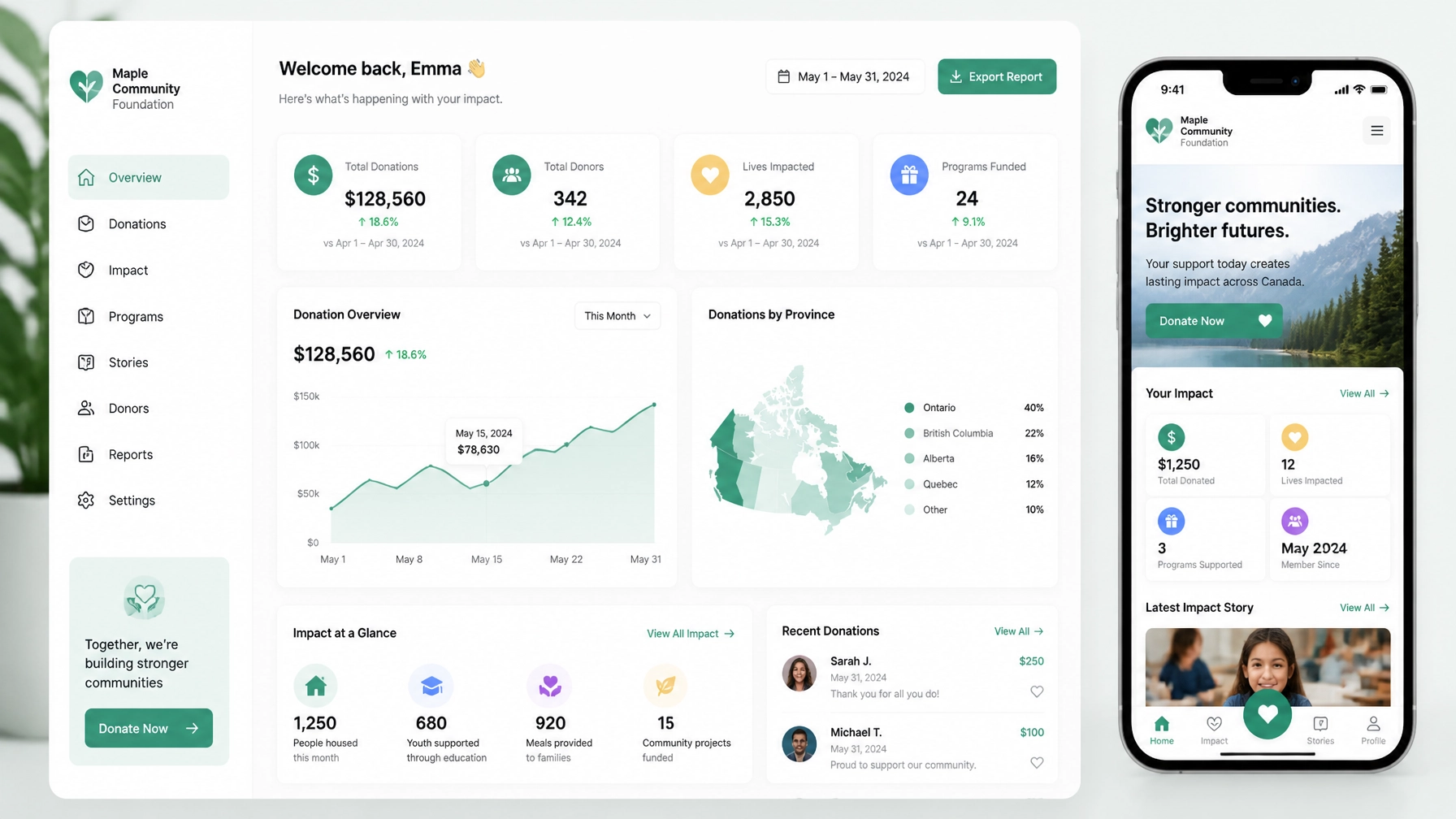
Your nonprofit may be doing important work. Your website may even be receiving traffic.
But if people cannot quickly understand who you serve, where you work, and what you do, you have an Answer Gap.
And if visitors understand your mission but cannot easily donate, apply, volunteer, or register, you have an Action Gap.
Both gaps cost Canadian nonprofits support.
The solution is not simply “more SEO” or a prettier homepage. It is a connected strategy: Answer Engine Optimization (AEO) makes your organization easier to understand, while conversion-focused web design makes it easier to act.
TL;DR
- The Answer Gap prevents search engines and AI tools from confidently describing or recommending your organization.
- The Action Gap creates friction after people arrive.
- AEO closes the first gap with structured, natural-language content.
- Conversion-focused design closes the second with clear journeys, focused pages, and low-friction forms.
- Webflow CMS helps nonprofits manage programs, events, campaigns, and impact stories at scale.
- The best approach is diagnostic: identify where understanding breaks down, then where momentum disappears.
The Answer Gap: when your mission is difficult to explain
Imagine someone asks an AI tool:
“Which nonprofit in Montreal helps newcomers access employment support?”
Or:
“Where can I find a Vancouver organization offering youth mental-health programs?”
If your website does not clearly answer those questions, the tool may not understand that your organization is relevant. It may recommend another nonprofit with clearer language and more structured information.
That is the Answer Gap.
It often appears in familiar forms:
- Your homepage says you “create transformational change” but does not explain how.
- Your programs are described using internal terminology.
- Your service area is buried in a footer or PDF.
- Eligibility requirements are unclear.
- Your impact stories are moving but disconnected from specific programs.
- Your content assumes people already know what your organization does.
AEO is not about writing for robots. It is about making your real work unmistakably clear to people and machines.
The practical fix: write from the question outward
Instead of beginning with “What do we want to say?”, begin with:
- Who is this program for?
- Where is it available?
- What problem does it address?
- What does someone receive?
- How much does it cost?
- What happens after they apply?
- Where does a donation go?
- What proof shows that this work is effective?
Each important page should answer its primary question in plain language near the top.
For example:
Free employment support for newcomers in Toronto
We help newcomers prepare for the Canadian job market through one-on-one coaching, resume support, and interview preparation at no cost.
That sentence does several jobs. It clarifies the audience, location, service, benefit, and cost. It gives a search engine or AI system useful context. Most importantly, it helps a real person decide whether to keep reading.

The Action Gap: when understanding does not become support
The second problem is often more expensive.
A visitor finds your page. They understand the program. They believe in the mission.
Then they ask:
- Where do I donate?
- Can I apply?
- Is this available in my neighbourhood?
- Do I need to create an account?
- How long will this take?
- What should I do next?
If the answer is unclear, you have an Action Gap.
This is where good intentions disappear. The donor is sent to a generic contact page. The volunteer opportunity is hidden three clicks deep. The application form is slow on mobile. The “Donate” button competes with six other calls to action.
A clear answer creates confidence. A clear next step creates momentum.
The practical fix: design around the decision
Every important page should have a primary action connected to its purpose.
- A program page should help someone apply or request support.
- A campaign page should help someone donate.
- A volunteer page should help someone choose an opportunity and register interest.
- An event page should help someone register.
- An impact story should help a supporter continue into a relevant campaign or program.
This does not mean every page needs to be aggressive or transactional. It means the next step should be obvious and appropriate.
A program page can include a secondary option such as “Ask a question.” But “Apply for support” should not be visually buried beneath unrelated links.
Friction is often structural, not visual
Nonprofits sometimes respond to weak conversion rates by changing colours, buttons, or hero images. Those details matter, but they are rarely the root problem.
The bigger issues are usually:
- A donation journey that starts from the wrong page.
- A form asking for information the organization does not need.
- A campaign page that explains the problem but not the immediate opportunity to help.
- A mobile layout that makes the primary CTA difficult to reach.
- A lack of reassurance around privacy, tax receipts, eligibility, or follow-up.
The question is not “Does this page look modern?”
The better question is:
What uncertainty or effort is stopping this person from taking the next step?
Why the two gaps must be solved together
AEO without conversion design can bring more people to a confusing experience.
Conversion design without AEO can create an excellent experience for people who already know your organization, while missing people who are searching for help, community, or a cause like yours.
You need both.
A useful page sequence looks like this:
- Answer the visitor’s core question.
- Support the answer with evidence, details, and human stories.
- Guide the visitor toward one relevant action.
- Reassure them about what happens next.
This structure works for donors, volunteers, applicants, funders, and community members.
What this looks like across Canadian markets
Local context changes what “trust” and “clarity” mean.
Montreal: bilingual clarity builds trust
For Montreal organizations, French and English content should not be treated as an afterthought. A translated navigation menu is not enough.
Your key answers should be available in both languages:
- Who you serve.
- Where programs take place.
- How to access support.
- Whether services are free.
- How to donate or volunteer.
The French and English versions should be equivalent in meaning, not simply technically connected by a language switcher. Bilingual clarity signals respect, accessibility, and local understanding.
Toronto: specificity helps you stand out
Toronto has a crowded nonprofit ecosystem. Broad phrases such as “supporting communities” are easy to overlook.
Specificity is your advantage.
Name the audience, neighbourhood, issue, and outcome where appropriate:
“After-school tutoring for newcomer youth in Scarborough”
is more useful than:
“Empowering the next generation.”
Specific language improves human understanding and gives search engines stronger signals about relevance.
Ottawa: evidence supports institutional credibility
Ottawa nonprofits often communicate with government partners, institutional funders, policy audiences, and national networks.
Your website should make evidence easy to find:
- Program outcomes.
- Annual reports.
- Evaluation methods.
- Geographic reach.
- Governance information.
- Funding and partnership details.
This does not mean turning every page into a report. It means connecting the emotional story to credible proof.
Vancouver: mobile-first, place-based storytelling
In Vancouver, many people discover organizations through mobile search, social media, events, and community networks.
The experience needs to work quickly on a phone. Donation, registration, and volunteer journeys should be easy to complete without pinching, zooming, or hunting through menus.
Place also matters. Use real stories and images that show the communities, neighbourhoods, and environments connected to your mission. Avoid generic corporate stock photography. A place-based image can communicate relevance faster than a paragraph of brand language.

How Webflow CMS helps close both gaps
Webflow is useful for nonprofits because it connects content structure with visual control.
With Webflow CMS, you can create structured Collections for:
- Programs and services.
- Impact stories.
- Events.
- Volunteer opportunities.
- Campaigns.
- Team and board members.
- Resources and reports.
Each Collection can have its own template. Add a new program once, and Webflow can generate a consistent page with the right fields, layout, related stories, location, eligibility information, and CTA.
That matters because nonprofit websites change constantly. Programs evolve. New events are added. Campaigns launch quickly. Staff need to update content without rebuilding the page every time.
Webflow also supports reference fields, so you can connect:
- An impact story to the program it represents.
- An event to a specific service.
- A campaign to related outcomes.
- A volunteer role to a location or program area.
This creates a more connected website for users and a more understandable content system for search engines.
It also makes rapid deployment practical. A campaign landing page can be launched with a focused donation path, while the broader site continues using reusable CMS templates. You can learn more about how we approach Webflow systems in our Webflow training guide.
AEO implementation: structure what is already true
Schema markup can help search engines interpret your organization, but it is not a shortcut.
Use accurate markup that matches visible page content:
- Organization or NonprofitOrganization for an organization page with visible name, logo, contact information, and relevant details.
- FAQPage only when the questions and answers are visibly presented on the page.
- Event for a dedicated event page with visible date, location, and registration details.
- Service for a clearly described program or service page.
Google’s structured data policies emphasize that markup must represent content users can see. Do not add hidden answers, invented services, or event information that is not on the page.
The goal is alignment:
The content should be clear to a person, structured for a machine, and useful enough to lead to action.
One compact diagnostic
Ask your team to choose one high-value page and answer:
- Can a new visitor identify the audience, location, and service in ten seconds?
- Is the primary action visible without searching?
- Does the page address the questions that stop people from acting?
- Does the mobile experience make the next step easy?
- Does the schema accurately reflect what appears on the page?
If you discover an Answer Gap, rewrite and structure the information.
If you discover an Action Gap, simplify the journey.
Do not solve both with a louder headline or another homepage redesign.
FAQ: the two gaps in one minute
What is the Answer Gap?
The Answer Gap is the space between what a nonprofit does and how clearly its website explains who it serves, where it works, and what support it provides.
What is the Action Gap?
The Action Gap is the friction between understanding a nonprofit’s mission and completing the next step, such as donating, applying, volunteering, or registering.
Why is Webflow a strong CMS for nonprofits?
Webflow gives nonprofits structured CMS Collections, reusable templates, visual control, and the ability to launch program and campaign pages quickly without rebuilding the entire website.
Close both gaps with a website that helps people help
Your website should not make visitors translate your mission, search for proof, or guess what to do next.
It should answer the right question, build confidence, and open a clear path to meaningful action.
If you are a social impact leader in Montreal, Toronto, Ottawa, Vancouver, or anywhere across Canada, we can help you diagnose where your organization is losing understanding and momentum.
Explore Arch Impact Studio’s work or book a consultation to build a Webflow website that makes your mission easier to find, easier to trust, and easier to support.
Conclusion
Your nonprofit may be doing important work. Your website may even be receiving traffic.
But if people cannot quickly understand who you serve, where you work, and what you do, you have an Answer Gap.
And if visitors understand your mission but cannot easily donate, apply, volunteer, or register, you have an Action Gap.
Both gaps cost Canadian nonprofits support.
The solution is not simply “more SEO” or a prettier homepage. It is a connected strategy: Answer Engine Optimization (AEO) makes your organization easier to understand, while conversion-focused web design makes it easier to act.
TL;DR
- The Answer Gap prevents search engines and AI tools from confidently describing or recommending your organization.
- The Action Gap creates friction after people arrive.
- AEO closes the first gap with structured, natural-language content.
- Conversion-focused design closes the second with clear journeys, focused pages, and low-friction forms.
- Webflow CMS helps nonprofits manage programs, events, campaigns, and impact stories at scale.
- The best approach is diagnostic: identify where understanding breaks down, then where momentum disappears.
The Answer Gap: when your mission is difficult to explain
Imagine someone asks an AI tool:
“Which nonprofit in Montreal helps newcomers access employment support?”
Or:
“Where can I find a Vancouver organization offering youth mental-health programs?”
If your website does not clearly answer those questions, the tool may not understand that your organization is relevant. It may recommend another nonprofit with clearer language and more structured information.
That is the Answer Gap.
It often appears in familiar forms:
- Your homepage says you “create transformational change” but does not explain how.
- Your programs are described using internal terminology.
- Your service area is buried in a footer or PDF.
- Eligibility requirements are unclear.
- Your impact stories are moving but disconnected from specific programs.
- Your content assumes people already know what your organization does.
AEO is not about writing for robots. It is about making your real work unmistakably clear to people and machines.
The practical fix: write from the question outward
Instead of beginning with “What do we want to say?”, begin with:
- Who is this program for?
- Where is it available?
- What problem does it address?
- What does someone receive?
- How much does it cost?
- What happens after they apply?
- Where does a donation go?
- What proof shows that this work is effective?
Each important page should answer its primary question in plain language near the top.
For example:
Free employment support for newcomers in Toronto
We help newcomers prepare for the Canadian job market through one-on-one coaching, resume support, and interview preparation at no cost.
That sentence does several jobs. It clarifies the audience, location, service, benefit, and cost. It gives a search engine or AI system useful context. Most importantly, it helps a real person decide whether to keep reading.
The Action Gap: when understanding does not become support
The second problem is often more expensive.
A visitor finds your page. They understand the program. They believe in the mission.
Then they ask:
- Where do I donate?
- Can I apply?
- Is this available in my neighbourhood?
- Do I need to create an account?
- How long will this take?
- What should I do next?
If the answer is unclear, you have an Action Gap.
This is where good intentions disappear. The donor is sent to a generic contact page. The volunteer opportunity is hidden three clicks deep. The application form is slow on mobile. The “Donate” button competes with six other calls to action.
A clear answer creates confidence. A clear next step creates momentum.
The practical fix: design around the decision
Every important page should have a primary action connected to its purpose.
- A program page should help someone apply or request support.
- A campaign page should help someone donate.
- A volunteer page should help someone choose an opportunity and register interest.
- An event page should help someone register.
- An impact story should help a supporter continue into a relevant campaign or program.
This does not mean every page needs to be aggressive or transactional. It means the next step should be obvious and appropriate.
A program page can include a secondary option such as “Ask a question.” But “Apply for support” should not be visually buried beneath unrelated links.
Friction is often structural, not visual
Nonprofits sometimes respond to weak conversion rates by changing colours, buttons, or hero images. Those details matter, but they are rarely the root problem.
The bigger issues are usually:
- A donation journey that starts from the wrong page.
- A form asking for information the organization does not need.
- A campaign page that explains the problem but not the immediate opportunity to help.
- A mobile layout that makes the primary CTA difficult to reach.
- A lack of reassurance around privacy, tax receipts, eligibility, or follow-up.
The question is not “Does this page look modern?”
The better question is:
What uncertainty or effort is stopping this person from taking the next step?
Why the two gaps must be solved together
AEO without conversion design can bring more people to a confusing experience.
Conversion design without AEO can create an excellent experience for people who already know your organization, while missing people who are searching for help, community, or a cause like yours.
You need both.
A useful page sequence looks like this:
- Answer the visitor’s core question.
- Support the answer with evidence, details, and human stories.
- Guide the visitor toward one relevant action.
- Reassure them about what happens next.
This structure works for donors, volunteers, applicants, funders, and community members.
What this looks like across Canadian markets
Local context changes what “trust” and “clarity” mean.
Montreal: bilingual clarity builds trust
For Montreal organizations, French and English content should not be treated as an afterthought. A translated navigation menu is not enough.
Your key answers should be available in both languages:
- Who you serve.
- Where programs take place.
- How to access support.
- Whether services are free.
- How to donate or volunteer.
The French and English versions should be equivalent in meaning, not simply technically connected by a language switcher. Bilingual clarity signals respect, accessibility, and local understanding.
Toronto: specificity helps you stand out
Toronto has a crowded nonprofit ecosystem. Broad phrases such as “supporting communities” are easy to overlook.
Specificity is your advantage.
Name the audience, neighbourhood, issue, and outcome where appropriate:
“After-school tutoring for newcomer youth in Scarborough”
is more useful than:
“Empowering the next generation.”
Specific language improves human understanding and gives search engines stronger signals about relevance.
Ottawa: evidence supports institutional credibility
Ottawa nonprofits often communicate with government partners, institutional funders, policy audiences, and national networks.
Your website should make evidence easy to find:
- Program outcomes.
- Annual reports.
- Evaluation methods.
- Geographic reach.
- Governance information.
- Funding and partnership details.
This does not mean turning every page into a report. It means connecting the emotional story to credible proof.
Vancouver: mobile-first, place-based storytelling
In Vancouver, many people discover organizations through mobile search, social media, events, and community networks.
The experience needs to work quickly on a phone. Donation, registration, and volunteer journeys should be easy to complete without pinching, zooming, or hunting through menus.
Place also matters. Use real stories and images that show the communities, neighbourhoods, and environments connected to your mission. Avoid generic corporate stock photography. A place-based image can communicate relevance faster than a paragraph of brand language.
How Webflow CMS helps close both gaps
Webflow is useful for nonprofits because it connects content structure with visual control.
With Webflow CMS, you can create structured Collections for:
- Programs and services.
- Impact stories.
- Events.
- Volunteer opportunities.
- Campaigns.
- Team and board members.
- Resources and reports.
Each Collection can have its own template. Add a new program once, and Webflow can generate a consistent page with the right fields, layout, related stories, location, eligibility information, and CTA.
That matters because nonprofit websites change constantly. Programs evolve. New events are added. Campaigns launch quickly. Staff need to update content without rebuilding the page every time.
Webflow also supports reference fields, so you can connect:
- An impact story to the program it represents.
- An event to a specific service.
- A campaign to related outcomes.
- A volunteer role to a location or program area.
This creates a more connected website for users and a more understandable content system for search engines.
It also makes rapid deployment practical. A campaign landing page can be launched with a focused donation path, while the broader site continues using reusable CMS templates. You can learn more about how we approach Webflow systems in our Webflow training guide.
AEO implementation: structure what is already true
Schema markup can help search engines interpret your organization, but it is not a shortcut.
Use accurate markup that matches visible page content:
- Organization or NonprofitOrganization for an organization page with visible name, logo, contact information, and relevant details.
- FAQPage only when the questions and answers are visibly presented on the page.
- Event for a dedicated event page with visible date, location, and registration details.
- Service for a clearly described program or service page.
Google’s structured data policies emphasize that markup must represent content users can see. Do not add hidden answers, invented services, or event information that is not on the page.
The goal is alignment:
The content should be clear to a person, structured for a machine, and useful enough to lead to action.
One compact diagnostic
Ask your team to choose one high-value page and answer:
- Can a new visitor identify the audience, location, and service in ten seconds?
- Is the primary action visible without searching?
- Does the page address the questions that stop people from acting?
- Does the mobile experience make the next step easy?
- Does the schema accurately reflect what appears on the page?
If you discover an Answer Gap, rewrite and structure the information.
If you discover an Action Gap, simplify the journey.
Do not solve both with a louder headline or another homepage redesign.
FAQ: the two gaps in one minute
What is the Answer Gap?
The Answer Gap is the space between what a nonprofit does and how clearly its website explains who it serves, where it works, and what support it provides.
What is the Action Gap?
The Action Gap is the friction between understanding a nonprofit’s mission and completing the next step, such as donating, applying, volunteering, or registering.
Why is Webflow a strong CMS for nonprofits?
Webflow gives nonprofits structured CMS Collections, reusable templates, visual control, and the ability to launch program and campaign pages quickly without rebuilding the entire website.
Close both gaps with a website that helps people help
Your website should not make visitors translate your mission, search for proof, or guess what to do next.
It should answer the right question, build confidence, and open a clear path to meaningful action.
If you are a social impact leader in Montreal, Toronto, Ottawa, Vancouver, or anywhere across Canada, we can help you diagnose where your organization is losing understanding and momentum.
Explore Arch Impact Studio’s work or book a consultation to build a Webflow website that makes your mission easier to find, easier to trust, and easier to support.