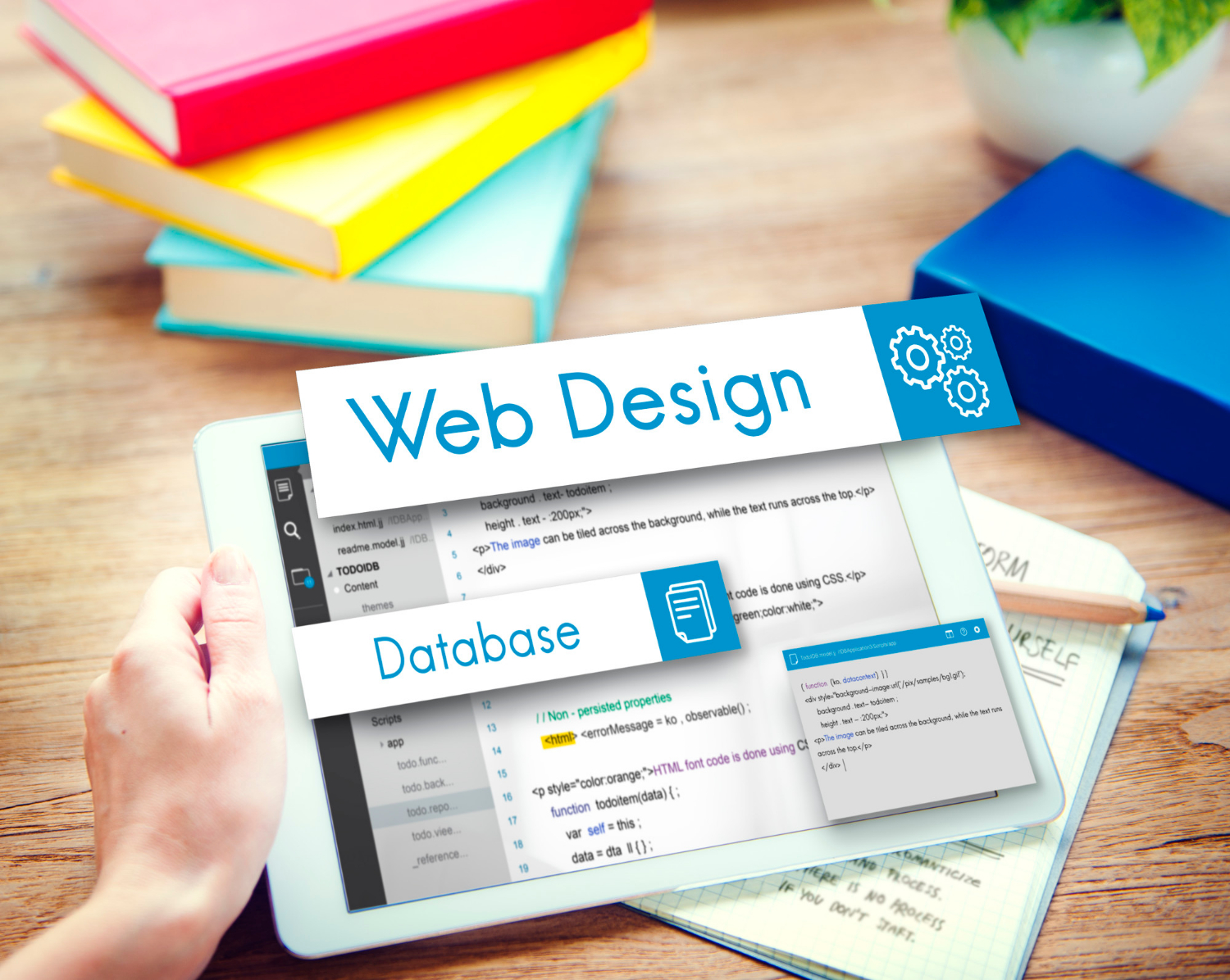
SaaS website design isn’t just about looking modern. It has to feel smooth, run fast, and help people move through it without confusion. When design gets in the way of that, even small issues can slow everything down. A clean layout might seem polished, but if people stumble trying to find what they need, they will leave just as quickly as they arrived.
It is common to hear things like “Our site looks great, but no one’s clicking” or “We have had traffic, but nobody signs up.” That is often a sign the website design is working against itself. It might be slowing people down with unclear steps, slow load times, or content that does not help users move forward.
By the time November rolls around, many teams are planning new launches or finishing the quarter strong. It is a good time to check what is working and what is not. This includes your website. If visitors are landing on your pages and leaving right away, the design may need a second look before the new year.
We have seen how small things create friction, things that seem simple but add up fast. In this post, we will walk through what makes some SaaS websites drag and, more importantly, how to find cleaner paths forward. Fixing these issues does not have to mean starting over. Often, it is about removing clutter, refocusing the layout, or rethinking a few choices that might be slowing users down without anyone noticing.
1. When Design Looks Good but Feels Slow
It is easy to focus on the way a SaaS site looks. Branding, colours, and spacing all matter. But if the design is not helping people move with purpose, it is not doing its job. A lot of sites seem smooth at first glance, but once a user starts to scroll or click around, the cracks show up fast.
The biggest issue here is the gap between how a site looks and how it works. We have seen SaaS companies invest in slick visuals, animations, or effects that look great during a walkthrough, but for real users trying to figure out next steps, those extras often get in the way. When users cannot find what they need right away, they freeze. They scroll, then bounce.
This happens when clean design is not backed by clear thinking. A button might look lovely, but if it does not tell you where it goes or why you should click it, it is just decoration. In the same way, a homepage might have bold headers and white space, but if it does not speak plainly, the visitor is left guessing.
We notice bounce rates rise when users feel unsure. If a site feels quiet but not guided, they are more likely to exit than explore. Every small delay counts. Reading a vague headline, hovering over multiple call-to-action buttons that all sound the same, or watching slow transitions between pages (these add up). When design pulls in one direction and flow pulls in another, users get lost.
The solution here often starts with a question: does each part of the site have a job, and is it doing that job clearly? A good design helps remove steps, not add them. It connects one idea to the next. It shows what to read, what to click, and what comes after.
2. Layout Choices That Add Friction
Even when a site’s elements look clean or well-placed, the layout itself might be making things harder. We have seen many well-branded SaaS sites where each section blends into the next without any clear direction. That is where friction creeps in.
Friction means the site slows people down instead of helping them through. Here are a few reasons we often spot:
• Too many choices on one screen
When a homepage offers six paths, three buttons, four signup prompts, and two contact links, it is not clear where the user should go. It might seem like a helpful layout, giving all the options at once, but in practice, it creates decision fatigue. The more choices we show upfront, the harder it is for people to act on any of them.
• No natural flow from top to bottom
People scan quickly. If the eye has to jump back and forth between columns, headers, images, and overlapping content, the flow breaks. A good layout steers the eye naturally, from the opening message to the main action. When there is no obvious path to follow, users scroll without direction, and they often stop before taking any action.
• Buttons and links that blend in
If a button looks like plain text or the same colour as everything else, people will not notice it. If every link has a different style, they will not trust any of them. These seem like small issues, but every unnoticed button means one missed chance to lead someone where they need to go.
We have worked with SaaS companies where just adjusting the order of a few sections made a big difference. Cleaner menus, better contrast on links, and grouping content by purpose all help create a layout that feels easier to use without changing the brand identity at all. Layout is not just about stacking boxes on a page. It is about shaping a path that fits the way people think.
3. Slow Load Times and What’s Causing Them
By mid-November, most users are working across multiple tabs, devices, and Wi-Fi setups. They are not sitting around waiting for a page to load. If your SaaS website design includes heavy files or extra bits that do not do much, there is a good chance it is dragging the whole experience down.
Load speed problems come in many shapes, but some are more common than others:
• Oversized image files and video backgrounds
Big background visuals can look nice, but if an image has not been resized for the web, it takes too long to load. Video headers bring energy, but they also bring weight. Users might leave before the first frame finishes loading if the wait feels slow. Cutting size or swapping formats can usually fix this fast.
• Extra code that does not do anything
Over time, sites collect bloat. Scripts for effects that never got used, plugins that do not serve a purpose anymore, or fixes that were temporary and never cleaned up. All of this adds time when the page loads, even if users cannot see it. A slow feel is not just about what is visible, it is about everything happening behind the scenes.
• Tools that pull outside content
Tracking tools, chat widgets, analytics, or embedded signups can also choke loading speed. If they rely on third-party servers or are not timed right, they block the rest of the page from showing up. This delay can hurt first impressions before a user even reads the first line.
Fixing slow loads is not about removing every tool. It is about choosing the right tools and trimming what does not help. The goal is to let each page open quickly enough that users do not even think about the wait. They just move.
When a site loads fast, it feels lighter, even before any content has been read. That feeling sticks with visitors. It makes the rest of the experience feel smoother, even if nothing big changed on the outside.
Next, we will walk through what happens when a site does not think mobile-first, and how that choice slows things down for most users without anyone noticing.
4. Mobile Is Not Just Smaller, It Is Different
It is easy to assume that making a site mobile-friendly just means shrinking things down. But phones do not work like desktops, and users do not act the same way. A page that reads fine on a laptop can feel slow or awkward on a phone without the right layout choices.
The biggest break in mobile flow usually comes from interactions that were not built with fingers in mind. On small screens, tapping buttons, filling forms, or scrolling through side-by-side content turns into extra effort. If your call-to-action is too close to the edge or a form field is impossible to spot, users get stuck fast.
Another sign of trouble is when visitors have to pinch and zoom just to read something. That is often a clue the layout was not built to adjust for screen size. Long columns of text, full-width background images, or icons too close together can turn a short task into a struggle.
Fixing this is not about adding new mobile features. It is usually about rethinking how to stack the content. Making each section fall naturally in one column, using short paragraphs, and spacing buttons wide enough for thumbs can all help mobile users move forward faster. A strong SaaS website design does not just adapt to mobile, it leads with it.
5. Unclear Messaging That Stops Users in Their Tracks
Once your site loads and looks smooth on every device, the next thing that can slow people down is what you are saying, or not saying. This usually shows up in the hero section or near the main button. If your headlines are clever but do not say what your product does, users pause. Then they bounce.
It is easy to fall into the habit of writing headlines that sound catchy but leave readers guessing. Phrases like “Transform your team” or “Build without limits” might read well, but they do not mean much unless paired with a real explanation. Without clear messaging, visitors start asking themselves what the site is really offering.
Buttons can bring the same problem. If your call to action says “Get started” or “See more,” but there is no context, people will not be sure what happens next. Is it a sign-up? A demo? A blog? The more work a user has to do to figure that out, the slower the site feels.
The same goes for supporting content. If the copy does not match what people came looking for, if it talks around features instead of showing how they help, then even a beautiful site will not keep visitors around. Messaging should make people feel like they have found exactly what they were trying to solve.
Fixing messaging starts with clarity. Are we telling users what this SaaS product does, who it helps, and why they should keep reading? That does not mean adding more words. It means writing simpler ones that do more.
6. Conversion Paths That Lead Nowhere
A common place where SaaS sites lose momentum is in the conversion flow. This does not always mean people do not want to sign up. Sometimes, the next step just is not clear enough, or the site makes it harder than it needs to be.
Pages with no call to action leave people stuck. They may be interested, but if there is nothing guiding them forward, they will not go hunting for the next move. We have seen pages with great stories and visuals, but no clear “what now.” Without a strong prompt, the user leaves, even if they liked what they saw.
Other times, the form shows up too early or asks too much. Requiring eight fields for an email demo or pushing a pricing calculator before someone knows what the product does puts pressure on the visitor. Every extra step adds another reason to abandon the process.
Even some menu setups slow people down. If links do not match the structure people expect, like “Contact” hiding under “Company” or sign-up flows tucked into a side tab, it creates small stumbles. These little things make users feel like they are working just to get through the site.
Smoother conversion paths start with thinking like a new visitor. Could we guess the next step? Could we take it without a second thought? The answer we want is yes.
7. When Branding Gets in the Way of Usability
Most SaaS teams care about their brand, but sometimes, branding choices create problems. The look and feel of a site might reflect company personality, but it has to support the user first. If people cannot read the body text or tell which buttons are interactive, style has gone too far.
Fonts are one easy misstep. A cool-looking typeface is fine, but if it is hard to read or too small to see on mobile, it creates friction. Thin type, light grey on white, or anything with poor contrast can slow people down.
Colours and layout can add to this. Brand palettes might favour lots of dark tones or bold effects, but when background images compete with text or hover effects blend in, users miss things. They skip over buttons, skim too fast, or misread important sections.
Striking the balance between brand and clarity often means using colour and style to guide, not decorate. The best branding supports the structure of the site. It makes it easier to scan, easier to spot important links, and more natural to trust the content.
Visual personality should not replace usability. When both work together, the site moves faster for everyone.
8. Cleaning Up SaaS Website Design the Right Way
Fixing a slow SaaS site does not always mean a full rebuild. Most of the time, it just takes looking closely at how each page works, from layout to copy to actions, and making one smart change at a time.
That might start with trimming the content. Remove extra words or sections that do not guide users forward. You would be surprised how often a shorter homepage performs better just because it is clearer. Other sites might benefit from reshuffling sections so each one leads into the next with less guesswork.
Some fixes are structural. That could mean cleaning hidden code, removing plugins, or rebuilding forms so they are easier to use. Other times, it is more design-focused, changing font sizes, reordering the menu, or making call-to-actions pop without overwhelming the page.
Redesign is not always the fix. If your brand look works but the structure feels heavy, restructuring may be the smarter route. This way, the site still feels familiar while becoming easier to move through. And when things really do need a fresh start, redesigning with flow in mind from the start makes all the difference.
When we take on slow-loading or unclear sites, we look past the surface. The goal is not just cleaner code or prettier buttons. It is a total experience that guides people from the first scroll to the final click with less work and more confidence.
9. Clearer, Faster Pages That Help More Visitors Move Forward
The things that slow down a SaaS website design are not always easy to spot. They show up in clicks that do not happen, load times that feel longer than they are, or layouts that look fine but do not lead anywhere. But once you know where to look, the fixes become clear.
The best-performing pages do not do more, they do less, more clearly. When every part of the site supports the next step and keeps users moving, it starts to work like it should. Clean visuals, focused copy, and helpful structure are not just good design choices. They are how we help people get where they want to go. That is what turns traffic into results.


