


Your organization is doing meaningful work.
But if visitors cannot quickly understand that work, trust your organization, or take the next step, your website is leaving impact on the table.
That next step might be:
- Making a donation
- Becoming a monthly donor
- Applying for support
- Volunteering
- Registering for an event
- Joining your email list
- Sharing your mission
Conversion-focused web design helps visitors act. Answer Engine Optimization helps the right people find you in the first place.
Together, they turn your website into more than a digital brochure. They make it part of your fundraising, service delivery, and community-building infrastructure.
TL;DR: What a high-impact nonprofit website should do
A strong Canadian non-profit website should:
- Explain your mission in plain language.
- Give every important page one clear primary action.
- Make donating, volunteering, and applying simple on mobile.
- Answer real questions from donors and community members.
- Use structured content that search engines and AI tools can understand.
- Give your team a flexible CMS for campaigns, programs, and impact stories.
- Reflect the local realities of the communities you serve.
Let’s dive right in.
Design around the actions that matter most
A nonprofit website does not need more buttons.
It needs better decisions about which actions deserve attention.
Start by identifying your core conversion journeys:
- Donate
- Give monthly
- Volunteer
- Apply for support
- Register for an event
- Partner with your organization
- Read an impact story
- Contact your team
Then assign one primary action to each important page.
For example:
- A program page should explain eligibility and lead people toward applying.
- An impact story should build trust and lead visitors toward donating.
- An event page should make registration quick.
- A volunteer page should clearly explain available roles and requirements.
- A campaign page should focus on one fundraising goal.
Clear design is not simplistic design. It is respectful design.
Your visitors may be discovering your organization during a stressful, emotional, or time-sensitive moment. Do not make them work to understand how to help.
Build a donation journey that reduces friction
A donor should not have to search through your navigation to find out how to give.
Keep a clear Donate button in your global navigation. Repeat it naturally on relevant program pages, impact stories, campaign pages, and your footer.
Your donation page should answer practical questions before the form begins:
- What will my gift help provide?
- Who benefits?
- Can I give once or monthly?
- Are the amounts shown in Canadian dollars?
- Who issues my tax receipt?
- Is the payment process secure?
- What happens after I donate?
A conversion-focused donation page usually includes:
- Specific impact examples
- One-time and monthly giving options
- A small number of suggested gift amounts
- Short, clearly labelled form fields
- Accessible mobile design
- Privacy and payment information
- A clear receipt and confirmation message
- Real photography from the communities you serve
“Support our work” is vague.
“Your gift helps provide fresh groceries to families in Laval” is more concrete: provided the claim is accurate and current.
If you use CanadaHelps, Zeffy, or another fundraising platform, the transaction may happen through a third party. That is fine. But the story, trust signals, impact information, and donor experience should still begin on your own website.
For official Canadian guidance, link to the Canada Revenue Agency’s charities and giving resources.
Why Webflow is a strong fit for Canadian nonprofits
Webflow is not a donation processor. You will still need a secure fundraising platform or payment provider.
Where Webflow excels is the experience layer: the content, layouts, design system, and publishing workflow that guide people toward action.
1. Scale your content without starting over
Your organization may begin with five core pages.
Over time, you may need:
- Programs and services
- Events
- Campaigns
- Impact stories
- Volunteer opportunities
- Regional pages
- Annual reports
- FAQs
- Staff and partner profiles
- Resource libraries
Webflow CMS lets your team organize this information into structured collections. A new event or impact story can appear automatically in multiple parts of the website using reusable templates.
That means fewer repetitive updates. Better consistency. Less dependency on developers.
Our Webflow CMS training guide explains how teams can manage structured content and publish updates more efficiently.
2. Launch donation-centric layouts quickly
Nonprofits often work against real deadlines:
- GivingTuesday
- Year-end fundraising
- Emergency appeals
- Seasonal programs
- Grant announcements
- New service launches
- Community events
With Webflow, you can create reusable layouts for donation campaigns, volunteer recruitment, event registration, and program applications.
Once the structure is in place, your team can adapt the content without redesigning every page from scratch.
3. Keep the visual experience mission-aligned
Donation forms often feel disconnected from the organization they support.
Webflow gives you control over the experience around the form:
- Typography
- Layout
- Colour
- Impact storytelling
- Trust signals
- Responsive behaviour
- Accessibility details
- Calls to action
The result is a donation experience that feels like a natural extension of your brand: not a form pasted into an unrelated website.
Arch’s portfolio includes work for purpose-led organizations such as N3O, a nonprofit-focused fundraising technology organization.
AEO Canada: make your mission easy for AI search to understand
People are increasingly asking complete questions in ChatGPT, Perplexity, Google AI Overviews, and other answer engines.
They may search:
- “Which charities support food security in Toronto?”
- “Where can I volunteer with youth programs in Montreal?”
- “What services are available for newcomers in Ottawa?”
- “How can I support wildfire recovery in British Columbia?”
- “Are there Canadian nonprofits offering mental health programs for youth?”
This is where Answer Engine Optimization, or AEO, becomes useful.
AEO is the practice of structuring your website so search engines and AI systems can better understand, extract, and reference your information.
It is not a shortcut.
Google’s guidance emphasizes “helpful, reliable, people-first content” for both traditional search and AI features. In other words, the best AEO strategy is also good communication.
Use natural-language questions and direct answers
For each important page or section:
- Put a real question in the heading.
- Answer it directly in one or two sentences.
- Add supporting details, evidence, and context.
- End with a relevant next step.
For example:
Who does your Montreal food security program support?
We provide grocery support and community food programs for low-income families and individuals across selected Montreal neighbourhoods. Eligibility depends on household needs, location, and program availability.
Then add:
- Eligibility requirements
- Service locations
- Program hours
- Application steps
- Accessibility information
- A clear “Get support” CTA
Another example:
How can I volunteer with our organization in Toronto?
We match volunteers with community programs in Toronto based on their interests, availability, and location. Most roles require a weekly commitment of two to four hours, and orientation is provided before your first shift.
That answer is useful to a person. It is also easier for AI systems to interpret.
Avoid vague headings like “Our Approach” when your audience is really asking, “How does your program work?”
Write the way your community speaks.
Structure content for people first
Useful AEO content often includes:
- Descriptive page titles
- One clear H1 per page
- Logical H2 and H3 headings
- Short paragraphs
- Bulleted lists
- Internal links
- Current statistics
- Consistent organization and location details
- Visible FAQ sections
- Relevant structured data
You can add Organization, NonprofitOrganization, Article, Event, Service, and FAQPage schema where appropriate.
But your schema must match the content people can actually see.
Structured data supports useful content. It does not replace it.
Make regional relevance useful, not decorative
A Canadian nonprofit website should reflect the communities it serves.
Montreal web design
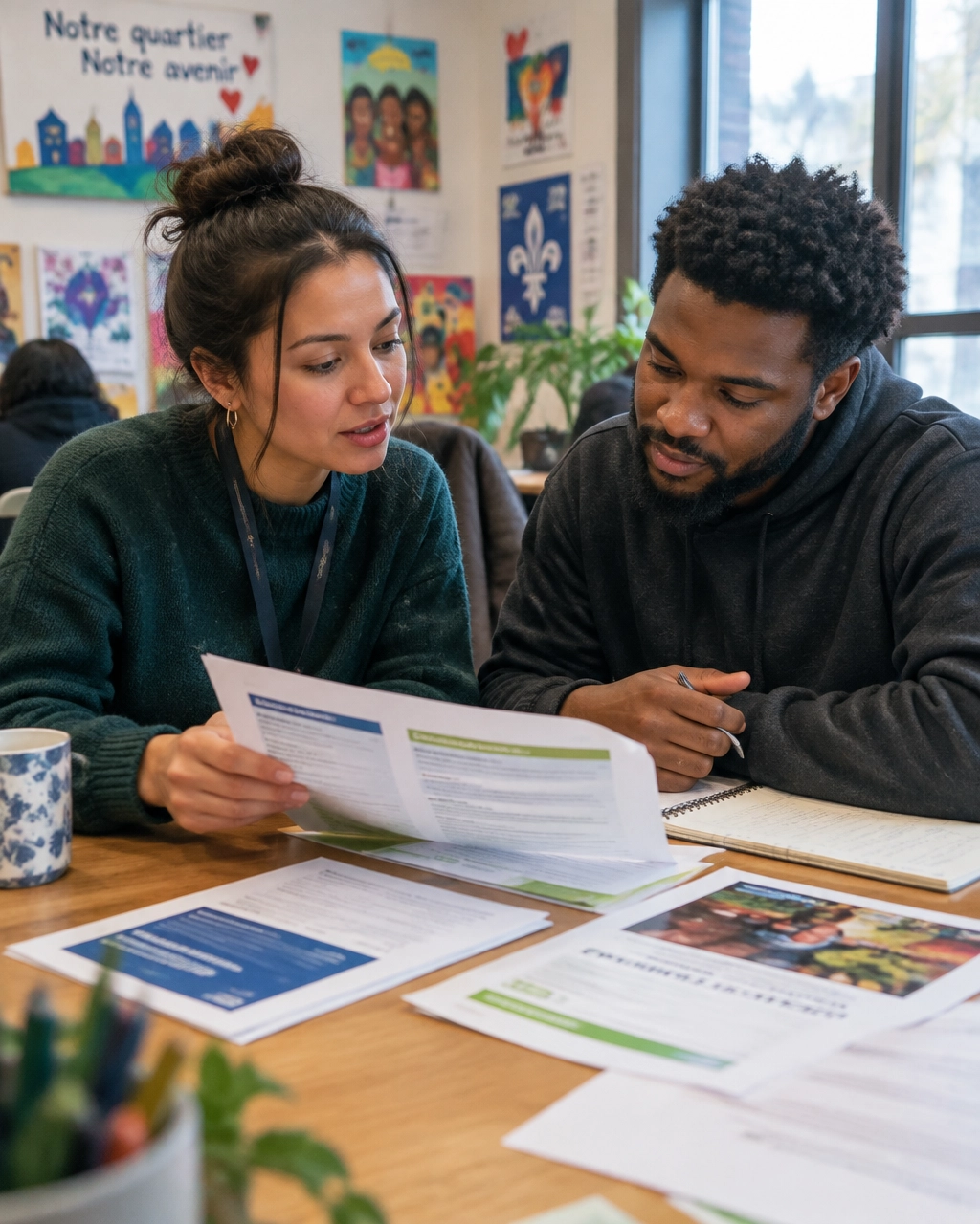
Montreal organizations often communicate with French- and English-speaking audiences.
For bilingual organizations, translation is only the starting point. Your English and French experiences should both include:
- Donation information
- Program eligibility
- Contact details
- Tax receipt information
- Impact stories
- Accessibility guidance
- Clear language switching
A thoughtful Montreal web design strategy treats bilingual content as part of trust and accessibility: not a last-minute add-on.
Toronto web design
Toronto has a dense and competitive nonprofit ecosystem.
A general statement about “serving the community” may not be enough. Visitors need to know:
- Which neighbourhoods you serve
- Who your programs are for
- What makes your approach different
- How to access support
- How partners and volunteers can participate
Strong Toronto web design should help users move from “I need help” to “This is the right program for me.”
Ottawa web design
Ottawa’s nonprofit landscape often intersects with government, policy, advocacy, research, and national organizations.
Your website may serve residents, donors, volunteers, policymakers, journalists, and institutional partners.
Use clear pathways for each audience. Explain your mandate, evidence, partnerships, governance, and outcomes without making the site feel overwhelming.
Vancouver web design
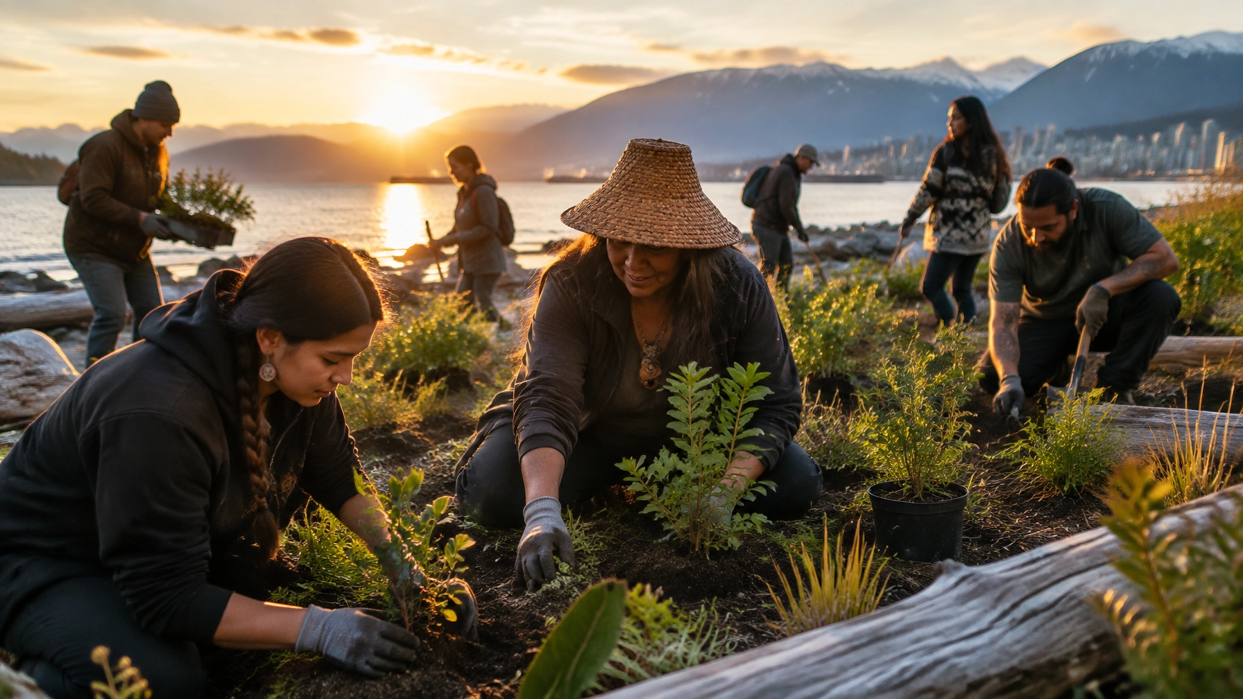
Vancouver and British Columbia have distinct conversations around housing, climate response, Indigenous-led initiatives, food access, and community resilience.
Show where your work happens. Use authentic local stories. Include service areas, access information, and current program details.
Do not create thin location pages that simply swap one city name for another. Regional content should include real local context and useful answers.
Measure digital impact beyond traffic
Traffic is useful.
But it is not the outcome.
Track the actions that matter to your mission:
- Donation completion rate
- Monthly donor conversion rate
- Volunteer application completion
- Program applications
- Event registrations
- Newsletter signups
- Clicks from impact stories
- Visits to regional program pages
- Mobile versus desktop performance
- Common questions your website still fails to answer
Review analytics alongside feedback from staff and community members.
If people continue calling to ask questions your website should answer, that is a content and user-experience signal.
A successful non-profit website reduces uncertainty.
It helps the right person understand what you do, decide whether your organization is credible, and take action with confidence.
A practical 30-day improvement plan
You do not need to rebuild everything at once.
Week 1: Clarify
- Assign one primary conversion to each key page.
- Add a clear Donate button to your navigation.
- List the top questions asked by donors, volunteers, and participants.
Week 2: Restructure
- Rewrite vague headings as natural-language questions.
- Add direct answers near the top of important pages.
- Link programs to impact stories, reports, and donation paths.
Week 3: Reduce friction
- Test donation, volunteer, and application journeys on mobile.
- Remove unnecessary form fields.
- Clarify tax receipts, privacy, security, and confirmation messages.
- Review keyboard navigation, contrast, labels, and image alt text.
Week 4: Measure
- Track conversions, not just sessions.
- Compare high-intent pages with low-action rates.
- Improve the pages where visitors are interested but hesitant.
Your mission deserves a website that carries its weight
Whether you are looking for non-profit web design, a charity website agency, a mission-driven website agency, or a Webflow developer Canada nonprofits can rely on, choose a partner that connects design decisions to measurable outcomes.
That means:
- Better donation journeys
- Clearer program information
- Stronger local relevance
- More accessible content
- Smarter CMS architecture
- More discoverable answers
- A visual identity that feels human and specific
At Arch Impact Studio, we build brands and Webflow websites for organizations with something meaningful to move forward.
If your website is losing donors, volunteers, applicants, or community members, book a consultation. We will help you identify the highest-impact opportunities and build a practical path toward a more visible, trusted, and effective digital presence.
Your mission is already making an impact.
Let’s make it easier for more people to find it, understand it, and support it.