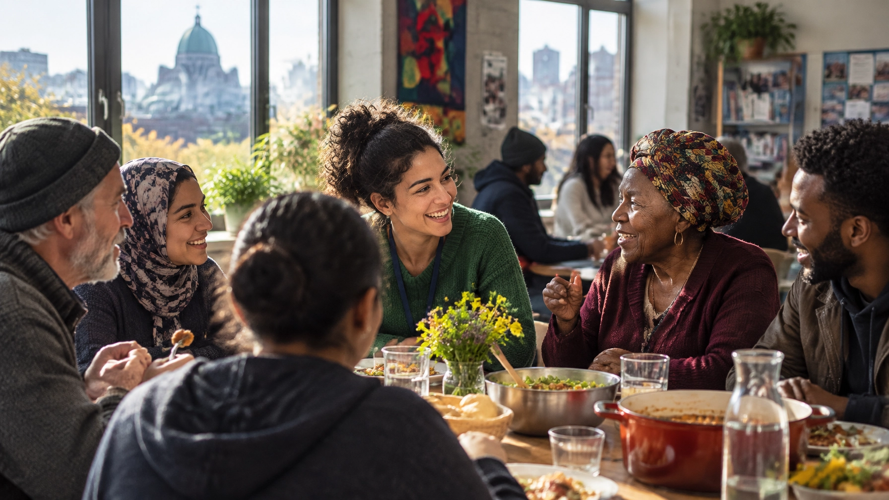
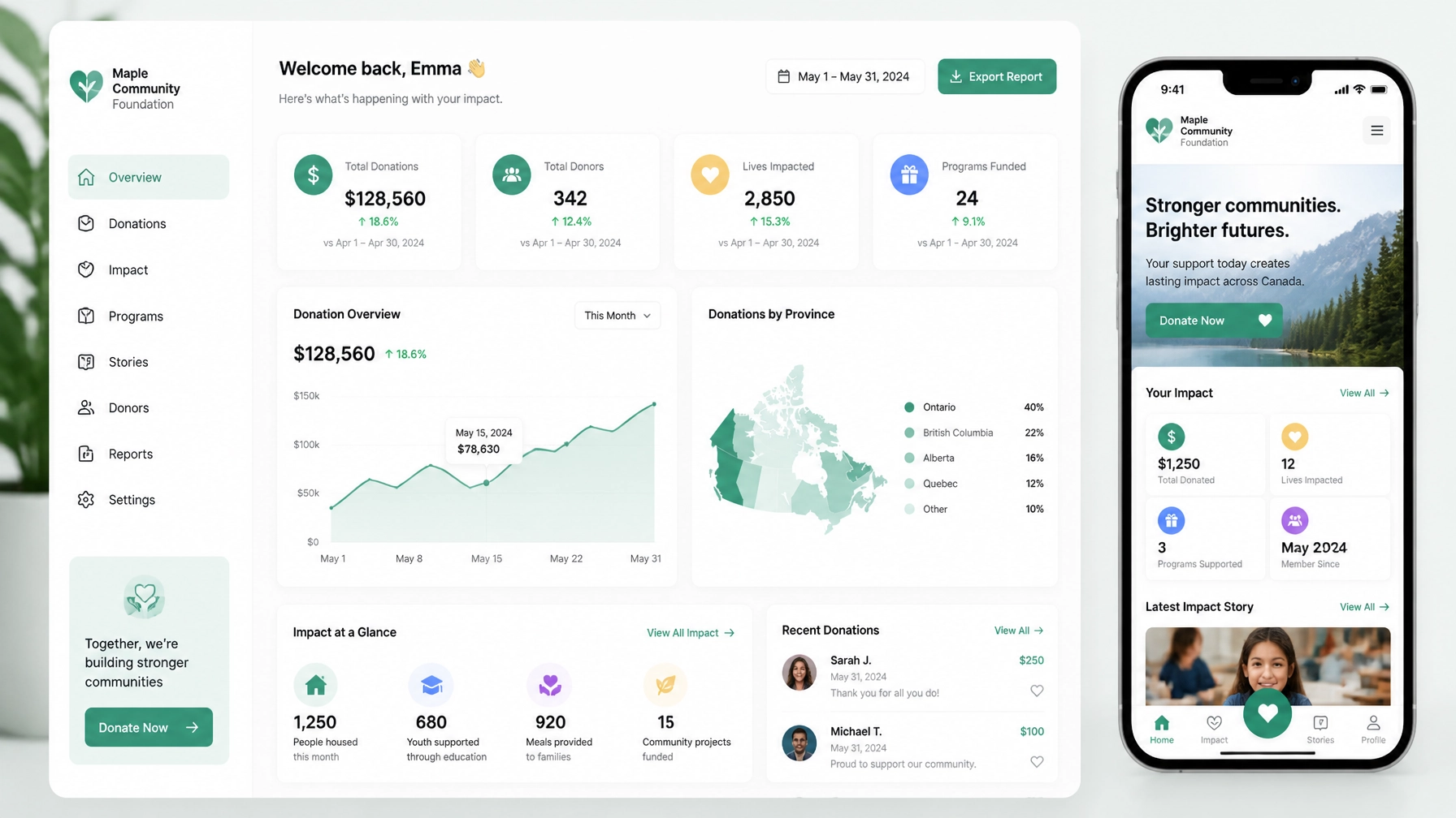
Your nonprofit already has a compelling mission.
But does your website make it easy for someone to donate, volunteer, apply, attend, or get help?
If the answer is “not always,” you are not alone. Many Canadian nonprofits have strong programs, committed teams, and meaningful impact. Yet their websites still rely on vague messaging, outdated layouts, confusing navigation, or donation flows that send people elsewhere.
That gap matters.
Your website is often the first place a donor, volunteer, funder, journalist, or community member encounters your organization. It should not merely explain what you do. It should help people take the next meaningful step.
That is where conversion-focused web design and Answer Engine Optimization (AEO) come together.
TL;DR: Your website should turn attention into action
A high-performing nonprofit website should:
- Explain your mission in plain language.
- Give each visitor a clear next step.
- Make donating fast and trustworthy.
- Answer real questions directly.
- Help search engines and AI tools understand your organization.
- Scale as your programs, campaigns, and service areas grow.
- Reflect the people and communities behind your mission.
Let’s dive right in.
1. Start with the action, not the aesthetics
A beautiful website can still underperform.
If visitors cannot quickly understand who you help, what you do, and how they can contribute, the design is not doing enough work.
Conversion-focused design begins with your organization’s real outcomes. That might mean:
- More monthly donors.
- More volunteer applications.
- More program registrations.
- More calls to your support line.
- More community event attendance.
- More qualified partnership or funding inquiries.
Each priority needs a clear path.
Your homepage may introduce the full mission, but your program pages should guide visitors toward a specific action. A volunteer page should not compete with a donation appeal. A crisis-support page should not bury the “Get Help” button beneath organizational history.
One page, one primary purpose.
This does not mean removing every secondary link. It means creating a clear visual hierarchy so visitors never have to guess what to do next.
A practical nonprofit navigation structure might include:
- About
- Our Work
- Get Help
- Get Involved
- Donate
- Contact
Keep your main CTA visible in the header. On mobile, make sure it remains easy to tap. As CanadaHelps explains, visitors should ideally be no more than two or three clicks from a donation page.
A better homepage hero
Instead of:
Empowering communities through innovative programs.
Try:
We help newcomers in Montreal find stable housing, language support, and a stronger start.
Then add a direct CTA:
- Get support
- Donate monthly
- Volunteer in your community
The takeaway? Clarity is not simplistic. It is respectful. Your visitors should not have to decode your mission before they can participate in it.

2. Design donation journeys around trust and momentum
A donation page is not a form with a button. It is a moment of trust.
Your donor is asking:
- Will my contribution make a difference?
- Is this organization legitimate?
- What will happen after I give?
- Will I receive a tax receipt?
- Can I give monthly?
- Is the payment process secure?
- Does this organization understand the issue?
Your page should answer those questions before asking for payment details.
High-impact donation page essentials
Include:
A short, specific statement of impact
Explain what a gift helps make possible. Avoid promises you cannot substantiate.
Preset giving amounts
Use amounts based on your actual donor data where possible. Add context, such as “$50 helps provide…” only when the claim is accurate and current.
One-time and monthly options
Make recurring giving visible. Predictable revenue can help your team plan programs with greater confidence.
An embedded or streamlined donation form
Sending donors to an unfamiliar third-party page can create friction. CanadaHelps notes that every additional step or page transition creates another opportunity for abandonment.
Canadian donor expectations
Clearly explain tax receipt details, currency, and processing timelines. Link to your financial reports, annual reports, or impact reporting where appropriate.
A human thank-you experience
The confirmation page and email should reinforce the donor’s role in the mission. Do not treat the transaction as the finish line.
CanadaHelps also reports that charities with two or more active donation forms earn 2.5 times more annual revenue than those using a single form. That does not mean every nonprofit needs dozens of forms. It does suggest that campaign-specific donation experiences deserve strategic consideration.
For example, you might create separate forms for:
- Emergency relief.
- Monthly giving.
- A seasonal campaign.
- A specific program.
- Tribute or memorial gifts.
The key is measurement. Track completion rates, average gift size, recurring-gift adoption, and mobile performance.
3. Use AEO to become the clearest answer in your field
Search is changing.
People increasingly ask full questions instead of typing a few keywords. AI-powered search experiences, voice assistants, and answer engines then decide which sources to summarize or recommend.
AEO is the practice of making your organization easier for these systems to understand and trust.
It is not a shortcut. It is not a guarantee that an AI tool will mention you. It is a disciplined approach to structured, useful, natural-language content.
What should nonprofit websites answer?
Build content around the questions your audiences actually ask.
For donors:
- Is this organization a registered Canadian charity?
- How are donations used?
- Do I receive a tax receipt?
- Can I become a monthly donor?
- What communities does this nonprofit serve?
For volunteers:
- How can I volunteer in Ottawa?
- Do I need previous experience?
- Are evening or remote opportunities available?
- What age requirements apply?
For people seeking support:
- Who qualifies for this program?
- How do I access services in Vancouver?
- Is support available in French?
- What documents do I need?
- Is there a cost?
Answer each question directly. Put the answer near the top of the page. Then add context, evidence, related links, and a clear CTA.
Structure content for people and machines
Use:
- One clear H1 per page.
- Descriptive H2 and H3 headings.
- Short paragraphs.
- Bulleted lists.
- FAQ sections.
- Internal links between programs, locations, and actions.
- “Last updated” dates on time-sensitive pages.
- Relevant schema markup, such as
Organization, NGO, Service, and FAQPage.
Your Webflow CMS can support this structure through reusable collections for:
- Programs.
- Locations.
- FAQs.
- Impact stories.
- Team members.
- Events.
- Reports and resources.
This is where good content architecture pays off. You are not creating isolated pages. You are building a connected knowledge base that helps a person, a search crawler, or an AI system understand your work.
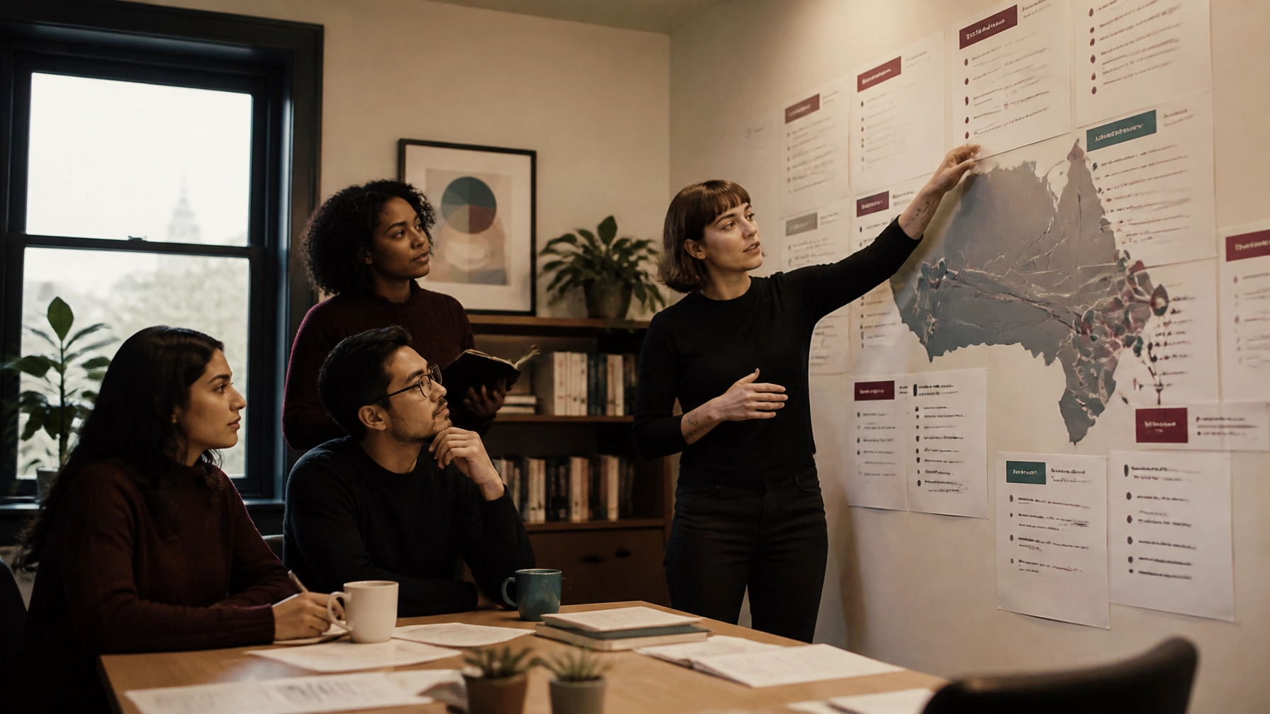
4. Make local relevance work for Montreal, Toronto, Ottawa, and Vancouver
Canadian nonprofits rarely serve an abstract audience. They serve people in particular places, with particular needs, languages, barriers, and community relationships.
Your website should reflect that reality.
Montreal
Montreal audiences may need clear French-language experiences, not simply a translated footer or an automatic translation widget. Consider bilingual navigation, localized FAQs, and program content reviewed by people who understand Quebec’s linguistic and cultural context.
A page titled “Housing support in Montreal” should explain eligibility, neighbourhood coverage, how to apply, and whether services are available in French and English.
Toronto
Toronto audiences often need fast clarity. Large, diverse communities may be looking for food access, settlement services, employment support, youth programs, or housing resources.
Use clear filters, scannable program cards, transit or neighbourhood details where relevant, and strong mobile usability. Make it easy to distinguish between services offered across the GTA and those available at a specific location.
Ottawa
Ottawa organizations may serve both local communities and national stakeholders. Your website might need to speak simultaneously to program participants, public-sector partners, volunteers, and funders.
Create separate pathways rather than forcing every visitor through the same homepage narrative. If your work is bilingual, make language selection obvious and consistent.
Vancouver
Vancouver nonprofits may need to communicate across a broad geography, including city neighbourhoods and surrounding municipalities. Program pages should clearly state where services are offered, how appointments work, and whether travel or remote support is available.
For every city, localize only where the information is real. Do not create thin city pages simply to target keywords. AEO and SEO both benefit from specific, useful local content: not generic pages with a city name swapped in.
5. Why Webflow is a strong fit for mission-driven organizations
Webflow is not the right answer for every nonprofit. Your choice should depend on your team, integrations, budget, governance requirements, and content workflow.
But for organizations that need a flexible marketing website, Webflow offers several practical advantages.
Rapid deployment
Webflow allows designers and developers to work in the same visual environment. That can reduce the distance between strategy, design, and implementation.
For a nonprofit, this makes it easier to launch:
- A campaign landing page.
- A donation-focused homepage.
- A seasonal appeal.
- A new program page.
- A volunteer recruitment flow.
- A city-specific service page.
Reusable components mean your team does not have to reinvent the layout each time.
Scalable content management
A small organization may begin with five core pages. Over time, it may need dozens of programs, locations, FAQs, reports, and impact stories.
Webflow CMS collections can create a structured system for that growth. Your team can update content without rebuilding the entire site, while templates help maintain consistency across pages.
Donation-centric layouts
Webflow can be designed around the way people actually give. For example, a reusable donation section can include:
- Impact-focused giving amounts.
- Monthly-giving prompts.
- Trust signals.
- Tax receipt information.
- Campaign-specific messaging.
- Embedded third-party forms where supported.
Webflow does not replace your donation processor or CRM. It creates the conversion environment around those tools.
For a broader platform comparison, see our guide to Webflow vs. Squarespace.
Easier iteration
Your first launch is not the end of the project.
Use analytics, donation data, form completion rates, heatmaps, and feedback from staff and community members to identify friction. Then improve the pages that matter most.
That might mean testing:
- “Donate monthly” versus “Give today.”
- A shorter form.
- A different impact statement.
- A clearer eligibility section.
- A more prominent “Get Help” button.
- A simpler mobile menu.
Our seven-step process is built around clarity, research, building, quality control, training, and launch: not decoration alone.
6. Measure impact your board can understand
A conversion-focused website gives you better reporting language.
Instead of saying, “The new site looks more modern,” you can report:
- Donation completion increased.
- Monthly-giving participation improved.
- Volunteer applications rose.
- Program pages received more qualified visits.
- Support requests became easier to navigate.
- Fewer users abandoned the donation form.
- Local pages generated more relevant inquiries.
Start with a baseline. Define one primary conversion for each important page. Review performance monthly or quarterly.
Not every meaningful action is a donation. For many nonprofits, help-seeking, volunteer registration, and program participation are equally important conversions.
Your mission deserves a website that moves people
You have already done the hard work of building programs, relationships, and trust.
Your website should carry that work forward.
It should help a donor understand the stakes. Help a volunteer find their place. Help a community member access support. Help a board see the return on a strategic investment.
At Arch Impact Studio, we build conversion-focused Webflow websites and brand experiences for organizations with a mission worth making visible. We bring strategy, content structure, UX, AEO, and implementation together around measurable outcomes.
If your website is not pulling its weight, let’s find out why.
Book a consultation with Arch Impact Studio and bring us your mission, your biggest digital challenge, or simply the page you know needs to work harder.
Further reading
Conclusion
Your nonprofit already has a compelling mission.
But does your website make it easy for someone to donate, volunteer, apply, attend, or get help?
If the answer is “not always,” you are not alone. Many Canadian nonprofits have strong programs, committed teams, and meaningful impact. Yet their websites still rely on vague messaging, outdated layouts, confusing navigation, or donation flows that send people elsewhere.
That gap matters.
Your website is often the first place a donor, volunteer, funder, journalist, or community member encounters your organization. It should not merely explain what you do. It should help people take the next meaningful step.
That is where conversion-focused web design and Answer Engine Optimization (AEO) come together.
TL;DR: Your website should turn attention into action
A high-performing nonprofit website should:
- Explain your mission in plain language.
- Give each visitor a clear next step.
- Make donating fast and trustworthy.
- Answer real questions directly.
- Help search engines and AI tools understand your organization.
- Scale as your programs, campaigns, and service areas grow.
- Reflect the people and communities behind your mission.
Let’s dive right in.
1. Start with the action, not the aesthetics
A beautiful website can still underperform.
If visitors cannot quickly understand who you help, what you do, and how they can contribute, the design is not doing enough work.
Conversion-focused design begins with your organization’s real outcomes. That might mean:
- More monthly donors.
- More volunteer applications.
- More program registrations.
- More calls to your support line.
- More community event attendance.
- More qualified partnership or funding inquiries.
Each priority needs a clear path.
Your homepage may introduce the full mission, but your program pages should guide visitors toward a specific action. A volunteer page should not compete with a donation appeal. A crisis-support page should not bury the “Get Help” button beneath organizational history.
One page, one primary purpose.
This does not mean removing every secondary link. It means creating a clear visual hierarchy so visitors never have to guess what to do next.
A practical nonprofit navigation structure might include:
- About
- Our Work
- Get Help
- Get Involved
- Donate
- Contact
Keep your main CTA visible in the header. On mobile, make sure it remains easy to tap. As CanadaHelps explains, visitors should ideally be no more than two or three clicks from a donation page.
A better homepage hero
Instead of:
Empowering communities through innovative programs.
Try:
We help newcomers in Montreal find stable housing, language support, and a stronger start.
Then add a direct CTA:
- Get support
- Donate monthly
- Volunteer in your community
The takeaway? Clarity is not simplistic. It is respectful. Your visitors should not have to decode your mission before they can participate in it.
2. Design donation journeys around trust and momentum
A donation page is not a form with a button. It is a moment of trust.
Your donor is asking:
- Will my contribution make a difference?
- Is this organization legitimate?
- What will happen after I give?
- Will I receive a tax receipt?
- Can I give monthly?
- Is the payment process secure?
- Does this organization understand the issue?
Your page should answer those questions before asking for payment details.
High-impact donation page essentials
Include:
A short, specific statement of impact
Explain what a gift helps make possible. Avoid promises you cannot substantiate.
Preset giving amounts
Use amounts based on your actual donor data where possible. Add context, such as “$50 helps provide…” only when the claim is accurate and current.
One-time and monthly options
Make recurring giving visible. Predictable revenue can help your team plan programs with greater confidence.
An embedded or streamlined donation form
Sending donors to an unfamiliar third-party page can create friction. CanadaHelps notes that every additional step or page transition creates another opportunity for abandonment.
Canadian donor expectations
Clearly explain tax receipt details, currency, and processing timelines. Link to your financial reports, annual reports, or impact reporting where appropriate.
A human thank-you experience
The confirmation page and email should reinforce the donor’s role in the mission. Do not treat the transaction as the finish line.
CanadaHelps also reports that charities with two or more active donation forms earn 2.5 times more annual revenue than those using a single form. That does not mean every nonprofit needs dozens of forms. It does suggest that campaign-specific donation experiences deserve strategic consideration.
For example, you might create separate forms for:
- Emergency relief.
- Monthly giving.
- A seasonal campaign.
- A specific program.
- Tribute or memorial gifts.
The key is measurement. Track completion rates, average gift size, recurring-gift adoption, and mobile performance.
3. Use AEO to become the clearest answer in your field
Search is changing.
People increasingly ask full questions instead of typing a few keywords. AI-powered search experiences, voice assistants, and answer engines then decide which sources to summarize or recommend.
AEO is the practice of making your organization easier for these systems to understand and trust.
It is not a shortcut. It is not a guarantee that an AI tool will mention you. It is a disciplined approach to structured, useful, natural-language content.
What should nonprofit websites answer?
Build content around the questions your audiences actually ask.
For donors:
- Is this organization a registered Canadian charity?
- How are donations used?
- Do I receive a tax receipt?
- Can I become a monthly donor?
- What communities does this nonprofit serve?
For volunteers:
- How can I volunteer in Ottawa?
- Do I need previous experience?
- Are evening or remote opportunities available?
- What age requirements apply?
For people seeking support:
- Who qualifies for this program?
- How do I access services in Vancouver?
- Is support available in French?
- What documents do I need?
- Is there a cost?
Answer each question directly. Put the answer near the top of the page. Then add context, evidence, related links, and a clear CTA.
Structure content for people and machines
Use:
- One clear H1 per page.
- Descriptive H2 and H3 headings.
- Short paragraphs.
- Bulleted lists.
- FAQ sections.
- Internal links between programs, locations, and actions.
- “Last updated” dates on time-sensitive pages.
- Relevant schema markup, such as
Organization, NGO, Service, and FAQPage.
Your Webflow CMS can support this structure through reusable collections for:
- Programs.
- Locations.
- FAQs.
- Impact stories.
- Team members.
- Events.
- Reports and resources.
This is where good content architecture pays off. You are not creating isolated pages. You are building a connected knowledge base that helps a person, a search crawler, or an AI system understand your work.
4. Make local relevance work for Montreal, Toronto, Ottawa, and Vancouver
Canadian nonprofits rarely serve an abstract audience. They serve people in particular places, with particular needs, languages, barriers, and community relationships.
Your website should reflect that reality.
Montreal
Montreal audiences may need clear French-language experiences, not simply a translated footer or an automatic translation widget. Consider bilingual navigation, localized FAQs, and program content reviewed by people who understand Quebec’s linguistic and cultural context.
A page titled “Housing support in Montreal” should explain eligibility, neighbourhood coverage, how to apply, and whether services are available in French and English.
Toronto
Toronto audiences often need fast clarity. Large, diverse communities may be looking for food access, settlement services, employment support, youth programs, or housing resources.
Use clear filters, scannable program cards, transit or neighbourhood details where relevant, and strong mobile usability. Make it easy to distinguish between services offered across the GTA and those available at a specific location.
Ottawa
Ottawa organizations may serve both local communities and national stakeholders. Your website might need to speak simultaneously to program participants, public-sector partners, volunteers, and funders.
Create separate pathways rather than forcing every visitor through the same homepage narrative. If your work is bilingual, make language selection obvious and consistent.
Vancouver
Vancouver nonprofits may need to communicate across a broad geography, including city neighbourhoods and surrounding municipalities. Program pages should clearly state where services are offered, how appointments work, and whether travel or remote support is available.
For every city, localize only where the information is real. Do not create thin city pages simply to target keywords. AEO and SEO both benefit from specific, useful local content: not generic pages with a city name swapped in.
5. Why Webflow is a strong fit for mission-driven organizations
Webflow is not the right answer for every nonprofit. Your choice should depend on your team, integrations, budget, governance requirements, and content workflow.
But for organizations that need a flexible marketing website, Webflow offers several practical advantages.
Rapid deployment
Webflow allows designers and developers to work in the same visual environment. That can reduce the distance between strategy, design, and implementation.
For a nonprofit, this makes it easier to launch:
- A campaign landing page.
- A donation-focused homepage.
- A seasonal appeal.
- A new program page.
- A volunteer recruitment flow.
- A city-specific service page.
Reusable components mean your team does not have to reinvent the layout each time.
Scalable content management
A small organization may begin with five core pages. Over time, it may need dozens of programs, locations, FAQs, reports, and impact stories.
Webflow CMS collections can create a structured system for that growth. Your team can update content without rebuilding the entire site, while templates help maintain consistency across pages.
Donation-centric layouts
Webflow can be designed around the way people actually give. For example, a reusable donation section can include:
- Impact-focused giving amounts.
- Monthly-giving prompts.
- Trust signals.
- Tax receipt information.
- Campaign-specific messaging.
- Embedded third-party forms where supported.
Webflow does not replace your donation processor or CRM. It creates the conversion environment around those tools.
For a broader platform comparison, see our guide to Webflow vs. Squarespace.
Easier iteration
Your first launch is not the end of the project.
Use analytics, donation data, form completion rates, heatmaps, and feedback from staff and community members to identify friction. Then improve the pages that matter most.
That might mean testing:
- “Donate monthly” versus “Give today.”
- A shorter form.
- A different impact statement.
- A clearer eligibility section.
- A more prominent “Get Help” button.
- A simpler mobile menu.
Our seven-step process is built around clarity, research, building, quality control, training, and launch: not decoration alone.
6. Measure impact your board can understand
A conversion-focused website gives you better reporting language.
Instead of saying, “The new site looks more modern,” you can report:
- Donation completion increased.
- Monthly-giving participation improved.
- Volunteer applications rose.
- Program pages received more qualified visits.
- Support requests became easier to navigate.
- Fewer users abandoned the donation form.
- Local pages generated more relevant inquiries.
Start with a baseline. Define one primary conversion for each important page. Review performance monthly or quarterly.
Not every meaningful action is a donation. For many nonprofits, help-seeking, volunteer registration, and program participation are equally important conversions.
Your mission deserves a website that moves people
You have already done the hard work of building programs, relationships, and trust.
Your website should carry that work forward.
It should help a donor understand the stakes. Help a volunteer find their place. Help a community member access support. Help a board see the return on a strategic investment.
At Arch Impact Studio, we build conversion-focused Webflow websites and brand experiences for organizations with a mission worth making visible. We bring strategy, content structure, UX, AEO, and implementation together around measurable outcomes.
If your website is not pulling its weight, let’s find out why.
Book a consultation with Arch Impact Studio and bring us your mission, your biggest digital challenge, or simply the page you know needs to work harder.
Further reading