
Streamlining the Figma to Webflow Process
If you're diving into the Figma to Webflow process, you're looking for a reliable way to turn your Figma designs into dynamic, high-functioning Webflow sites.
Your website is like a joke. If you have to explain it or handhold your visitors so they don’t get lost navigating, it’s not that good. And often, even when you create the perfect design, it might still not look perfect on the website or deliver the flawless user experience you pictured.
When you export Figma to Webflow, things can quickly go south, especially if you haven’t optimized your Figma designs for Webflow’s main requirements.
In this blog post, I’ll show you how to do that so you can:
- Preserve the integrity of your original design.
- Guarantee smooth site performance.
- Simplify the entire transition process.
Want to skip the heavy lifting? Leave it to the experts at Arch Web Design. As a Figma to Webflow agency, we leverage best practices to design visually stunning, high-performing websites.

TL;DR - How to Convert Figma to Webflow
Here’s a summary of our extensive optimization guide. To turn your elegant Figma designs into a user-friendly Webflow website, you must set up your Figma workspace to mirror how you’ll work in Webflow.
This is the Slate method and involves optimization:
- In Figma: Use the 12-column grid and 8px sizing guide, a consistent color palette, and typography rules. Implement design tokens for spacing, color, and typography and organize assets and layers as you would in HTML/CSS. Also, label elements clearly and compress/export images to WebP.
- In Webflow: Create a div block matching your Figma artboard, set it to a 12-column grid, and drag elements in according to the Figma blueprint. Use the 8px sizing guide for spacing, keep stylesheets clean, and use symbols for repeating components.
A dedicated Figma to Webflow plugin is a great alternative to importing Figma. Below, let’s explore both the Slate method and this plugin.
Need help with your SaaS website?
Enhance your online presence with our bespoke, AI-driven design solutions. At Arch Web Design, we take pride in being a trusted SaaS web design agency capable of unlocking your website’s full potential. Don’t miss out—schedule your free strategy session today!

Why Turning Your Figma Designs to Webflow is Beneficial
While designing directly in Webflow is possible, importing your Figma designs into this powerful website-building platform opens up a world of possibilities.
Here’s why:
Precision and Consistency
Figma lets you create detailed, pixel-perfect designs with precise control over typography, spacing, and colors. When you import these designs into Webflow, the visual editor maintains this precision and consistency, making your live website look and function exactly like your design.
Streamlined Collaboration
Teams can work together smoothly in Figma’s design environment. After finalizing the design, Webflow helps turn these efforts into a live website, keeping the vision clear and avoiding miscommunication. To enhance this process, visual feedback tools for web agencies like Feedbucket allow clients to annotate directly on the website, syncing seamlessly with tools like Asana or Slack. This ensures clearer feedback and keeps everyone on the same page.
Enhanced Creativity
Figma has powerful design tools that let creativity flow freely. Moving to Webflow allows you to add complex interactions and animations, turning the static Figma designs into dynamic web experiences.
Efficient Workflow
Designing in Figma and developing in Webflow gives you the strengths of both platforms. Thanks to this separation, designers can focus on what they do best — design — while Webflow handles the technical aspects of turning those designs into functional websites.
Rapid Prototyping to Production
With Figma, you can quickly create detailed prototypes. Importing these prototypes into Webflow speeds up the move from concept to production, saving you time and sparing you from any rework.
Slate Method for Figma to Webflow Conversion Without Plugins
Figma stands out in the landscape of design tools because of its collaborative nature and the depth of its features, making it an indispensable part of my design toolkit.
I’m here to guide you through the Slate method, an innovative approach focused on perfecting your Figma design, which makes the Webflow development phase considerably easier.
This method matters because it addresses a common gap in the design-to-development workflow. The Slate approach alters this dynamic:
- First, meticulously refine your design in Figma.
- Then, smoothly transition to Webflow Designer, where the process feels more systematic and less like guesswork.
How to Prepare Figma for the Conversion
Figma and Webflow are powerful tools, but they serve different purposes.
If you don’t prepare Figma for the conversion, you might run into issues like:
- Inconsistent Layouts: Elements may shift or not align properly, making your website look unprofessional.
- Poor Performance: Unoptimized images and fonts can slow down your website, affecting user experience.
- Broken Interactions: Animations and interactions may not work as intended, leading to a frustrating user experience.
- Extra Work: You may need to spend additional time fixing these issues, delaying the project.
By contrast, when you take the time to prepare Figma for Webflow conversion, your designs will translate well, which means you’ll enjoy:
- Visual Fidelity: Your live website reflects your Figma mockup with no discrepancies.
- Functional Accuracy: All your planned interactions and animations work as envisioned.
- User Experience: Your website is beautiful, intuitive, and responsive across all devices.
Next, I’ll show you precisely what to focus on to enjoy these benefits. From adopting HTML/CSS principles and mastering grid systems to optimizing assets and ensuring layout consistency, you’ll learn how to set up your Figma workspace for a headache-free Webflow page transition.

Adopt HTML/CSS Principles in Figma
Setting up my Figma workspace to mirror the way I'll work in Webflow is a game-changer. I group elements like I'm already in the developer's seat, laying down a clear path from design to development. When designing in Figma, applying HTML/CSS principles can immensely streamline the transition to Webflow. Consider these key aspects:
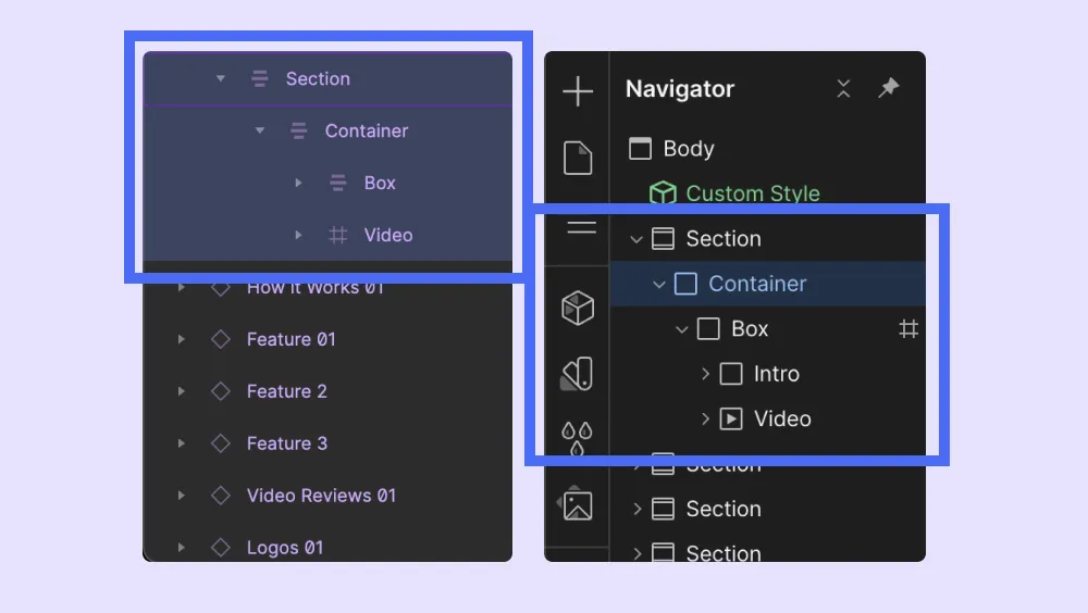
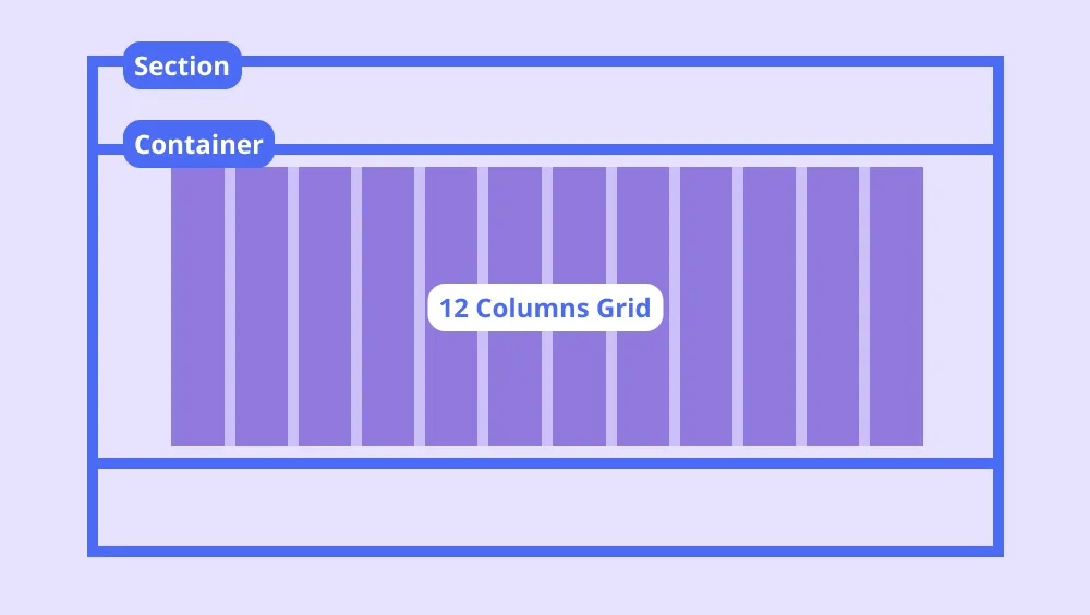
- Artboards as Body Elements: In Figma, artboards are akin to the body element in HTML. They form the canvas where your website layout will take shape.
- Frames and Auto-Layouts as Containers and Sections: Utilize frames with auto-layouts in Figma as you would use sections and containers in HTML/CSS. This parallel helps in visualizing how your design translates to web structure.
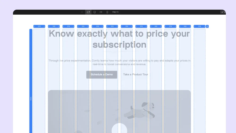
Master the 12-Column Grid and 8px Sizing
The 12-column grid and 8px sizing guide are critical in both Figma and Webflow:
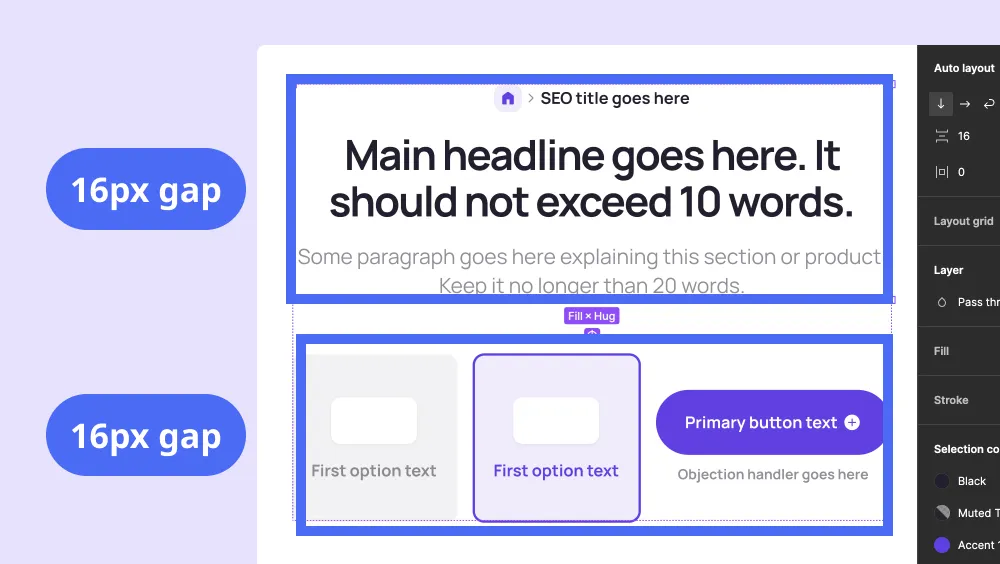
- Implementing a 12-Column Grid: This grid system is a staple in web design for a reason. Set it up in Figma to ensure your layouts are responsive and align well when ported to Webflow.
- Using the 8px Sizing Guide: Stick to an 8px grid for consistent spacing and sizing. This approach simplifies alignment and spacing issues when you start building in Webflow.
Implementing Style Guide Best Practices in Figma
Having a comprehensive style guide in Figma is essential for ensuring consistency and efficiency across your website design project. This is a critical step in the Figma to Webflow development process. Here are 4 strategies to prepare your style guide:
- Creating a Consistent Color Palette: Define and use a consistent color palette in Figma. This makes it easy to maintain a cohesive look when the design is implemented in Webflow.
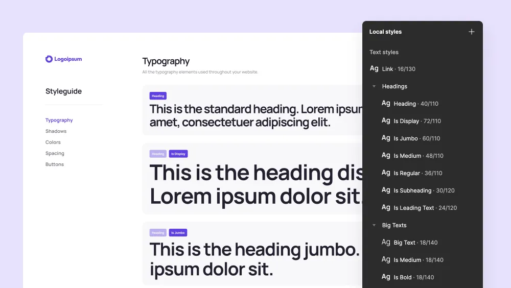
- Typography Standards: Establish a set of typography rules in Figma, including font styles, sizes, and weights. Consistent typography ensures that your design remains visually coherent in Webflow Designer and your web pages.
- Scalable Asset Management: Organize icons, images, and other assets in a scalable manner. Consider how these elements will be used in Webflow to ensure they are easy to adapt and integrate.
- Design Tokens: Utilize design tokens in Figma for spacing, color, and typography. This practice helps maintain design consistency and speeds up the development process in Webflow.
Tips for a Webflow-Friendly Figma Design
To make your Figma designs more Webflow-friendly, consider the following:
- Strategic Layer Grouping: Organize your layers and groups in Figma as you would structure HTML/CSS. This makes your design more logical and easier to understand when moving to Webflow.
- Logical Naming Conventions: Use clear, descriptive names for your Figma elements. This practice reduces the potential for confusion during the development phase in Webflow.
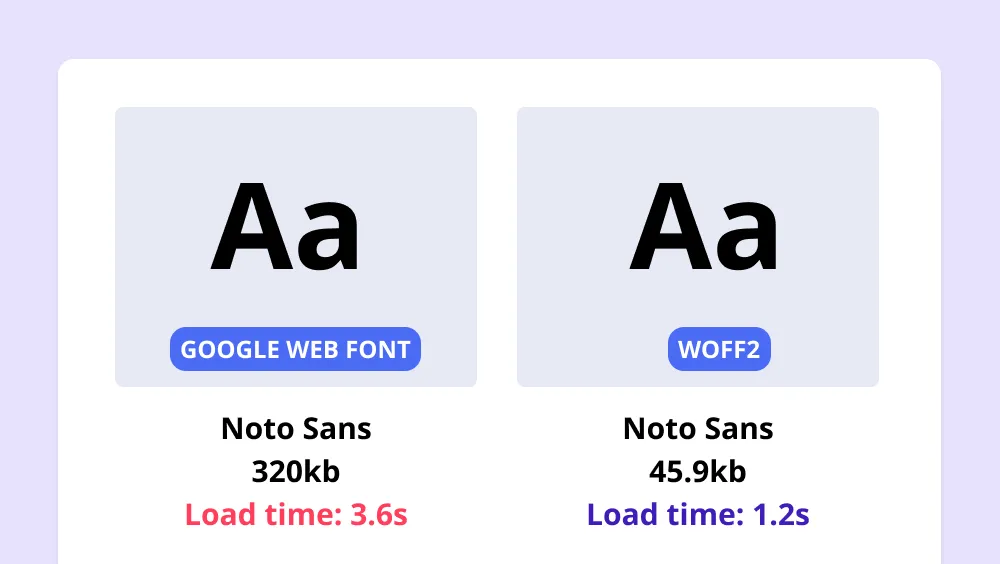
The Importance of Image and Font Optimization
Optimizing images and fonts in Figma isn't just a detail; it's a necessity for a performance-oriented Webflow site. Here's why:
- Faster Page Load Times: Optimized assets lead to quicker page loads, a key factor in user experience and SEO.
- Enhanced Visual Quality: Properly optimized images retain quality while reducing file size, ensuring your site looks sharp and loads fast.
Techniques for Optimizing and Exporting Assets
When preparing your assets in Figma for Webflow, follow these steps:
- Image Optimization: Use Figma’s export options to compress images and, if possible, convert them to WebP format for better performance.
- Font Optimization: Minimize the number of font variations and weights. Overusing fonts can significantly slow down your site, as discussed in our Webflow page speed article.
- Efficient Exporting: Ensure assets are exported in the right format and resolution for the web, balancing quality and performance.
Frames in Figma vs. Div Blocks in Webflow
Understanding the correlation between Figma frames and Webflow div blocks is crucial:
- Frame to Div Block Translation: Frames in Figma can be thought of as div blocks in Webflow. This understanding aids in structuring your design for a seamless transfer.
- Layout Consistency: By maintaining consistent sizing and spacing in your Figma frames, you ensure that the layout remains intact when converted to div blocks in Webflow.
With these techniques in place, you're not just optimizing assets in Figma; you're setting the stage for a high-performing, visually stunning Webflow site. And if you're hungry for more insights on creating top-notch Webflow sites, don't miss out on my guide on how to build a website in Webflow.
How to Apply the Slate Method in Webflow
The Slate Method isn't just a theory; it's a practical workflow that transforms the way you bring your Figma designs to life in Webflow. It all starts with a solid grid and a container that holds everything together.
How to Create a Div Block with a 12-Column Grid in Webflow
First things first, let's set up our stage:
- Laying the Foundation: In Webflow, create a new div block. This is your canvas, akin to your Figma artboard.
- Grid Setup: With your div block selected, switch its layout to 'Grid'. Here, you'll set up a 12-column structure, mirroring the organization you've meticulously crafted in Figma.
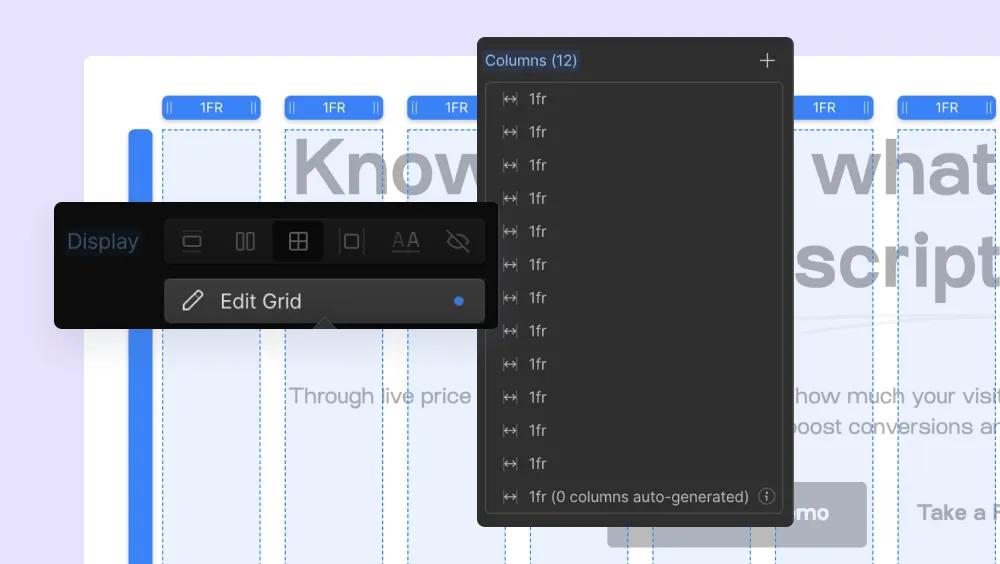
How to Add and Manage Content Within the "Container" Div Block
Now, let’s fill that container:
- Content Allocation: Drag elements into your container div block, assigning them to the appropriate columns based on your Figma blueprint.
- Spacing and Alignment: Refer back to your 8px sizing guide from Figma to maintain consistent spacing as you adjust margins and paddings in Webflow.
By replicating the 12-grid layout and spacing from your Figma file's in Webflow, you ensure that your design's integrity is maintained from concept to execution. It's about making Webflow an extension of your Figma workspace, where every decision you made earlier pays off.
Feeling overwhelmed with all these optimization steps?
At Arch Web Design, we can help convert your SaaS website into a lead-generating machine. Discover our secret to conversion-focused web design with bespoke, AI-driven solutions, and let us do the work for you. Schedule a free discovery call today!
Slate Method Examples and Practical Tips
Once you're in the thick of the Figma to Webflow process, having a set of go-to strategies can make all the difference. Let's walk through some detailed examples and tips to keep your design consistent and accurate.
Examples of the Slate Method
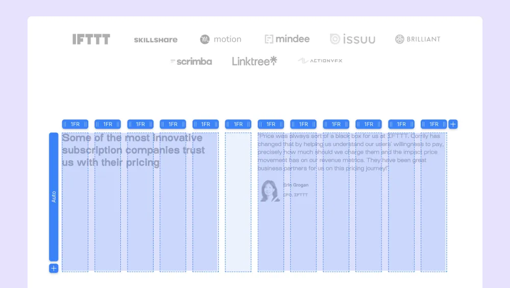
Seeing is believing, and there's no better way to understand the Slate method than through real-world examples:
- Grid Alignment: Take a complex section from your Figma design—let's say, a feature list with icons, titles, and descriptions. We'll recreate this in Webflow using our 12-column grid, showing exactly how each element aligns with our grid guidelines.
- Responsive Adjustments: Watch as we adapt a hero section for different screen sizes, demonstrating how the Slate method ensures that your layout is not just visually appealing but also responsive.
Tips for Maintaining Design Consistency and Accuracy
When I switch to Webflow, I carry over that clarity from Figma. It’s like my workspace stays with me, keeping things tidy and manageable as I translate my designs into reality. A few pro tips can help you maintain the integrity of your design as you build:
- Overriding Styles: Learn when to reuse classes and when to override styles for unique elements, keeping your stylesheet clean and your site performing well.
- Smart Use of Symbols: Utilize Webflow's symbols for repeating components. This will save you time and help prevent discrepancies between different instances of the same component.

Remember, it's these small details that make a big impact on your final website. By applying these tips, you'll not only replicate your Figma design in Webflow but also create a site that stands out for its attention to detail and design fidelity.
Benefits of the Slate Method
Adopting the Slate Method isn't just about adhering to a new set of rules; it's about unlocking a streamlined workflow that enhances every aspect of web design and development. Here's why this method is a game-changer.
Streamlined Workflow from Design to Development
The Slate Method bridges the gap between design and development:
- Speed: Designers and developers can work faster because the method eliminates guesswork and constant back-and-forth.
- Clarity: Everyone involved understands the structure and the end goal from the get-go, thanks to the method’s emphasis on organization and consistency.
Improved Website Performance and User Experience
Every element of your design is optimized for Webflow, which translates to:
- Speedier Load Times: By sticking to optimized assets, your website loads faster, keeping users happy and engaged.
- Seamless Interactions: The pre-planned structure ensures that interactions and animations work fluidly, providing a top-notch user experience.
Enhanced Collaboration Between Designers and Developers
When both sides speak the same design language:
- Better Understanding: Designers gain insight into development constraints, while developers get a clearer picture of the design intent.
- Efficient Handoffs: The method makes the transition from design to development smoother, with fewer revisions and less frustration.
The Slate Method does more than just make your Webflow site look good; it optimizes your entire workflow, from the first sketch in Figma to the final live site. By following this method, you're setting up your team for success and ensuring that the finished product is as polished and performant as possible.

Alternative Option: Import Figma Designs to Webflow
Now that you know how to import Figma to Webflow with the Slate method, let me show you an easier and faster way - a Figma to Webflow plugin that converts your static Figma layers into clean, production-ready HTML and CSS for Webflow.
This plugin is developed by Webflow Labs, which means it’s mainly designed to meet the demands of working in Webflow. Using it, you can improve your designs with Webflow interactions, integrate dynamic content, and publish your site with just one click on Webflow's fast hosting infrastructure.
Here are some of the plugin’s key features:
- Design System Sync: Sync components and variables for consistent designs.
- Prebuilt Layouts: Access over 20 responsive layouts and structures.
- Seamless Styling Transfer: Smoothly transfer styling, layouts, colors, text, and images.
- Automatic Style Guide Creation: Generate a style guide in Webflow based on your Figma styles.
- Support for 50+ CSS Declarations: Extensive CSS support ensures design fidelity.
- SVG Export: Export vector nodes as SVGs for high-quality graphics.
- Component and Variable Syncing: Sync Figma components and variables.
- Auto Layout: Maintain Figma's auto layout structure.
- Backgrounds and Gradients: Transfer background images and gradients.
- Typography and Shadows: Keep your typography and shadow styles intact.
- SVG Conversion: Convert vectors and shapes to SVGs.
With all these features, the plugin simplifies turning static designs into functional websites. Next, let’s walk through a Figma to Webflow tutorial with this particular plugin.

How to Use the Figma to Webflow Plugin
To start using the Figma to Webflow plugin, you must first install it in Figma and authorize the plugin for your Webflow account:
- Go to the Figma Plugin Directory and search for the Figma to Webflow plugin.
- Click "Open in..." to redirect to a new Figma design file and open the plugin modal window.
- Click "Run" in the plugin modal window, then click "Connect account."
- If you’re not logged into Webflow, a new tab will open for Webflow login.
- After logging in, you'll be taken to the App authorization page to authorize the plugin.
- Select the sites and workspaces you want to authorize and click "Authorize app."
Now that you’ve taken these mandatory steps, there are two ways you can use this Webflow Figma plugin:
- Option #1 “Design and Sync”: You design your project in Figma, using auto layout for best results. Then, use the plugin to sync your entire design system or selectively copy elements into Webflow. To streamline the transition, simply adjust your HTML tags within Figma.
- Option #2 “Copy and Paste”: You select the design elements in Figma and choose the Webflow site from the plugin modal's dropdown menu. Then, you click "Copy to Webflow" and confirm if prompted. Finally, you open the Webflow Designer and paste the design onto the canvas.

7 Tips to Make the Most of the Figma to Webflow Plugin
Having worked with this plugin, I can tell you that specific actions will help you make the transfer faster and smoother. So follow the tips below to get the most out of it:
1. Leverage Prebuilt Layouts and Structures
Access prebuilt responsive layouts for common elements like navbars and hero sections. Use these prebuilt structures as content wrappers to keep your designs responsive across various devices.
Doing so will save you time and maintain design consistency.
2. Use Text and Color Styles
Again, transfer text and color styles from Figma to Webflow for consistency.
Create a style guide page in Webflow to organize and access these styles efficiently. This will make it easy to maintain a cohesive look throughout your website.
3. Don’t Forget the Auto Layout
Accurate translation into Webflow is critical. That’s why you want all your frames in Figma to use the auto layout.
This way, your designs will maintain their structure when you transfer them.
4. Upload Custom Fonts in Advance
Losing font settings is so annoying. Upload any custom fonts to Webflow before transferring your designs, and you’ll keep your design’s typography without hiccups.
5. Manage Classes Carefully
Want to prevent duplication and maintain clean, efficient CSS in Webflow?
Proper class management can do that for you. So, manage your classes carefully in a tidy and organized stylesheet, which is easier to maintain.
6. Optimize for Responsiveness
The Figma to Webflow plugin has quite a few responsiveness options.
Use them to control how your designs adapt at different breakpoints and make your website look great on all devices, from desktops to mobile phones.
7. Use Supported Browsers
Sometimes, compatibility issues can mess up your workflow.
Avoid them by working in a supported browser like Chrome or the Figma Desktop App.
How Good is the Figma Webflow Plugin?
If you're tired of Figma to Webflow handoff headaches, this plugin is a game-changer. It lets you zip your designs across in a flash, keeping everything crisp and consistent. It will save you a lot of time, especially for hefty projects or situations where you need to make edits on the fly.
Sure, it has a few quirks, but the benefits outweigh the potential issues. So, if you want to crank out stunning, responsive websites in record time, I recommend giving it a try.
It’s efficient, consistent, and fairly easy to use.

Frequently Asked Questions (FAQs)
Before wrapping it up, here are the answers to some questions I frequently hear about Webflow Figma integration:
Is it Better to Design in Figma or Webflow?
Figma and Webflow are powerful tools, but they serve different purposes. Figma is for creating detailed designs, while Webflow is for building and launching websites. That’s why it’s better to use Figma for design precision and only turn to Webflow for website development and implementation.
Are There any Tools That Can Assist in the Figma to Webflow Transition?
The Figma to Webflow plugin is a great tool for transferring designs. It automates converting design elements into Webflow's HTML and CSS, keeping it consistent and saving you time. This plugin is particularly useful for maintaining design integrity and efficiency.
What Common Issues Might I Face During the Transition?
Common issues include browser compatibility (the plugin doesn't support Safari), managing class name duplication, and ensuring all Figma layers use auto layout. Custom fonts also need to be manually uploaded to Webflow. If you don’t address these issues properly, they can slow down your transition.
